Categories
Business Intelligence Data Analytics

How to Learn Data Analytics with the Feynman Technique

Using the Feynman Technique to Enhance Your Data Analysis 

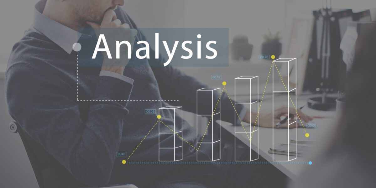
The field of data analysis is an ever-growing, ever-changing industry. Most data analysis advice for best practices will go into the technical needs for the field, such as learning specific coding languages and relevant algorithms. However, to fully grasp your data analysis, you must be able to make it easy to comprehend for people outside of the field, such as business users or the general public. Thankfully, there are positive qualitative techniques that you can employ in your analytics practice to help with this, particularly the methodology known as the Feynman Technique.

Why is the Process Called the Feynman Technique?

The Feynman technique is named after the world-renowned theoretical physicist, Dr. Richard Feynman.

Who is Richard Feynman?

Dr. Feynman was a Nobel Prize-winning scientist, university professor, and writer. He was best known for both his work in the field of quantum electrodynamics and his involvement in major historical scientific events, specifically his work on the Manhattan Project and his official investigation into the Challenger shuttle explosion. As an educator, he was best known for his approach to teaching, which emphasized true understanding of the subject matter, as opposed to the then-standard of conventional learning techniques.

How Does the Feynman Technique Work?

The Feynman Technique is a multi-use means of understanding any new data, regardless of the context. The general goal is to better understand the information by effectively explaining it to others. The technique works by adapting Feynman’s personal approach to understanding data and involves a small number of steps to achieve this process. 

1. Study the Data Thoroughly

In order to fully understand a set of data, Feynman believed that you had to first truly study everything about it. In many cases, there are numerous items in a data set that might need additional study to thoroughly understand the data set as a whole. In these cases, the Feynman Technique dictates that you should narrow your focus to those items you might have any difficulty focusing on first.

2. Explain the Data

As an educator, Feynman believed that the next step for data, once understood, was the ability to teach it to someone else. For this step of the Feynman Technique, once a data set is truly understood, you then teach what you have learned to another person or group. It is at this stage where you welcome questions and feedback, this allows you to spot any weaknesses in your analysis or overall understanding of the data.

Further Study

If there are any gaps or inconsistencies that your audience points out in Step 2, this is where you return to the initial data set and dive deeper into those areas. Ideally, the more these points are analyzed, the more they will become the strongest points of your overall knowledge.

Create a Simplified Explanation of the Data

Once you have a thorough and reasonably airtight knowledge of the data and its implications, the last step of the Feynman Technique is to break down your analysis into as simple and basic an explanation as possible. This enables the fastest and most efficient means of communicating to your clients, coworkers, or any other audience you might have. From time to time, you will have to go into further details when asked about specific points related to your analysis, but for most audiences, basic information works best to allow others to understand it quickly.

Conclusion

In today’s modern society, secondary and higher education now emphasizes project-based learning and a more thorough understanding of the subject matter. With up-and-coming analysts approaching data with the Feynman Technique, or a similar model, this strategy enriches the overall quality of your analyses, and will most likely benefit you throughout your career.


Categories
Big Data Data Analytics Data Enrichment Data Quality

5 Common Challenges of Data Integration (And How to Overcome Them)

Big data is a giant industry that generates billions in annual profits. By extension, data integration is an essential process in which every company should invest. Businesses that leverage available data enjoy exponential gains.

What is Data Integration?

Data integration is the process of gathering and merging information from various sources into one system. The goal is to direct all information into a central location, which requires:

  • On-boarding the data
  • Cleansing the information
  • ETL mapping
  • Transforming and depositing individual data pieces

Five Common Data Integration Problems

Getting a data integration process purring like a finely tuned Ferrari takes expertise, and the people running your system should intimately understand the five most common problems in an informational pipeline.

#1: Variable Data From Disparate Sources

Every nanosecond, countless bytes of data are moving rapidly around the ether — and uniformity isn’t a requirement. As a result, the informational gateway of any database or warehouse is a bit chaotic. Before data can be released into the system, it needs to be checked in, cleaned, and properly dressed.

#2: The Data/Security Conundrum

One of the most challenging aspects of maintaining a high-functioning data pipeline is determining the perfect balance between access and security. Making all files available to everyone isn’t wise. However, the people who need it should have it. When departments are siloed and have access to different data, inefficiencies frequently arise. 

#3: Low-Quality Information

A database is only as good as its data. If junk goes in, then waste comes out. Preventing your system from turning into an informational landfill requires scrubbing your data sets of dreck.

#4: Bad Integration Software

Even if your data shines like the top of the Chrysler Building, clunky data integration software can cause significant issues. For example, are you deploying trigger-based solutions that don’t account for helpful historical data?

#5: Too Much Useless Data

When collected thoughtfully and integrated seamlessly, data is incredibly valuable. But data hoarding is a resource succubus. Think about the homes of hoarders. Often, there’s so much garbage lying around that it’s impossible to find the “good” stuff. The same logic applies to databases and warehouses.

What Are Standard Data Integration Best Practices?

Ensuring a business doesn’t fall victim to the five pitfalls of data integration requires strict protocols and constant maintenance. Standard best practices include:

  • Surveillance: Before accepting a new data source, due diligence is key! Vet third-party vendors to ensure their data is legitimate.
  • Cleaning: When information first hits the pipeline, it should be scrubbed of duplicates and scanned for invalid data.
  • Document and Distribute: Invest in database documentation! Too many companies skip this step, and their informational pipelines crumble within months.
  • Back it Up: The world is a chaotic place. Anomalies happen all the time — as do mistakes. So back up data in the event of mishaps.
  • Get Help: Enlist the help of data integration experts to ensure proper software setups and protocol standards.

Data Integration Expertise and Assistance

Is your business leveraging its data? Is your informational pipeline making money or wasting it? If you can’t answer these questions confidently and want to explore options, reach out to Inzata Analytics. Our team of data integration experts can do a 360-degree interrogation of your current setup, identify weak links, and outline solutions that will allow you to move forward more productively and profitably.

Categories
Big Data Business Intelligence Data Analytics

Top 5 Growing Data and Analytics Trends for 2021

What Are the Top 5 Growing Data and Analytics Trends for 2021?

Today, data and analytics are constantly evolving the way we do business. Companies are becoming heavily reliant on historical big data to create a foundation for decisions, from driving cost efficiency to determining new strategic directions. These decisions are more important than ever, especially when businesses are battling to stay competitive amongst the digital frontier.

To keep the competitive edge in the turmoil of a global economic crisis, more companies are taking the lead to be proactive in data analytics. The traditional AI techniques of being driven by big data are rapidly transitioning to the class of analytics based upon smaller yet more varied data techniques. Automation technology is the solution to this rapidly growing, complex problem.

Here are five of the biggest analytics trends to look out for in 2021.

1. Why Analytic Automation with Advanced and Scalable AI

With the demise of “big data” and the pivot to “small data” analytical techniques, AI systems will be required to do more with less. Advanced AI has the unique ability to analyze complex data sets and quickly detect trends and patterns that would be challenging or easily overlooked by the human eye. Analytics automation provides the opportunity for corporate analysts to focus more on high-value targets to drive top-line growth. Intelligent automation is the “engine” for today’s complex and challenging data-driven decision-making.

2. How Xops Delivers Automated Analytics for the Enterprise 

Xops has an objective to increase efficiencies with an economy of scale by deploying DevOps best practices. The end goal is to reduce cross duplication of technology automation processes while maintaining high levels of reliability, accuracy, and reusability. The key components of Xops (data, machine learning, model, platform) scale with DevOps best practices to maximize the value of analytical information. Xops promise to automate and accelerate the collection, collation, and identification of data elements, ultimately helping organizations keep their competitive edge.

3. What Dashboard Automation Promises for the Organization

The rapid movement to deploy data automation solutions that deliver insightful user-created data has tremendous implications. Analytical data traditionally would have to be delivered by IT or a data expert within the organization. The promise of analytical data generated on-demand by anyone ranging from marketing, human resources, or even finance will shift organizational agility, delivering insights faster and more effectively to the company as a whole. The impact on an organization from decentralized to on-demand data delivery can be dramatic.

4. Why Cloud Services Are Rapidly Growing for Analytical Data

With the advent of increasingly complex and larger data sets along with their intrinsic values, cloud services are rapidly becoming the repository of choice. Data is stored outside an organization on remote, secure servers. Extremely valuable information is better protected and in case of a disaster, data can be recovered much more efficiently. Scalability for the enterprise is more fluid with the cloud hosting services.

5. Why Data Analytics Has Become a Core Business

Data analytics has transitioned from being a secondary support function to mission-critical for an organization. The buy-in for data analytics has widespread support from the board room and the C-suite for its tremendous potential. The positioning of data analytics as a core business function, though, does not come without cost. Often, businesses may underestimate the complexity of data collection and analytics, missing valuable opportunities. Many times, partnering with AI-powered tools such as Inzata will immediately shorten the ramp-up time to deliver valuable data assets.

Conclusion

These data and analytics trends are being driven by analytics automation platforms. Technology is rapidly advancing, and organizations embracing it first will enjoy a competitive edge. Previously, a few gatekeepers generated the data analytics and insights based upon specific data requests from corporate analysts. With the trend for insight generation being pushed down to the individual, data analytics becomes available to all. The ability to create insights on-demand by the end-user will inevitably lead to a leap in corporate strategic planning, decision-making, and the ability to maintain a competitive edge.

Categories
Business Intelligence Data Analytics Data Visualization

What is a KPI Dashboard?

What is a KPI Dashboard?

Every day your business collects hundreds or even thousands of data points, and it can be overwhelming to wade through all of this information. Key Performance Indicators (KPI) are the different metrics used to access if you’re reaching your business objectives and goals. 

There are numerous KPIs that businesses can use, but the most common are Quantitative, Qualitative, Lagging, and Leading KPIs. 

Quantitative KPIs deal with numerical data such as currency, percentages, and statistics. Qualitative KPIs, on the other hand, takes into account the interactions of your customers. It factors their opinions, experiences, and even feelings towards your business or product. 

Lagging KPIs takes a look at historical data and uses it to predict future outcomes. Most Leading KPIs, though, look at performance for future forecasting. Typically these will be used together to help increase your overall visibility. 

Looking at all of this data separately can be both time-consuming and inefficient in the use of resources. A KPI dashboard can look at all of this data and provide you with key information at a glance. That allows you to monitor goal performance, find ways of improving workflows, and make sure that you’re making the best use of your resources. 

Who Can Benefit From a KPI Dashboard?

Businesses that are already gathering any form of operational or transactional data can benefit from a KPI dashboard. Organizations that need to make adjustments to their workflow or data collection processes would also benefit from a KPI dashboard. They can see information at a glance to know if the business is over or underperforming in regards to trends, quarterly goals, and business strategy. 

Companies that have numerous departments or organizational levels can take advantage of a KPI dashboard. Each business function may have its own individual goals and the dashboard can help paint a clearer picture of how that fits into the organization as a whole. That way you can manage your target strategies and identify which areas of your operations need to be streamlined. 

What Are Some of the Benefits of a KPI Dashboard?

A KPI dashboard can provide you with new insights into how your business is performing. Whether you want a high-level view or need to drill down for more detailed information, you can customize reporting to meet the needs of your business or department. Additionally, the KPI dashboard can also be customized to meet the needs of individual users. That way the data can be tailored to what’s relevant for each person’s role and daily responsibilities. 

Some examples of KPIs that you can put into your dashboard can include:

  • Revenue per customer
  • Project time
  • Churn rates
  • Net profit
  • Revenue growth

Depending on the size of your business, you could be using hundreds of KPIs. Regardless, dashboards will work to filter and highlight the key information. 

Another benefit of a KPI dashboard is that you can scale the data. You can get down to individual performance metrics, departments, or teams so that you can easily access desired information and find ways of improving performance. 

Using a KPI dashboard can also help businesses make decisions about their investments. You can get real-time updates to monitor the ROI and use historical data to forecast profitable future investments.

Why Should I Use a KPI Dashboard for My Business? 

When building a KPI dashboard, you should consider metrics that are relevant to the goals of your business. Examine the various stakeholders in the organization and access who will need to access the data, then choose the KPIs that align with their goals and strategies. 

When selecting individual KPIs, you should focus on actionable metrics. Be specific with your goals and focus on the ones that are of the highest priority. If the business strategy changes, you can always go back and adjust the KPIs to realign with your new approach. At the end of the day, the KPI dashboard that you use should help improve your business. 

As your goals and strategies change, the KPI dashboard should be robust enough to adapt as well. A KPI dashboard that works well for one industry may not work for yours, so it’s important to do your research and find the right components for your business.

Categories
Big Data Business Intelligence Data Analytics

The Real Competitive Advantage of Real-Time Analytics

Information is power, or so the saying goes. Yet, that power rests in large part on how recently that information was collected. Let’s say you want to buy a house, you take the tour and like what you see. Before you make your final decision, though, you want to see a home inspection report. Do you want to base your decision on a home inspection report from six months ago or the one the home inspector will finish an hour from now? How about an inspection report from one month ago? One week? 

Information is constantly changing, anything could have changed within the past few weeks alone. To make effective and accurate decisions, you need to be working with the most current information. That desire rests at the heart of real-time analytics and the competitive advantage it offers.

What is Real-Time Analytics?

Businesses are inundated with data from countless sources. They get data directly from customers, aggregate data from social media, traffic data from websites, and even from marketing tool suites. Real-time analytics takes all of that data, processes it, and provides up-to-the-moment results. 

The kind of results depends on the analytics software you use and the settings involved. For example, some businesses prefer that the software provide answers only when queried on something specific. Others prefer that the software offer real-time alerts or trigger real-time actions for certain pre-set results.

Why Does it Give You a Competitive Advantage?

No business can know with certainty what data its competitors possess. You also can’t know with certainty how soon they’ll analyze that data and put it to work. Leveraging that real-time information lets you adjust tactics, change orders, or even create promotions in response to new trends before your competitors do. 

That lets you collect on the immediate benefits of reduced waste, better marketing, and an uptick in revenue. It also helps solidify your business as being on top of what is happening in the world. Customers like businesses that either predict or seem in close tune with the market. Every time you seem on top of your game, you cement your business as the one people should turn to first. 

What is the Cost of Working with Outdated Data?

So, what are the pitfalls of working without outdated data? For some functions, such as forecasting, data that is a little out of date probably won’t change the results by a significant amount. 

For any business that must respond quickly to rapidly changing trends, the cost can prove to be high. Let’s say a trend highlighting the value in some otherwise obscure IT function is rapidly developing in a specific industry. If you run a managed IT service company, recognizing the trend quickly lets you update your service offerings, set pricing, and shift your targeting strategy. If you don’t catch that trend quickly, you can lose out on potential revenue from new customers and expanded services for old customers. 

Use Cases

One of the most obvious use cases for real-time analytics is monitoring your IT infrastructure. Immediately you are able to gain visibility into the capacity, availability, and performance of your infrastructure investments. This lets you respond to any issues as soon as they arise. Getting the information tomorrow won’t be any help to your service levels. 

Another common use case is for digital marketing efforts. Let’s say that you offer a rewards program for customers. When they are shopping online or in an app, it’s a golden opportunity for some personalized marketing based on their previous purchase history. Real-time analytics can alert you or your automated marketing system that the customer is browsing the store. That lets you deliver customized discounts, coupons, or personalized promotions when someone is most likely to buy.

Real-time analytics is a powerful tool for carving out a competitive advantage. It helps keep your company at the forefront of changing trends. It also helps your business adapt faster when the unexpected happens. In turn, you reap short-term as well as long-term benefits in terms of cost-savings, revenue boosts, and customer conversions.

Categories
Big Data Data Analytics

7 Effective Tips to Secure Your Cloud Data

It’s been said that we “live in the cloud” — the digital stratosphere where images, videos, and files orbit. According to recent counts, the often mentioned but elusive digital ether holds 40 trillion gigabytes of data — or 40 zettabytes, which begs the question: Is it safe out there on the digital frontier?

The answer depends on precautions taken.

What Is Cloud Data?

In the old days, businesses maintained in-house computers to catalog files, and individuals typically stored their documents on desktops, laptops, and portable hard drives. But today, the “cloud” — a network of servers that can be accessed via the internet — is the primary digital storage environment.

To put it another way, from a personal computing perspective, the difference between local and cloud computing is the difference between saving a Google doc on Google servers and saving a Word file on your laptop or desktop.

Is My Data Safe in the Cloud?

Like a house, the cloud is only as safe as the security it has in place. Apps, websites, and other platforms that offer cloud storage are responsible for ensuring that their stake is guarded and sufficiently shielded.

Seven Tips To Keep Your Cloud Data Safe

Individuals also play a role when it comes to keeping their information safe in the cloud, and implementing a few practical tips can go a long way in avoiding a data breach.

Encrypt Data

Over four billion people are plugged into the internet, and Google processes over 40,000 searches per second! In other words, a lot of data is darting around at any given second.

Now ask yourself: what type of data would a cybercriminal target? Would they spend precious time trying to crack through a digital fortress or go for the low-hanging fruit that’s easy to access and provides the same ROI? Of course, they’re gunning for easy targets! So pull yourself out of that murky pool and only use cloud app services that encrypt data!

Run Backups

Do your cloud access providers regularly backup data? They should. Moreover, it’s best to back up personal devices on drives that don’t automatically connect to the internet.

Enable Two-Factor Authentication

Yes, two-factor authentication can be more annoying than a slow driver in the left lane, but at this point, every business should make it mandatory. Not only does it keep users safe, but it serves as an enterprise shield.

Better Password Hygiene

Password protection is an essential part of cloud safety. Individuals should never use the same one for every account, and businesses should be helping users create effective and difficult-to-crack passwords. Forcing users to change their passwords every month or two is also wise.

Do Your Homework

Would you buy a house without doing a little research about the neighborhood? Would you date a stranger without Googling them? The same logic applies to cloud apps. Before clicking “Yes, I Agree,” engage in some due diligence. Research the company and read up on red flags that rear their cautionary heads. 

Be Selective With Sensitive Information

Don’t relinquish personal or sensitive data unless necessary. Moreover, consider using services that cloak any critical financial or personal information.

Use Antivirus

Being online without an antivirus program is like crossing the Sahara without water: you’ll eventually succumb to the elements. But understand that not all antivirus options are created equal — some have the potential to do more harm than good. So be paranoid! Do a bit of review reading before installing programs on your devices.

Who is Responsible for Keeping Cloud Data Safe?

Cloud safety should be a top priority for every company, nonprofit, government, and individual. Never assume someone else is doing the job for you. Vet the apps and digital account services with which you sign up. Do they have a history of privacy problems? How long have they been around?

But overall, if you take the necessary precautions, your stuff should remain secure in the cloud.

Categories
Artificial Intelligence Data Analytics Data Preparation

Growth Hacking Your Business Processes with Artificial Intelligence

Along with data and analytics, the focus on continuous improvement remains a constant in the business world. Recent market disruptions have only emphasized the need for businesses to optimize their processes and core functions moving forward. Artificial intelligence is one tool companies are turning to when achieving greater efficiency within their operations. Let’s explore how AI is transforming the way we do business, from data cleaning to the customer experience.

Using AI to Cleanup Dirty Data

Let’s get straight to the point. Dirty data costs businesses money, regardless of if they heavily rely on or prioritize data in their operations. The average cost of dirty data sings to the tune of around 15% to 25% of revenue each year. While this percentage doesn’t appear to be an overwhelming amount, consider the overarching estimate from IBM that bad data costs the U.S. $3.1 trillion each year. This high cost is mainly due to the complexities associated with cleaning and maintaining an organization’s data quality. 

There’s no question that data cleaning is a lengthy and time-consuming process. As a result of this, less time is able to be devoted to high-level goals. Decision-makers have long wait times when it comes to converting raw data into actionable insights. AI, though, is able to automate this process so businesses can focus their efforts elsewhere. AI learns from each data set and can detect columns in need of cleaning, all while simultaneously updating the data model. The productivity of your data science team is improved, saving hundreds of hours that would have been spent on cleaning tasks.

Analyzing Business Data for Forecasting and Prediction

The use of business data to identify patterns and make predictions is well established. Using AI-powered tools and solutions, any business user can generate insights quickly without advanced programming or data science skills. The ease of use makes this process faster, more accessible, and efficient across business units. This reduces miscommunications between the analytics team and eliminates wait times on reports, query requests, and dashboard delivery.

Additionally, exploding data volumes have made effective use of an organization’s data difficult to manage. Artificial intelligence helps to quickly analyze these large volumes in record time, allowing for faster insights along with higher quality forecasting. Actionable business data is becoming accelerated with the use of AI, helping business leaders make decisions with greater accuracy.

Improving Sales and Customer Success

AI-powered analytics is helping companies gain insights into their prospects as well as current customers. For instance, companies can use AI in conjunction with their CRM data to predict which customers are most likely to cancel their subscriptions or which new sales accounts are more likely to close. These predictions can be flagged to alert the customer success team or sales staff, highlighting where they should be maximizing their time. This acceleration can also result in a more efficient and effective customer lifecycle.

On the customer experience side of things, process improvement can also be established through automatic support lines and AI-powered chatbots. AI systems can monitor customer support calls and detect detailed elements as minuscule as tone to continually keep an eye on quality. Chatbots also offer additional availability for immediate support. Problems are identified and resolved faster to increase revenue along with customer retention.

Categories
Big Data Business Intelligence Data Analytics

What is the Half Life of Data?

Half-Life of Data Mean?

The term “half-life” was originally coined by scientists studying the amount of time it takes for at least 50% of a substance to undergo an extreme change. When studying analytics and data science, the term often comes up. 

While the half-life of data isn’t as exact a measure as the half-life of substances, the implications are similar. In this case, the half-life of data is referring to the amount of time it takes for the majority of it to become irrelevant. This is an exponential curve downwards, meaning that data is at its peak value when first collected, then accelerates in loss of value over time.

In a recent study, researchers highlighted the issue that administrators often underestimate or misunderstand the half-life of their data and the implications it carries. 

What Are the Three Business Categories of Data?

Nucleus Research found in their study that businesses driving decisions with data fall into one of three categories: tactical, operational, or strategic. The half-life of data varies by the business data category.

These categories were self-identified, and no real-world business is only one of these categories. Companies in the study were asked to select a category based on four factors: their suppliers, their markets, how regulated they are, and how much they depend on intellectual property.

Tactical

According to the study, the tactical category contains companies who utilize data to influence their processes in almost real-time. Because data received is extremely valuable when first received, then rapidly declines in value to the company, this category has the steepest downward curve of data half-life.

This category emphasizes how important it is for companies to have technology that allows them to act as quickly as possible on actionable data. The study found that, on average, the half-life of data in this category is a mere 30 minutes. That means data is losing a majority of its value in the first 30 minutes after collection!

Operational

The study indicates that companies using data for operational purposes generally require it to make decisions that could be anywhere from a day to a week. This is a mid-level category with a half-life curve that goes down exponentially, but far more slowly than data of companies in the “tactical” category.

Nucleus Research found that data in this category had an average half-life of 8 hours but ranged widely among companies, from one hour to 48 hours.

Strategic

Companies falling into this category use data for long-term processes and plans. Strategic data’s value is the most distributed, losing value very slowly over time. The half-life of their data is a small-slope linear graph. Strategic data’s average half-life is 56 hours and widely variable.

What Are 3 Ways to Speed Up Conversion from Raw Data into Actionable Insights?

Here are three ways to divert data from silos and process it into valuable and actionable insights for your business.

Ask Good Questions – In order for raw data to be valuable, it must have a defined purpose. Meeting with all stakeholders and determining what specific question you’d like answered, then identifying data that must be collected to answer it instantly increases the value of what you’re already collecting.

Use Segmentation – If possible, differentiate among types of clients or users as much as possible. This will create more individualized and accurate insights.

Create Context – Data silos happen when large, ambiguous groups of data are collected. Ensure that everyone understands what each piece of data actually means to instantly add value to logged data.

Categories
Big Data Data Analytics

The Top 3 Most Valuable Data Visualizations & When to Use Them

Today’s dashboard software is making it easier than ever to integrate and visualize data in a way that is as inspiring as it is applicable and valuable. While doing so is simple, an exceptional dashboard still requires strategic planning and designing.

Knowing your audience will help you to determine what data you need, and knowing what story you want to present tells you which data visualization type to use. Assuming you have clean data and the best data visualization software, your next step is to choose the right charts and graphs. This article suggests – what we think are – the most valuable data visualizations any analyst could use. Based on research, personal experience, and client reviews, these suggestions are a sure fire way to present your business data with flying colors.

Sunburst Graph

This interactive, radial space-filling visualization shows the aggregated values of subtrees. This is ideal for presenting hierarchical data (Ex. store locations and their sales by product/team member/date/etc.)

This visualization shows “hierarchy” through a series of rings that are divided into multiple categories. Each ring coincides to a level in the hierarchy. The innermost circle represents the root value and the hierarchy moving outwards from it.

The rings are sliced and divided based on their hierarchical relationship to the source slice. The angle of each slice is either divided equally under its source value or can be made proportional to a value.

Different colors are typically used to highlight hierarchical groupings or certain categories.

The value in this type of visualization is in the ability to see the root cause and effect of each piece of data, based on its parent’s value. You can answer questions about changes in your data that may or may not have been caused by another piece of data. Is one value controlling the other? Will a change in a parent value affect the child value?

Co-Occurrence Matrix

With a co-occurrence matrix, a network of data values can be represented by an adjacency matrix, where each cell ij represents an edge from vertex i to vertex j.

The effectiveness of a matrix diagram is heavily dependent on the order of rows and columns: if related nodes are placed close to each other, it is easier to identify valuable clusters and bridges.

This type of diagram can be extended with reordering of rows and columns, and expanding or collapsing of clusters, to allow deeper exploration of important relationships within your data and business.

While path-following is harder in a matrix view than in a node-link diagram, matrices have other advantages. As networks get large and highly connected, node-link diagrams often devolve into giant webs of line crossings. With matrix views, line crossings are impossible. Matrix cells can also be encoded to show additional data. Colors are often used to depict clusters calculated by a “community-detection” algorithm.

Co-occurrence matrix visualizations hold value in their accessibility of relationships among every piece of your data, and how “strong” that relationship is. Does one piece of data occur more often when another, separate piece of data is also occurring more often? Or vice versa? The effects of each piece of data on one another is quite endless, and valuable, if their relationship is fact a “strong relationship”.

matrix data visualization

Choropleth Map

The purpose of a choropleth map is to display geographical areas or regions that are colored, patterned, or shaded based on a specific data variable. This gives the user a way to visualize data values over a geographical area, showing variation or patterns across the available location. Choropleth maps give us the ability to represent a large amount of data over any amount of space in a concise and visually engaging manner.

The data value uses “color progression” to represent itself in each region of the map. This can be blending from one color to another, transparent to opaque, hue progression, light to dark, or an entire spectrum of colors.

There are 3 basic criteria necessary to use a choropleth map:

  1. The data is spatially related (i.e. countries, states, counties), or “enumeration units”
  2. Data is not raw; it has been processed to reveal rates/statistics/ratios
  3. The data could be collected and used anywhere in space

These criteria quickly reveals the fact that to effectively use a choropleth map, the purpose must be statistically related, and be able to freely cover any area in space.

For any business that produces data over a geographical area – sales, political, population, etc. – a choropleth map is your best visualization option to display growth/success/comparisons of that data over the respective area in an instant. Most choropleth maps are also interactive, giving you the ability to drill down into each geographical area’s data results by simply moving your mouse over that area.

The value a choropleth map provides is simple: instant comparable geographical data representation. Are your east coast sales doing better than your west coast sales? Is your political campaign more successful in one county than in another? The answers provided about your geographical data are endless.

Read More Here

Categories
Business Intelligence Data Analytics

The Comprehensive Guide to Healthcare Analytics

What is Healthcare Analytics?

The healthcare analytics field involves collecting and analyzing data from health services in order to make improved medical decisions in the future. The goal of the field is to support overarching health domains, ranging from prescriptions to microcosmic areas such as rare diseases. Better care can be given to patients in less time than ever before due to the introduction of BI and healthcare analytics tools. 

Depending on the field of medical practice in which healthcare analytics software is used, the benefits vary. For example, a small local practitioner may see the biggest benefit in having access to public health information derived from large hospital groups. Through this, the practitioner may be able to gain insights they otherwise would not have access to. On the other hand, the largest benefit that a large hospital may see in healthcare analytics could be streamlining patient charts and records. This can significantly lower the chances of losing records and ensures flexible access to needed information.

How Does the Healthcare Industry Use Healthcare Analytics?

The healthcare industry uses healthcare analytics to support services on all fronts. From ensuring positive patient experiences to lowering readmission rates to payer and insurance services, healthcare analytics has a wide array of purposes.

The high-risk patient population is one demographic assisted by healthcare analytics. This type of software digitizes healthcare records and leverage Artificial Intelligence (AI) to easily flag and identify high-risk patients. Physicians can utilize this data to divert patients from potential emergency room visits down the line. Extremely intricate risks, such as a rare polydrug reaction that can only occur with certain uncommon diseases, can be instantly highlighted and then mitigated by the prescribing physician.

Human error is also significantly cut down by healthcare analytics. Anomalies in prescription dosages can be found before a patient is prescribed the wrong amount. Both doctors and insurance companies can automate lengthy claims processes, allowing doctors to spend more time one-on-one with patients and less time haggling with insurers. In the most significant cases, even accidental death with lasting medical, fiscal, and personal problems attached can be prevented; this is particularly beneficial for larger offices with more doctors and patients since the onus is no longer solely on the doctor to have a clear and comprehensive view of the patient.

How Healthcare Analytics is Transforming Healthcare

Healthcare is rapidly evolving, primarily due to innovations in healthcare analytics software. Business Intelligence (BI) is one such innovation that’s been a game-changer. The costs of operation, workflow, and automated decision-making software involved are all evolving over time. Indirectly, healthcare facilities and practitioners benefit from data aggregated and analyzed from other facilities to help each other identify public health issues like COVID-19, as we’ve seen over the past couple of years.

Another more recent evolution in healthcare analytics is Population Health Management (PHM). This is a more modern approach to health; while traditional healthcare is reactive to situations that emerge, PHM focuses on preventing possible issues that could occur in the future. This is far more efficient in terms of time and money, but it requires predictive modeling in order for it to work in the public sector.

To perform PHM using healthcare analytics software, there must be a first, large initial data set. Using this, specific diagnoses can be analyzed and patterns can be found. In other words, AI can essentially perform medical research on very specific populations to inform doctors on public health problems and how they may work to help lower incidences in their local communities.

Wrapping Up Healthcare Analytics

It’s clear that healthcare analytics software is used extensively across the strata of medicine. Patients see instant value in this because it makes everything from new patient signup to paying copays much easier and more streamlined. Practitioners also see an instant return on investment from healthcare analytics by lessening manual research time and administrative headaches. Even insurance companies benefit, as do their customers, by being able to process items like prior authorizations and the like at a much faster rate than ever before.

Polk County Schools Case Study in Data Analytics

We’ll send it to your inbox immediately!

Polk County Case Study for Data Analytics Inzata Platform in School Districts

Get Your Guide

We’ll send it to your inbox immediately!

Guide to Cleaning Data with Excel & Google Sheets Book Cover by Inzata COO Christopher Rafter