After your account has been created, complete the following steps to log in to the platform for the first time.
1. Go to app.inzata.com.
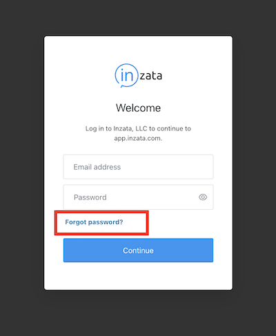
2. Click “Forgot password?”
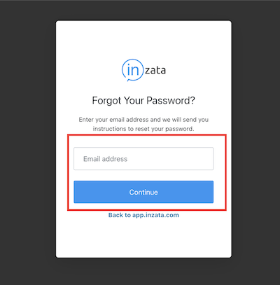
3. Enter the email address you registered with Inzata and click “Send Email”.
4. Go to your inbox and follow the steps to set up your password, then continue to log in at app.inzata.com.


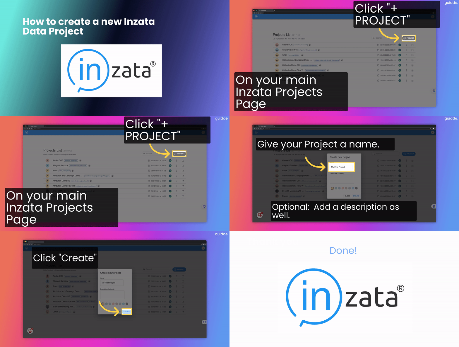
On the project screen, click the + Project button. Give the project a descriptive name so you can find it easily later.
Create a snapshot of Production Project
Using the three buttons on the right side of the screen, create a snapshot. Give it a name and a description.

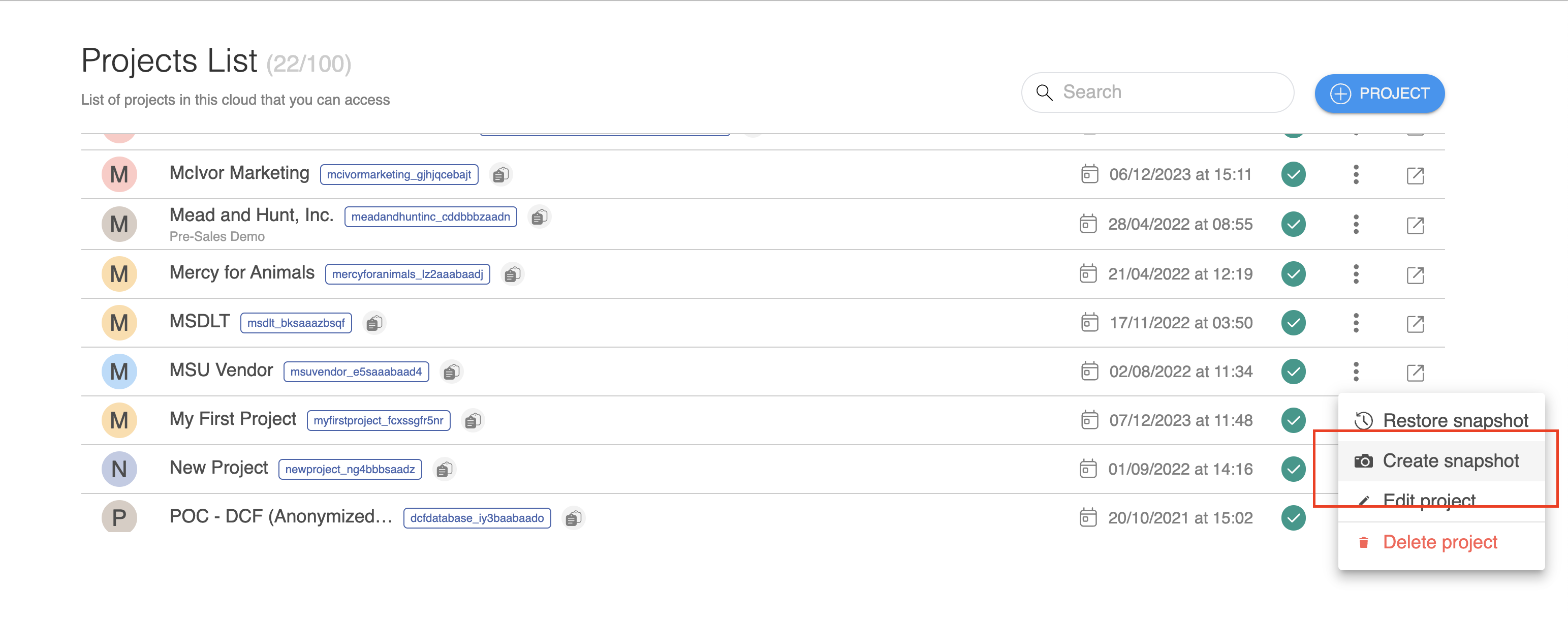
You can use the project snapshot you just made to create a new project, or restore the snapshot to overwrite an existing one. This is useful if you wish to have separate “Development” “QA-Test” and “Production” environments. You can use snapshots to promote code changes between these different environments. You can make your changes in the Dev project, snapshot it, then restore that snapshot to your QA environment for testing, then once testing is completed, restore the snapshot to production. (You may want to create a pre-push snapshot of Production so you quickly roll back the changes if necessary.)
On the project you wish to restore to, click “Restore snapshot”
1. Using the menu on the right side of the screen, “Restore Snapshot”.
.png)
2. Choose the snapshot you just created and press the play button.
.png)
3. This will create an exact replica of the Inzata project including all of the flows, the data model, the metrics, and the dashboards, and any authorized user accounts. Any modifications on this project will NOT go to production unless specifically pushed to it.


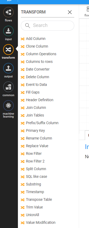
Transformation Widgets are used to make changes to your data during the loading process. There are multiple transformations available, each with its one set of actions. Multiple transformations can be chained together to accomplish more complex tasks. Branching and splitting your flow(s) into two or more sub-flows is also supported via the Row Conditional Filter transformation. Flows can then be re-consolidated using one of the Union transforms.


The PUSH process facilitates the smooth propagation of changes from the Quality Assurance (QA) environment to the Production (PROD) environment. This process involves selecting the project and objects to be propagated through a few-step procedure.
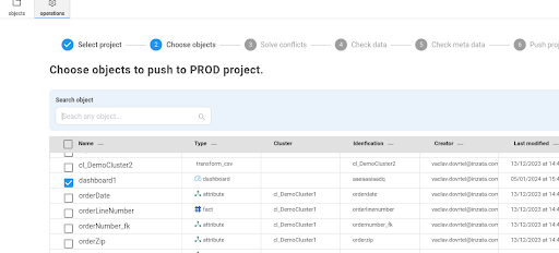
During the first and second steps of the PUSH process, users are required to choose the project and objects slated for propagation.
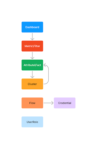
This marks a significant improvement from the previous version, as users are no longer obligated to be aware of all dependent objects. The system leverages the Object Dependency Model (ODM) graph, illustrated in Image 1, to identify and manage dependencies. This eliminates the need for users to manually specify all dependencies.
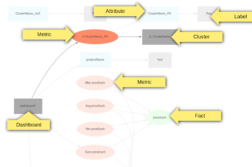
The system leverages the Object Dependency Model (ODM) graph, illustrated in Image 1, to identify and manage dependencies. This eliminates the need for users to manually specify all dependencies.
Dependency resolution relies on other dependencies, with the following exceptions:
UserRole: User role objects are not automatically marked as dependencies but can be selected in Step 2(choose object).
UserRole Users: Users within user role objects are not synchronized at all.
Cluster: Clusters are synchronized as a single object. This implies that all newly added or deleted columns will be synchronized, ensuring the cluster is identical after the synchronization process. Additionally, all dependent attributes and facts will be propagated to the target project. An attribute/fact can be deleted if the corresponding column was removed in the source project.
Cluster and Joins: Clusters are recursively synchronized with all joined clusters.
Flow: Currently, flows are not dependent on clusters or other objects and must be selected in Step 2(choose object).
Flow Credentials: Credentials are created in the target project but without content and must be set again in the target project.
WebDAV Files: All dependent files from WebDAV, including input files for inflow and images for dashboards, are ignored and must be synchronized manually.
Folder: All objects within a folder are marked as dependent for synchronization.
Market Packages: Currently, packages cannot be synchronized. This capability will be available at the beginning of February.
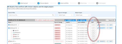
Currently, conflicts can only be resolved by rewriting the target object. This entails rewriting both the title and content. Or the second option that the input object selected in step 2 will be ignored. This step shows only objects with conflicts, not all that will be added. To show and check all changes in the target project go to next step.

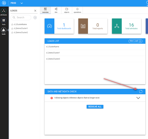
In this step, users can check for all possible objects and data issues in the target project after the push. If everything is ok it will show:

There may also be issues present in the target project before the push. Therefore, please carefully inspect the errors. If you are unsure, you can also review current issues in inModeler within the target project:
1. If objects has “userrole” as dependency the push fails now on “Cannot process object aaeaaaiaadq: its ACL definition points to role aafbbb1aade, which does not exist!”. Will be fixed at the end of January.
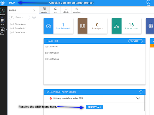
2. In step 5 (check meta data) there can be an issue “Following objects have broken ODM: These objects can be regenerated.”. This issue means that the user has to go to the target project to inModeler after the push and click on resolve md issue.
WARNING: Before the resolve, check that there is only one issue “Following objects have broken ODM”.
See image:
1. Ability to push dependent packages. For example, users connect “time dimension” from the market in QA and want to propagate these changes to PROD. This capability will be available at the beginning of February.
2. Ability to filter objects in step2(choose object) by type, time of modifications … TBD

3. The capability to display differences between objects during conflict resolution. TBD
4. Mark inflows as dependent objects for clusters. Currently, inflow is not dependent on the cluster, and if the cluster is synchronized, the flow is not propagated to the target. TBD
InFlow is Inzata’s data ingestion and application, used to create real-time data pipelines for transporting your data. Whether you want to load in a single CSV file or connect to a database, this is where you’ll start. See the inFlow Navigation to reference particular pieces of the application. InFlow can be used to create both inbound and outbound data flows, giving you maximum flexibility.
Creating a new Flow
Design tip: It is good practice to give each data source its own flow so you can schedule and execute each one individually using Triggers, however you can have multiple data sources within one flow.
To create a new flow click either of the buttons indicated with red arrows in the picture below. If there are existing data loads, you may see them listed on this page.
Upon creating a new flow, you will see the default new flow. While you can create flows in this view, we recommend changing to a list view by toggling the button on the bottom of the right side menu.

The new view functions similarly to the graph but is easier to see the order of inputs and transformations when you are first starting to work with Inzata. After toggling to a list, you should see the following screen:

Once your flow is created, you should name it using the options on the far right. Click the top icon “Flow” and enter in a name that will remind you what the data table or information you’re loading will be so you can easily locate it again to make changes if needed.

You should also save your flow periodically as you work to avoid losing any work. The save button is located at the top of the page. After saving, you’ll have to click “Edit” to make any other changes to your flow.

Loading Data from a Source
Now that you have a flow created, you will use the correct input type to start the process of bringing your data into the Inzata platform. The inputs are found on the left of the screen.

When you select that, a menu will appear on the right of the screen. (You may need to click on Settings to toggle the menu open.)

Click the blue UPLOAD button which will open your folders for you to select a file to upload. If “Mutiload” is selected, you can upload multiple files at once but you will still only be able to connect to a single CSV file in this Flow.
Once your file is uploaded, click on it in the list so that its name appears in the “File selected” box.

While not required, it is suggested to click the box next to “Use Safe Mode” which just strips out any residual formatting from the source file as it’s uploaded into Inzata.
Using the “Output data” to preview your data
After you have your file selected, you can click the arrow button at the far right of the input data (in this case CSV Reader) to run the flow up to that point.

Once you click that, it will show a preview of your data in the bottom right under the “Output Data” header. This will allow you to check that the data coming in is in the expected format and give a visual representation as you start to add transformations to your data.

Common Transformations and When to Use Them
Now that you have a file selected to upload, you can use Inzata’s built-in transformations to set up cleaning procedures to improve data quality as it’s brought into the Inzata system. The transformations are found on the left of the screen by clicking on the yellow icon with “transform” under it.
Several transformations are commonly used as best practices:
1. Date Converter: While in rare cases dates are standardized throughout a file, Inzata recommends using the Date Converter transformation to ensure all dates read in the same format.
2. Primary Key: If there is no primary key on the table, this transformation will create one. Simply enter the name of the primary key column (ex. “pkgen”) and Inzata will create a primary key column. If you would like the Primary Key to be derived from existing columns (ex. First Name, Last Name, Transaction Date), select the “Generate from columns” and enter in the names of the columns in the “Which Columns to Use” box. Make sure to separate the column names with a comma.
3. Prefix/Suffix Column: When loading in data from multiple tables, the chance of repeating column headers increases. To avoid confusion as you’re building your report, it is recommended to add an identifying prefix to each column header. To add the prefix to every column, leave the “Column Name” box blank. (Ex. If you’re loading in a table of Customers, add “cust_” in the Prefix box and select “use on header”.) This is typically the last transformation applied so no new columns are created without the Prefix added.
Loading the Data
Once your data source is connected to and the transformations are applied, you are ready to load your data into Inzata. Click on the Inzata Load icon to open the settings on the right. It will give you the option to name your cluster by typing a name in the box under “Cluster”. Creating a name here will make it easier in the inModeler application but is not necessary.
Use the Manual Table Input to copy and paste a table to load into Inzata. The settings are as follows:
Table Input: Type or paste a table in the box. Each value should be separated by a comma and each new row should start on a new line. The first row will be read in as headers and each subsequent row will be a new “entry” row in the table.
Table Editor: Clicking this button will give you a visual of the table being created and allow you to see how the table will load in. After clicking on the Table Editor button, the following popup will appear.

The options within the table editor are as follows:
1. To manually enter values, click on any cell. The col1, col2… will be the header columns. val1, etc will be the values in the table.
2. Click the plus (+) to add a column to the end or the minus (-) to remove the last column.
3. ‘Save’ will save the table and ‘Close’ will close the table editor.
4. Click the plus (+) to add a row to the end or the minus (-) to remove the last row.


The Inzata Report box operates off data that is already loaded into Inzata. This box is primarily used to generate exports of subsets of your inzata data for other platforms or to create flags or derived attributes from data already loaded. This can be done in the following ways:
AQL: Paste the AQL definition of the report you wish to use.
Select Grid: Select a pre-saved grid you wish to use.
.png)


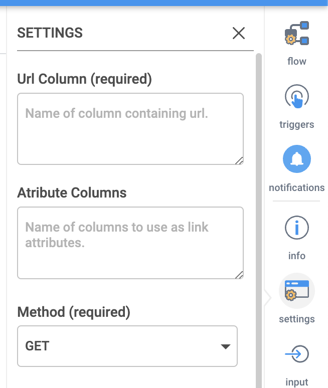
After dragging in the “Batch JSON Downloader” and selecting it, the settings should appear on the right. Shown on the right side of this screen, the options are as follows:
URL Column: The column from the data being fed to this input that contains the URLs of the data to be ingested
Attribute Columns: What columns in the data being fed to this input contain the data to formulate the batch of requests
Method: If the request will be GET or POST, POST will be used when you need to do something to have the data returned first. If you are not sure what to use then use GET
Post data: If you selected the POST method, here is where you would supply the data for that POST statement
Selector: Where the data is located or where the post statement should be given. This can be found by right clicking on the desired data on the webpage and selecting “Inspect Element”. Then in the console that opens hover over items in this console until your data is highlighted and then right click again and chose “Copy Selector”. Then enter that information here.


The HTML Table input task is a great tool for scraping individual tables from a webpage, but it can only pull data from a single table as opposed to the HTML Downloader. If only one table is needed from a webpage, then it is recommended to use this input task. While it is simpler to use than the HTML Downloader, this task still involves a level of technical understanding regarding webscraping in order to configure it.
Settings
URL: The URL where the data is located
Method: If the request will be GET or POST, POST will be used when you need to do something to have the data returned first. If you are not sure what to use then use GET
Post data (optional): If you selected the POST method, here is where you would supply the data for that POST statement
HTML Entity Selector: Where the data is located or where the post statement should be given. This can be found by right clicking on the desired data on the webpage and selecting “Inspect Element”. Then in the console that opens hover over items in this console until your data is highlighted and then right click again and chose “Copy Selector”. Then enter that information here.
Request custom headers(in JSON format) (optional): If additional authorization information is required as a header it can be included in here
What to use as header: What should be recognized as the headers of the data, is it the first column of data, should Inzata just use the column number, or did you want to define your own headers
Own definition of header (optional): If you define your own headers then you would enter that definition here
.png)


The CSV Local File input will read in a file in csv, tsv, and some forms of txt formats. There may be other file formats that work as well.
To use this input method, the user must select a file from their local file system by clicking the “upload” button and using the pop-up file browser. The selected file will then be present and auto-selected in the “select or upload file” list shown below. At this point, most use cases will not require any further setting configuration, but if this task is run and subsequently stop with an error, then the user should click the check box next to “Use Safe Mode”. This should resolve most errors, but if the error persists or another error appears, then further troubleshooting will be required.
.png)
Settings
Multiload (optional): If this is selected, you will be able to use regular expressions to match multiple files.
Select or upload file: First, click the blue UPLOAD button to find a file on your device to upload into Inzata. Click on the file you would like to load with this input selector. If there are files in the box you would like to delete, click on it to highlight it and click the red DELETE button.
File selected: When you select a file in the previous box, it will be displayed here so you can confirm it is the correct file.
Without header (optional): If this box is selected, the top row of the CSV will not be brought in to Inzata.
Separator (optional): If you would like to specify the separator used, you can enter it here. Generally Inzata will be able to recognize the separator and you can leave this blank.
Encoding: If you know the encoding of your csv file, you can select it here. The default and most common is UTF-8.
Use safe mode (optional): Check this box if you would like to upload with safe mode.


The CSV Local File input will upload a file in xlsx and xls formats.
To use this input method, the user must select a file from their local file system by clicking the “upload” button and using the pop-up file browser. The selected file will then be present and auto-selected in the “select or upload file” list shown below. At this point, most use cases will not require any further setting configuration, but if this task is run and subsequently stop with an error, then the user should click the check box next to “Use Safe Mode”. This should resolve most errors, but if the error persists or another error appears, then further troubleshooting will be required.
Settings
Select or upload file: First, click the blue UPLOAD button to find a file on your device to upload into Inzata. Click on the file you would like to load with this input selector. If there are files in the box you would like to delete, click on it to highlight it and click the red DELETE button.
File selected: When you select a file in the previous box, it will be displayed here so you can confirm it is the correct file.
Choose file encoding: If you know the encoding of your csv file, you can select it here. The default and most common is UTF-8.
Sheet name (optional): Leave blank to load in the first sheet of the excel file. To load in a sheet that is not the first, type the name in this box.
Range of file data: Select one of the four options. By default, it will select ‘Leave as is’.
• Leave as is: This will read in the entire sheet
• Start at row: Selecting this will show a box at the bottom of the list. Type in the row number you would like to start at. If you have blank columns or extra metadata at the top of your excel sheet, this will allow you to skip those rows and load in only the rows containing the data you need for analysis.
• Read n rows: Selecting this will show a box at the bottom of the list. Type in the number of rows you would like read in. This will start at the first row and only read in the number of rows you specify.
•
Range of data: Selecting this will show two new boxes at the bottom of the list. The first asks you to specify the Top left cell and the second asks to specify the Bottom right cell. This will read in every cell between the two specified cells.
Use safe mode (optional): Check this box if you would like to upload with safe mode.


Clicking the ‘input’ icon on the left side navigation will open a menu with the following options. To use one, simply click and drag it into the main canvas for your.


The JSON downloader will pull data in a JSON format. The settings are as follows:
URL: The URL where the data is located
Method: If the request will be GET or POST, POST will be used when you need to do something to have the data returned first. If you are not sure what to use then use GET
Post data (optional): If you selected the POST method, here is where you would supply the data for that POST statement
Selector (optional): Where the data is located or where the post statement should be given. This can be found by right clicking on the desired data on the webpage and selecting “Inspect Element”. Then in the console that opens hover over items in this console until your data is highlighted and then right click again and chose “Copy Selector”. Then enter that information here.
Custom headers(in JSON format) (optional): If additional authorization information is required as a header it can be included in here
.png)


The Excel or CSV SFTP loader will load data in that’s sent to an SFTP. The settings are as follows:
Hostname of SFTP server: the host name or IP address of the SFTP server
Port: The port of the SFTP server
Username for authentication on SFTP server: Username credentials for the SFTP server
Password for authentication on SFTP server: Password for the SFTP server
Path to file on SFTP server (optional): If you want to pull a specific file, put the path name here.
.png)


1. From the InFlow > Inputs menu, select the Snowflake connector and drag it into your workspace.
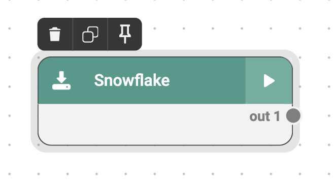
2. Then click on the connector in the workspace to open the Settings menu on the right.
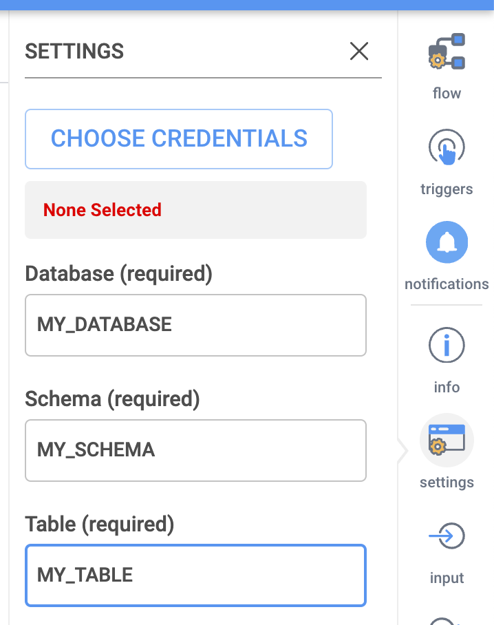
3. Click on CHOOSE CREDENTIALS to bring up the Credentials dialogue.
4. In the Dialogue that opens, click on Add if you wish to add a new Snowflake access credential. (If you wish to use an existing Snowflake credential, simply click on it and the dialogue will close.)

5. In the Credentials Manager – Edit window, you will need to collect a few pieces of information from your Snowflake account:
1. Organization ID
2. Account ID
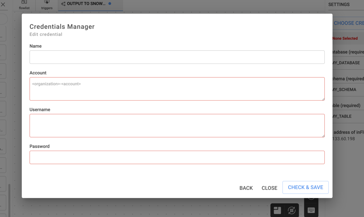
You can ask your Snowflake administrator for these, or if you have access to Snowsight, they can both be found under Admin > Accounts.
You will also need the username and password of a Snowflake account with access to the target data.

6. Give your Credential a descriptive name.
7. In the account field, enter your Organization and Account IDs in the following format, note the dash between the two values:
Organization_ID-Account_ID
Example:
nujlopff-rq61152
(Do not include the .snowflakecomputing.com domain extension.)
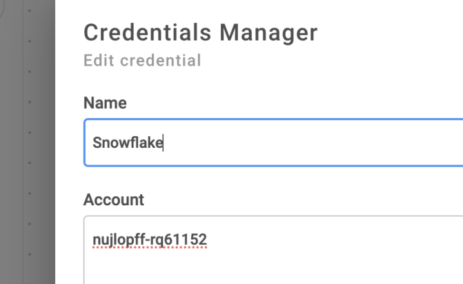
8. Enter your Snowflake Username and Password and click “Check and Save” to save and test the credential.
If you receive an error, verify the following:
– Are Org and Account ID valid? Are they formatted properly (No spaces, single hyphen “-” between?)
– Does Snowflake user have appropriate access to this account?
– Is password correct?
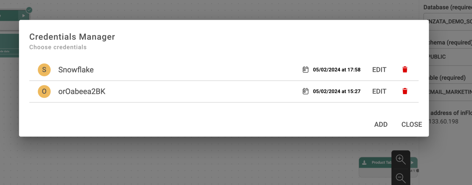
9. From the Manage Credentials dialogue, click to select the Snowflake Credential you just entered.
The window will close.
10. Now navigate back to the Settings on the Right menu. Enter the target Database, Schema and Table you want the connector to read data from, exactly as they appear in your Snowflake console.
If you wish to read data from more than one table, please configure a second connector in the workspace. You can clone the 1st connector and simply change the database parameter in the new one to speed this up.

11. You can now test your connector by loading sample data from Snowflake, then connect it to the rest of your Flow.
The PostgresSQL Database Connector will create a connection to a database to load data into Inzata. Shown on the right side of this screen, the settings are as follows:
Choose Credentials: Click this button to open the Creditials dialogue. Then click “Add” in the dialogue window that opens to add your first PostgresSQL login credential.
Choose Database: Choose the name of the database.
Choose Tables Use SSL (optional): Select this if you would like to secure the server to browser transaction. If the data being loaded contains secure or identifying information, this should be selected.
Use Custom Query: Type or paste your SQL Select statement into the box.
Number of rows to download (optional): Enter in the number of rows to load in. This will only load in the number of rows specified, even if the Query would normally return more rows of data.
.png)


This input task requires a greater technical understanding for how files are made available via hosting or API. It is used to download csv, tsv, or txt files that are publicly hosted or are made available through an API. It may work for other file formats as well, however those are not officially supported.
Settings
URL: The web URL of the file you wish to be downloading
Method: If the request will be GET or POST, POST will be used when you need to do something to have the data returned first. If you are not sure what to use then use GET
Choose file encoding: Is the file utf8 or ascii
Post data (optional): If you selected the POST method, here is where you would supply the data for that POST statement
Line Delimiter (optional): This is where you can specify the type of end of line character for the data
Value Delimiter (optional): This is the delimiter of the data, this should be a single character
Quote Character (optional): You can also specify a quote character if the data is enclosed within single quotes or something else
Escape Character (optional): How the data is escaped, most of the time this is also a quote character
Read only N lines (optional): If you only want to read the first X lines of data you can put a number here
Use safe mode (optional): If the data is quoted and escaped you should use this option for more checks while parsing the data


This Inflow input method is a highly flexible tool that involves some technical understanding of how webscraping works. It differs from the HTML Table Downloader in that it can scrape from more than one location at a time and requires an input table. This input table must contain a column of URLs and it may also contain one or more columns containing the link attributes associated with each given URL.
Settings
URL Column: The column from the data being fed to this input that contains the URLs of the data to be ingested
Attribute Columns: What columns in the data being fed to this input contain the data to formulate the batch of requests
Method: If the request will be GET or POST, POST will be used when you need to do something to have the data returned first. If you are not sure what to use then use GET
Post data: If you selected the POST method, here is where you would supply the data for that POST statement
Selector: Where the data is located or where the post statement should be given. This can be found by right clicking on the desired data on the webpage and selecting “Inspect Element”. Then in the console that opens hover over items in this console until your data is highlighted and then right click again and chose “Copy Selector”. Then enter that information here.
HTML entity type: If the data is contained in a table object or a block of text
What to use as header: What should be recognized as the headers of the data, is it the first column of data, should Inzata just use the column number, or did you want to define your own headers
Own definition of header (optional): If you define your own headers then you would enter that definition here


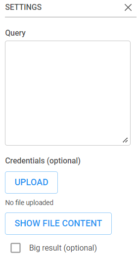
Pulling data from BigQuery is made straightforward with this connector. To learn more about how to get a JWT for access credentials if needed, please refer to Google’s documentation here. Settings Query: This should be a query that Selects a table or a view from withing Google Big Query. Please note Google Big Query will refuse to export tables if they have a lot of “Order” or “Group” statements or potentially if the table is poorly built in Google Big Query. Credentials (optional): If there are access restrictions on the Google Big Query data then you need to provide the json access credentials for a service account with access to that data here. Show File Content: When a user wants to review the uploaded credentials json file they can use this button. It will load a pop-up window within the browser that displays the file contents. Big Result (optional): This option is for users using legacy sql in their query to set the AllowLargeResults flag.
You should now have downloaded a JSON file with credentials for your service account. It should look similar to the following:
{
  "type": "service_account",
  "project_id": "*****",
  "private_key_id": "*****",
  "private_key": "*****",
  "client_email": "*****",
  "client_id": "*****",
  "auth_uri": "https://accounts.google.com/o/oauth2/auth",
  "token_uri": "https://oauth2.googleapis.com/token",
  "auth_provider_x509_cert_url": "https://www.googleapis.com/oauth2/v1/certs",
  "client_x509_cert_url": "*****",
  "universe_domain": "googleapis.com"
}
In InFlow, enter the following information in the Connector's Settings tab
Selected
Dataset (required)
Enter the name of an existing dataset from your Google Big Query project
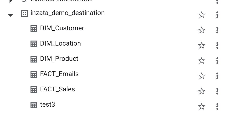
Table (creates new if does not exist) (required)


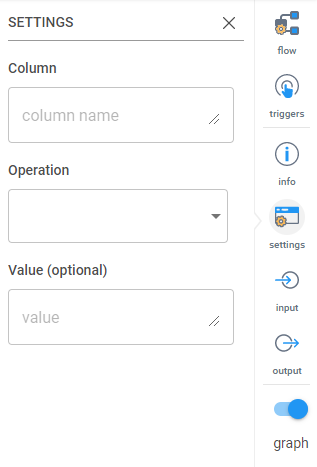
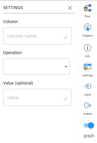
This transformation modifies values in columns. The settings are:
Column: The name of the column that has the values you want to modify.
Operation:
• Plus (+): Add a value to the values in the column
• Subtraction (-): Subtract a value to the values in the column
• Division (/): Divide the values in the column by a number
• Multiplication (*): Multiply the values in the column by a number
• Modulo (%): Modify the values by a modulo.
• Exponentiation (**): Raise all the values to a power.
• Not (for boolean): Modify boolean values
• Prepend (for string): Put a value at the front of a string
• Append (for string): Put a value at the end of a string
Value (optional): The value you want to use to modify the entries.


Acts like a SQL Union. All and joins two datasets together by appending the values for columns that exist in both data sets and adding nulls for columns that only exist in one data set.
There are no settings for this transformation.


This transformation will transpose a table. There are no configurable settings.


The AI widget within Inzata requires a properly configured AI flow to have been previously set up and run within InFlow for information on how to do this please see the inFlow help document. The AI widget has two options from within the widget menu. They are:
1. AI
2. Format
AI Menu
In this menu the user can customize the AI widget.
The label option allows the user to set the title of the AI widget. The inflow component dropdown allows the user to select what previously designed AI algorithm they want to use and the column, value option is where the user sets what columns from the algorithm should be represented with what values for the prediction.
Format Menu
The format menu is how the appearance of an AI widget is changed.


Bringing this transformation in lets you add a column at the end of your table with a prefilled value. The settings are as follows:
Name: Name of the column
Value: Value to fill the column with.


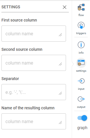
This transformation will join two columns together into a single column. Entries in each column will be combined by a given string. A new column will be created as a result of this transformation. The settings are:
First source column: Type in the header of the column you want as the first (or left) part of the combined column. Example: LastName
Second source column: Type in the header of the column you want as the second (or right) part of the combined column. Example: FirstName
Separator: Type in the character you want to separate the two combined entries. Example: ,
Name of the resulting column: Type in the name of the new combined column. Example: Full Name


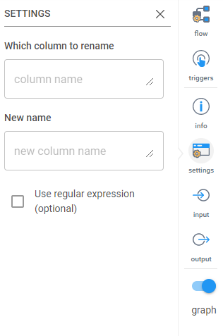
Use this to rename a column. The settings are:
Which column to rename: Type the name or a regular expression to find the column you want to rename.
New name: Type in the new name for the column.
Use regular expression (optional): Select this if you want to use regular expression to identify the column.


Inzata’s Fully Automated data quality solution
Ensuring the accuracy, completeness, and reliability of data is most important for organizations. The integration of diverse data sources into a centralized data warehouse poses challenges that, if not addressed, can lead to compromised data quality. This article delves into the robust Data Quality Assurance Program employed by the Inzata Platform and the innovative IZ Data Quality System, both of which play pivotal roles in maintaining data integrity throughout the entire data lifecycle.
Inzata Platform’s Data Quality Assurance Program
The Inzata Platform’s data quality assurance program is designed to address challenges encountered during the entry of information into the data warehouse. Several key strategies contribute to enhancing data quality:
• Quality improvement in data is achieved by enhancing knowledge about source system data and increasing access to source data owners/analysts. The effectiveness is further boosted by well-documented data attributes, entities, and business rules governing them, resulting in superior modeling, and reporting from the data warehouse. Understanding how data is translated and filtered from source to target is crucial, necessitating mandatory access to Source System Developers when documentation is insufficient. In cases where developers lack comprehensive source definitions due to personnel changes, an empirical “data discovery” process may be required to unveil source business rules and relationships.
Integrated planning between the source and target systems, with agreement on tasks and schedules, enhances efficiency and reduces resource-wasting surprises. Effective communication plans during projects, providing timely updates on the current status of and addressing issues, are integral to this collaborative workflow approach.
• Collaborative planning between source and target systems minimizes surprises and increases efficiency.
• A well-communicated data quality control process provides current status updates and addresses issues promptly.
1. Conducting Data Quality Design Reviews with all relevant groups present is a proactive measure to prevent defects in raw data, translation, and reporting. In cases where design reviews are omitted due to tight schedules, a compensatory allocation of at least double the time is recommended for defect corrections.
2. Implementing Source Data Input/Entry Control is crucial for data quality improvement. Anomalies arise when human users/operators or automated processes deviate from defined attribute domains and business rules during data entry. This includes issues like free-form text entry, redefinition of data types, referential integrity violations, and non-standard uses of data entry functions. Screening for such anomalies and enforcing proper entry at the source creation significantly enhances data quality, positively impacting multiple downstream systems that rely on the data.
Expanding the Data Quality Assurance Horizon with Inzata Platform’s Program and IZ Data Quality Control Process
Beyond procedural activities, the Inzata Platform’s Quality Assurance Program considers user and operational processes that may impact data quality. Meanwhile, the IZ Data Quality System provides a comprehensive solution with its Data Audit functions, Data Quality Statistics, and ETL Data Quality Monitoring.
Common Challenges and Solutions:
1. Operating Procedures:
• Solution: The business users responsible for the source systems and the end users’ processes need to be engaged in identifying standard procedures that create bad data. They should understand the root causes and they should be chartered with process improvement of those data creation processes.
2. Mis-Interpretation of Data:
• Solution: Developers in the data warehouse must possess a comprehensive understanding of the data to ensure accurate modeling, translation, and reporting. In cases of incomplete documentation, conducting design reviews for both the data model and translation business rules becomes crucial. It is essential to document business rules influencing data transformation, subject them to an approval process, and, in instances of personnel changes, undertake an empirical “data discovery” process to unveil business rules and relationships.
3. Incomplete Data:
• Solution: To address incomplete data, a thorough review of each data source is imperative. Specific causes of incompleteness should be identified and targeted with quality checks. This includes implementing scripts to identify transmission errors and missing data, as well as generating logs during load procedures to flag data not loaded due to quality issues. Routine review and resolution of these logs, coupled with planned root cause analysis, are essential to spot and correct repetitive errors at their source. A designated data quality steward should regularly review the logs for effective quality control.
The IZ Data Quality System employs a workflow processing approach with comprehensive reporting systems utilizing the following IZ Platform modules:
IZ Data Quality System: A Closer Look
The IZ Data Quality System employs a workflow processing approach with comprehensive reporting systems utilizing the following IZ Platform modules:
1. InFlow:
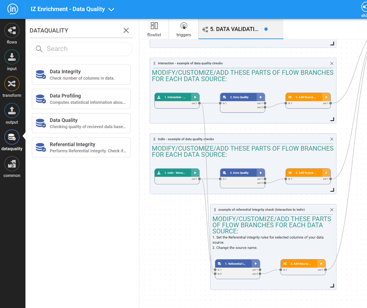
• InFlow Special Data Quality Functions – InFlow has pre-built special Data quality functions allowing easy and fast configuration of various functions (see the list at the end of this document).
• Data Integrity – checks the number of columns in each data cluster.
• Data Profiling – calculates basic statistical patterns and characteristics for a given data cluster.
• Data Quality – checks data quality features of received data based on a pre-configured set of selected audit functions (the list at the end of this document)
• Referential Integrity – checks if values from the first data set are present in the second data set.
These functions are available in a special IF menu:
• DQ Flows monitors data anomalies in provided data and verifies the correctness of source data. The DQ Flow system also executes automatic go/no go decisions in terms of the ETL process’s continuation based on the results of data auditing procedures.
• On-the-fly communication with an automated messaging system created in the IZ Project performs data verification after transformation into target PDLs and lookup files used by the IZ project
• Loading DQ audit results into Inzata – results of Data profiling and DQ analysis are loaded into IZ DW
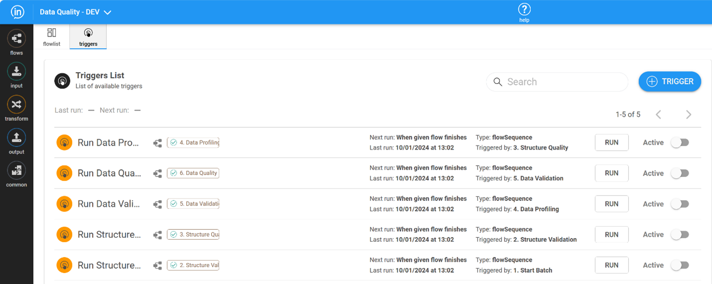
• Automation – the orchestration of all the processes is supported by the Triggers functionality of the InFlow module. The system is designed to make smart go/no-go decisions in a fully automated way.
2. InModeler
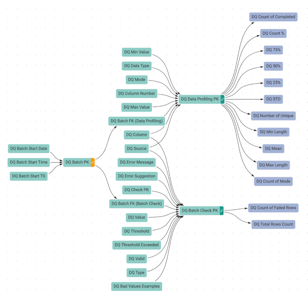
• The dimensional data structure is designed to accommodate results from the ETL process of data quality analysis in the InFlow module.
3. InBoard
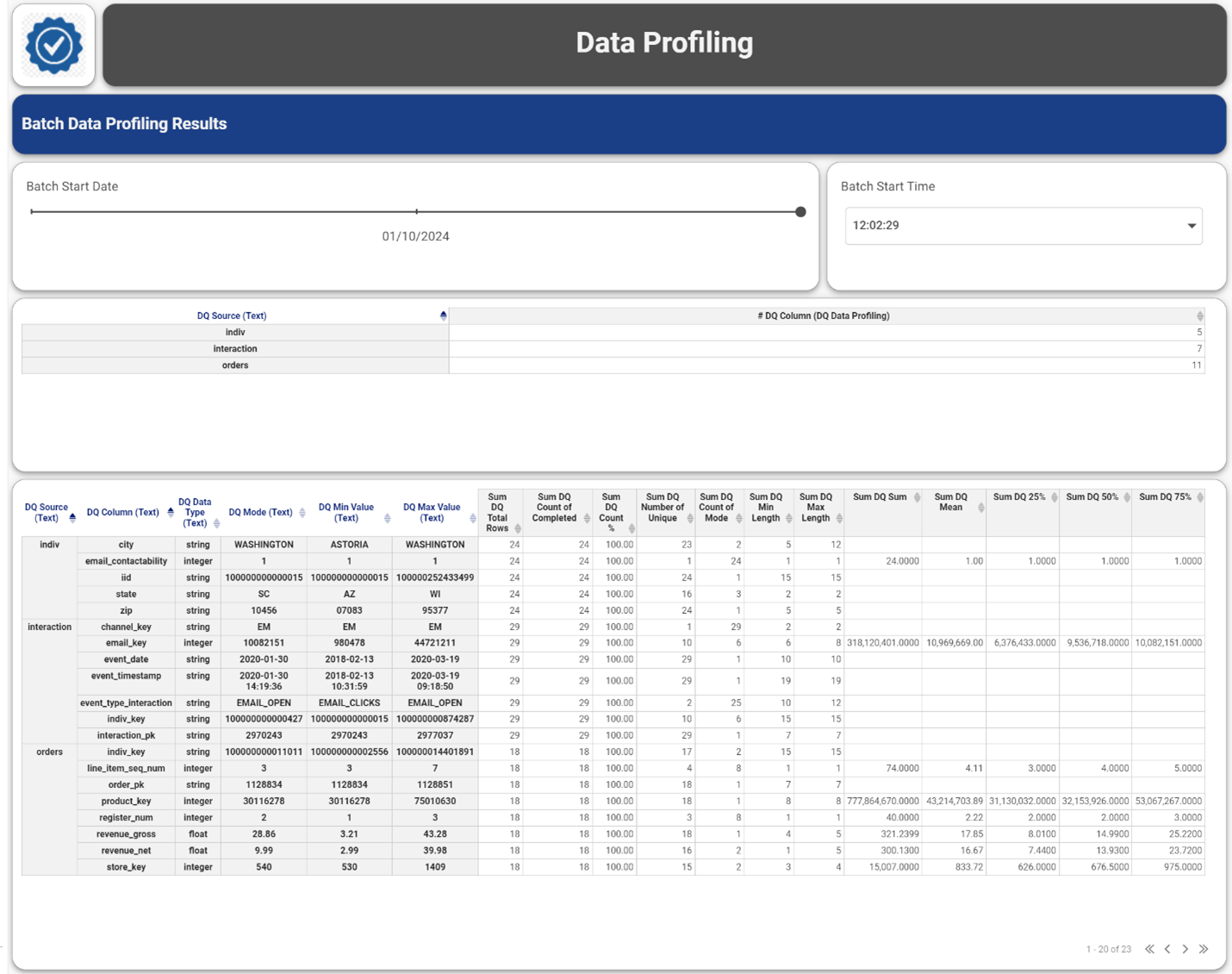
• This module supports flexible reporting over the data profiling and DQ audit results, see examples in the next section below.

The IZ ETL process includes the following DQ flow types:
1. Start Batch Flow – adding a new batch record to the Batch cluster. It is run typically when a new data file is to be processed from the data quality point of view.
2. Structure Validation – during this phase the system verifies the presence of all the columns in a given data source file.
3. Structure DQ Manager – executes the decision whether the data file structure is correct, in such a case system continues with the next phase, otherwise, processing stops, and automated generated messages are sent out to predefined recipients.
4. Data Profiling – basic statistical profiles are generated over all the columns and the results are loaded into DQ DW

5. Data Validation – all the predefined audit checks are executed over all the columns of a given data source. The results are loaded into DQ DW. All possible DQ check types are listed in the Appendix section.

6. Data DQ Manager – executes the decision whether the data quality of all the columns is correct, in such a case system continues with the next phase, otherwise processing stops, and automated generated messages are sent out to predefined recipients. Some critical data checks may end with an error, however, if the number of failed rows stays within a given, predefined threshold, the process is still allowed to continue in the next phase.

7. Reporting – during the processing phase, the results of structure validation, data profiling, and data quality auditing were loaded DQ DW (step 2. And 5.) The results are available for comprehensive reporting and analysis. Examples of dashboards can be seen below:

The integration of the Inzata Platform’s Data Quality Assurance Program and the IZ Data Quality System creates a comprehensive framework for maintaining high-quality data throughout its lifecycle. By addressing challenges at multiple stages and employing innovative tools, organizations can ensure the reliability and accuracy of their data, empowering informed decision-making and maximizing the value derived from their data assets.
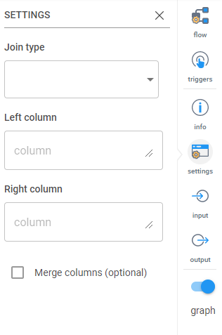
This transformation will perform a join similar to a SQL join of two tables. Currently you can only join on a single column. The settings are:
Join types:
• Inner Join: This will take the column to match and the resulting table will only have rows whose values appear in BOTH tables.
• Outer Join: This will take the column to match and will combine the rows of both tables with values matching on the identified columns. If any values do not match, it will enter null values in the other table but still bring in the row.
• Left Join: This will take the column to match and will only bring in rows on the right table that match the value in the left table. Any row without a match in the right table will still be brought in but with null values in the right table columns.
• Right Join: This will take the column to match and will only bring in rows on the left table that match the value in the right table. Any row without a match in the left table will still be brought in but with null values in the left table columns.
Left Column: Identify by the column header which column you want to be the ‘left’ column.
Right Column: Identify by the column header which column you want to be the ‘right’ column.
Merge column (optional): Select this if you want to merge the left and right columns.


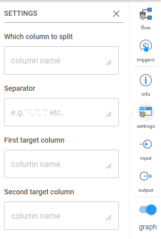
This transformation will split a single column into two on an identified separator. The settings are:
Which column to split: Type the name of the column here. Case sensitive.
Separator: What character will identify the split. Common ones are ‘-‘, ‘,’ or ‘.’.
First target column: Name the first of the new columns
Second target column: Name of the second of the new columns


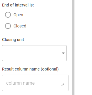
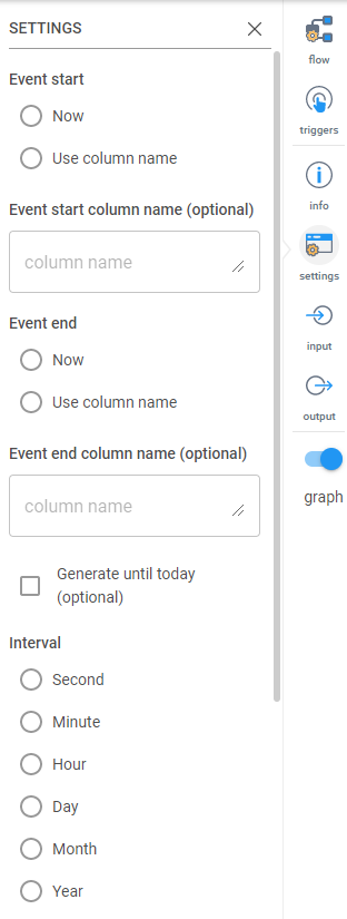
Convert a single event into data per time unit. Example: From an entry containing only year, make entries for each month in year. The settings are as follows:
Event start: This allows you to use today’s date or the column specified in the section below as the start date for the events replication
Event start column name (optional): If you chose ‘Use column name’ for the event start, you must specify the column name here.
Event end: This allows you to use today’s date or the column specified in the section below as the end date for the events replication
Event end column name (optional): If you chose ‘Use column name’ for the event end, you must specify the column name here.
Generate until today (optional): This will tell Inzata to only generate data until today
Interval: Select the time interval (Second, Minute, Hour, Day, Month, Year) that you would like to create.
End of interval is: An open interval means that records should be continued to be created where as a closed interval means that all intervals should be closed out by some other column of data.
Closing Unit: This designates the unit of measure that should be closing out the replication, should it close out on a given year, month, day, etc
Result column name (optional): A name for the resulting replicated column


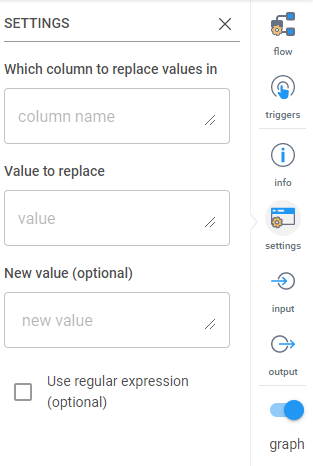
Use this to replace a specified value in a column. The settings are:
Which column to replace values in: Type in the name of the column that contains the values you want to replace.
Value to replace: Specify the value you want to replace. You can use regular expressions.
New value (optional): Specify the new value you want to take the place of the current value. If nothing is entered, it just deletes the value and leaves a blank.
Use regular expression (optional): Select this if you want to use regular expressions to identify the value to replace. Supports positive lookbehind.


This transformation removes the blank spaces from around values in a column. The settings are:
Which column to trim values in: Enter the column name you want to remove the spaces from.
Which side to trim:
• Left: Before the values
• Right: After the values
• Both: Before and after the values.


Bringing this transformation in lets you clone a column in your table.
Clones data from given column into a new one. Column name can be either chosen from available columns, or entered as regular expression (regex), allowing multiple columns to be cloned at once based on wildcards and pattern matches. (I.e. “all columns whose names contain the string “sales”.)


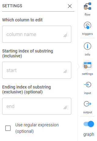
Substring applied on the values in the column or columns. Indexing from one. The settings are:
Which column to edit:
Starting index of substring (inclusive): This is 0 indexed meaning the first character in your string is character 0.
Ending index of substring (exclusive) (optional): This is also 0 indexed, meaning if you wanted to remove everything after the 5th character you would enter “6” here as the 6th character onward will be removed.
Use regular expression (optional): If this box is checked you can use regex to define the starting and ending indexes of the columns identified.


Perform operations on columns. The settings are:
Operations to perform:


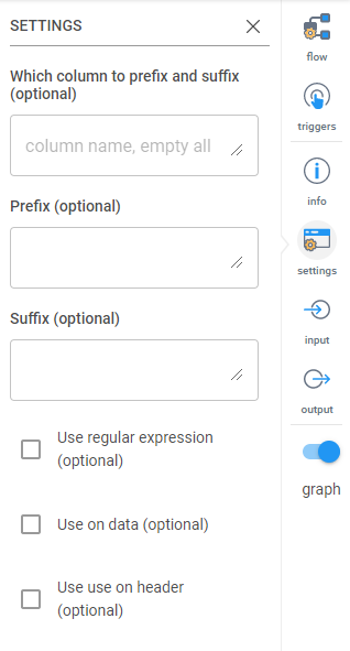
This will add a prefix or suffix to the headers or the data in a column. The settings are:
Which column to prefix and suffix (optional): Type the column name(s) here. Separate columns by a comma (,). If this is left blank, the default is all columns.
Prefix (optional): If adding a prefix, type it here. Can be left blank.
Suffix (optional): If adding a suffix, type it here. Can be left blank.
Use regular expression (optional): Select this if you’d like to use regular expressions to identify the column names.
Use on data (optional): Select this if the prefix/suffix is being added to the data in the identified column(s).
Use on header (optional): Select this if the prefix/suffix is being added to the column headers.


This will perform a SQL like SELECT with given WHEN – THEN case. Example: “WHEN Quantity Ordered > 40 THEN ‘a’ WHEN Quantity Ordered > 30 THEN ‘b’ ELSE ‘c'”
The settings are:
Column to store result: Name of the column the data will be stored in
SQL Case (optional): When your WHEN….THEN…. statement in here. Make sure column names are spelled correctly (case sensitive) and the condition you want entered is in single quotes.


This is similar to the Row Filter transformation, but it allows you to perform multiple row filters on multiple columns combined with AND or OR conditions.
The settings by default look like below. Click the arrow on the right to expand down.
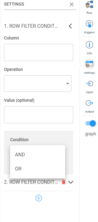
After clicking the arrow, you’ll see the following options.
The basic settings for the first row filter are the same as the Row Filter transformation:
Column: The name of the column that contains the values you want to filter on.
Operation: Equal (==), not equal (!==), greater than (>), less than (<), less than or equal to (<=), greater than or equal to (>=), starts
With and endsWith.
Value (optional): Type in the value you want to perform with the operation (example, typing in a 100 while the == is selected for Operation will look for values that are exactly equal to 100). If left blank, ___________
After filling in the above fields, click the plus (+) sign to add a new row filter condition.
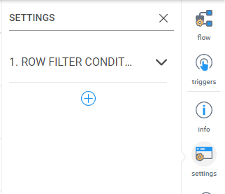
First it will prompt you to select if you want the second filter as an AND (both must be correct) or OR (meet one or both conditions).

Then a second row filter condition will appear with the same options as the first row filter.


.png)
Generate a primary key for the table. This can be used to combine multiple column values together to create the primary key. The settings are:
New PK column name (optional): If you’d like to name the column, type it here.
Generate from columns (optional): When selected, this will prompt you to enter the column names to be used to generate the primary key. (Shown below)
Which columns to use (optional): This will only show if the “Generate from columns” box is checked. List the column header names in the order you want them combined. Use a comma to separate the names.


Use this transformation to delete a column from the data being loaded. The settings are:
Which columns to delete: Enter in the name(s) of the column(s) you would like to delete. Multiple columns may be identified in one Delete Column transformation.
Use regular expression (optional): Use regular expressions to identify the column names.


Use this transformation to select the columns you want to keep in your dataset. If a column name is not mentioned here, they will be deleted and not loaded in. If a column is named that doesn’t exist in the original data set you’re loading in, it will be created with null values.
You can also use this to rearrange your data set. The order column names are mentioned will be the order of the data set coming out of the transformation.
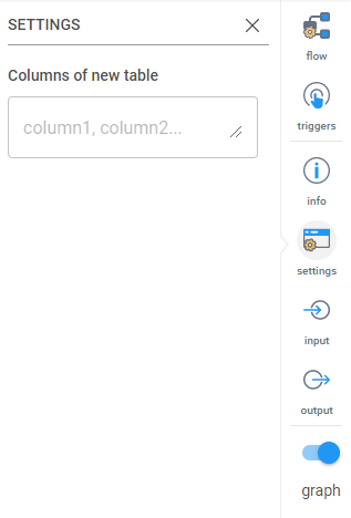
The settings are:
Columns of new table: Enter the names of the column headers you want to keep. Separate names by comma (,). List names in the order you want the output data set in.


Convert date and times to a uniform format. The settings are:
Which column to format: Enter the name of the column that contains the date.
Input date format (optional): Enter the format of the dates that you’d like to change. If left blank, Inzata will auto detect the format.
Choose output format: Options are:
• Date format
• Time format
• Date-Time format
• Custom output format: If this is selected, you must enter in the custom format you want in the next box.
For the full list of how to enter in dates, see this link (https://momentjs.com/docs/#/displaying/format/).


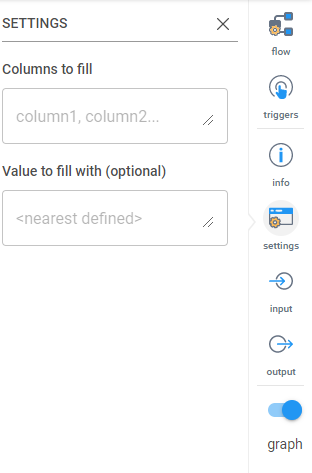
Fill null values in the specified column. The settings are as follows:
Columns to fill: Specify the names of the column you want to check for blank/null values.
Value to fill with (optional): Specify the value you want to fill in the blank entries. If nothing is specified, the preceding value will be used to fill in the blank.


Splits multiple values in one column to rows copying the rest of row data. The settings are:
Which column contains more values: Enter the name of the columns you want to split into rows.
Values separator (optional): Indicate the character that is separating the values. This is optional.


Filters your data based on a value in a column. Only rows that meet the condition will be returned. The settings are:
Column: The name of the column that contains the values you want to filter on.
Operation: Equal (==), not equal (!==), greater than (>), less than (<), less than or equal to (<=), greater than or equal to (>=), startsWith and endsWith.
Value (optional): Type in the value you want to perform with the operation (example, typing in a 100 while the == is selected for Operation will look for values that are exactly equal to 100). If left blank, ___________


This transformation will add a column that inserts a timestamp when data is loaded in or changed. The settings are:
Timestamp column name: Name of the new column that will contain the timestamp.


An enrichment, also referred to as a package, is a pre-prepared cluster that is able to be connected into your project. Inzata automatically explores all the attributes of a project’s data model and compares them with the contents of the Inzata Object Marketplace. Only compatible attributes are listed to be selected for integration. The recommended-listed results must be approved by a user before they are connected into a project’s data model. The guessing algorithm uses a comparison of the look up elements’ format with the elements’ formats of the available dimensions in the marketplace. The list of compatible dimensions and packages proposed for integration must be treated as recommended ones.
There are two types of packages: a dimension enrichment and a cluster with any facts enrichment.
• Dimension enrichment
It is the most commonly used type. It is a dimension which consists of attributes with logical relations. Here is an example of the Geographical dimension:
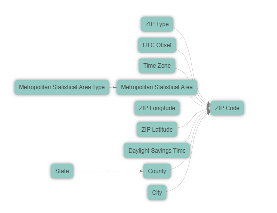
Figure 18: An enrichment example – geospatial enrichment
The picture shows that the “ZIP Code“ attribute is a primary key of this dimension package. This attribute will be used as a dimension join attribute to integrate this whole dimension into your cluster containing the zip code attributes (the column in the source file).
Load your base cluster first and then join the Geospatial dimensional package into this cluster. The cluster join attribute (ZIP Code) is offered by Inzata’s data analysis package matching.
Figures 18, 19, and 21 together are an example of the connection of a Geographical dimensional package into the Member cluster using the “Member Zip“ join attribute.
Figure 19 is the part of an LDM — the Member cluster — before a connection:

Figure 19: Identify the “To Attribute” that the geospatial enrichment is connecting to
Click on the Overview tab and then press the “Load“ button in the Available Packages window to display all available packages. 4. Select the object and drop it into the To Object section of Hierarchy the panel in the same way.

Figure 20: The geospatial enrichment displayed on the Overview tab of InModeler
The Inzata marketplace only shows the packages that can be mapped to an attribute in integrated clusters. Keep in mind that a join cluster attribute has to be defined with a label. When setting load parameters up, the join cluster attribute has to be set as an Attribute-String. Otherwise a package will not be displayed (offered) in Available Packages for possible integration.
A dimension package has the “Mapped To“ property as a list of offered join attributes from all the integrated clusters. Select one attribute from this list where a dimension will be joined to.
Click on the “Explore“ button to display all the information about such a package in the Inzata marketplace panel of the Overview tab.
Click on the “Connect“ button to connect the enrichment to your cluster or data model. Confirm the next button to start the join process up. The package is then immediately integrated into your LDM and subsequently into the physical layer.
As soon as the join process and the Data and metadata check is finished (the twisting circle in the upper right hand corner is off) , you can click the LDM tab to display the result of your join process.
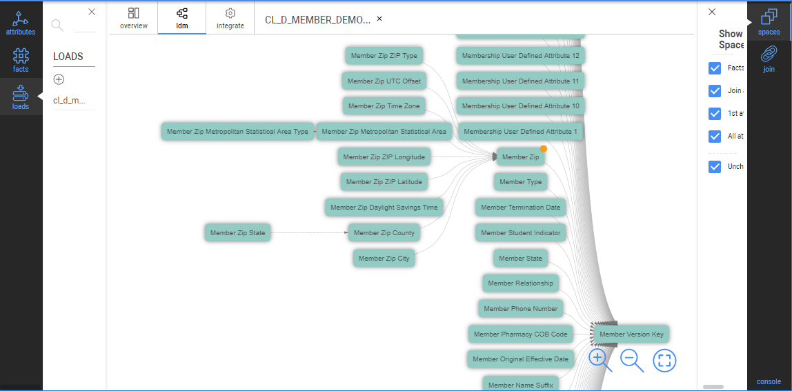
Figure 21: The LDM after enrichment connected
After a package join is done, the join attribute has the same name as the join cluster attribute. All the attributes in the dimensional hierarchy will be renamed using a role name.
In our example, the “ZIP Code“ attribute from the package is substituted by the “Member Zip“ attribute from the Member cluster. All the dimensional attributes are renamed with the “Member Zip“ prefix.
• Cluster with any facts enrichment
These are clusters with facts which are not usually used for denormalization into any other cluster.
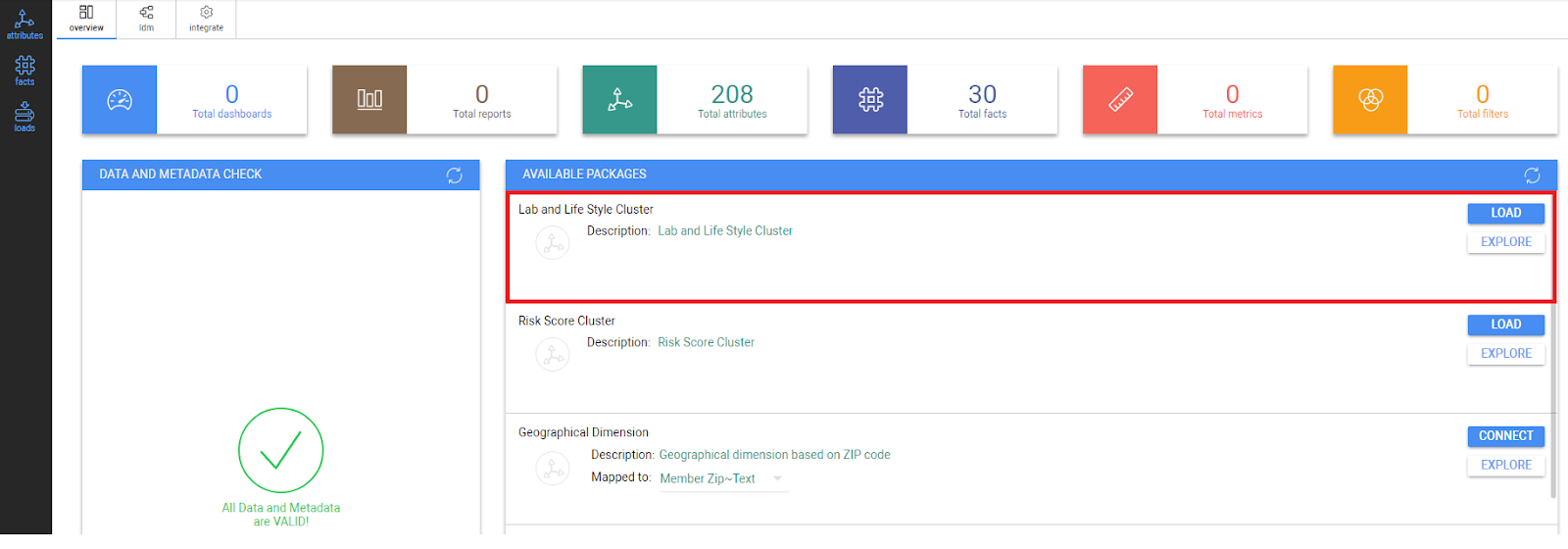
Figure 22: Lab and Lifestyle Cluster displayed in the Overview Tab
There are the following steps for a join of such two clusters:
1. Press the “Load“ button.
2. Confirm this action with the next button to start the join process
3. After the join process and the Data and metadata check is performed, you can look at the LDM tab to control the result of your integration process.
4. Such a cluster may stay as a stand alone one, or if a user wants to integrate it into existing enterprise LDM, such cluster can be joined via a common attribute using the join process described above(“Creating new join”).
For greater detail on joining two clusters, please refer to the “Join of Loads” article.


.png)
Figure 5: Loads panel and part of the overview tab
Left Toolbars
Attributes
As shown in figure 6, in the left toolbar, click on the attributes tab to open the Attributes panel. Click on the button or the attribute name to show all the labels of an attribute.
Click on the button next to the label name to show its values.
.png)
Facts Toolbar
In the left menu, click on facts to open the Facts panel to show all created facts. Moving cursor over fact name and clicking on icon the new tab with fact properties is created.
Creating a folder to organize your Facts and Attributes
All objects in your Inzata project can be grouped into folders. The folder can contain different types of objects, such as attributes, metrics etc. The folder is usually used to associate all objects of one cluster or to logically organize objects such as “basic metrics”,“percentage metrics”, “date attributes” etc.A folder can be created in the list of any object, e.g. Attribute list, by clicking on the Add folder button at the bottom of the Attribute or Fact panels.
.png)
From there, you can give the new folder a. There is also the option to save the new folder as a Global Folder. Saving it as a Global Folder will make the new folder appear in other modules of Inzata (InBoard, InViewer). If you do not save it as a Global Folder, the folder will only appear in the panel in InModeler.
Click the Create button to finalize the and save the new folder, which is then added to the top of the Attribute and Fact panels as shown in figure 8.
.png)
Figure 8: Create New Folder dialogue
To add items to folders, drag any object (attribute or fact) into the folder and drop it on the folder name. The added object moves from the main object list and will now appear in the folder.
Double click on the folder name for showing the folder properties as seen in figure 9.
.png)
Figure 1 (repeated): The InModeler Overview page.
In figure 1, the colored boxes displayed horizontally along near the top of the webpage show the count for each aspect of a given Inzata project. Below that count bar, there are three windows:
• Loads List
A list of all loads
• Data and Metadata Check
The physical and logical models are automatically checked and the results are shown in this window. This can be used to debug errors that may appear as a data model is created.
• Available Packages
This is described in the “Connecting a package into a cluster” section below.
Logical Data Model (ldm tab)
.png)
Figure 10: Logical Data Model tab
This tab displays the logical data model of a project. The model (LDM) shows the relationships among attributes and facts as they are defined in the project’s metadata. The lower level (right side) of a cluster is represented by facts while the second level (middle) is represented by the primary keys of the clusters. The other attributes displayed on the highest level (left side) are related to the primary key that they are connected to by lines.
The blue boxes denote facts and the green ones are attributes, the dark green-accented boxes are the primary keys in their respective clusters. Setting the cursor over the graphic symbol and then clicking will highlight an object’s relations. A user can click on a relation to keep it highlighted in a model (suitable when scrolling in larger LDM to follow the link between objects). Your model can be zoomed in or zoomed out using a mouse scroll bar or buttons in the tab at the bottom of the screen.
The right side of your screen contains the Properties Type toolbar:
.png)
Spaces
The Spaces menu defines the levels of model display. It can be used to filter objects by type.
Join
The Join menu is used to define join attributes between 2 clusters, when integrating originally separated clusters (source files) into one unified, enterprise LDM. This action is described in the “Join of loads” section below.
Hierarchy
This tool allows you to place two attributes into a hierarchy (Parent-Child) relationship. Simply drag the parent attribute into the parent location, and the child attribute beneath it. You can create multi-level hierarchies as well by using the child attribute of one hierarchy as the parent of another. These relationships will be displayed as a horizontal row in the data model.
Conversion
This allows you switch an individual object’s classification from Attribute to Fact, or from Fact to Attribute.
Relation
This tool allows you to check whether a relationship exists between two objects, for example before creating a manual join.
Objects (objects tab)
.png)
The objects page in figure 11 displays all the metrics, facts, and attributes in a given project, along with different characteristics of those objects. The different columns in order of left to right are:
Checklist
Checklist for selecting objects. These selected objects can then be shared so that different users can access them by using the button in the panel on the right, under the word “selected”.
Name
The name assigned to a given object to help the users identify the object.
Ident
The ID that is given either by the system or the user to an object that distinguishes it from the other objects.
Type
The type of an object describes its purpose or usage within the project, IE attribute, fact, metric, dashboard.
Creator
This is the user’s name who created the object initially.
Clusters
A group of objects associated with a file source. If two or more clusters are integrated by joining, then this column will list all the clusters that an object is related to. It is possible that all the clusters are integrated into one, cohesive data model, leading to every attribute, fact, and metrics being able to relate to each other.
Modified
This will list the last date and time that an object was modified.
Acl
The Access Control List shows the different users that have access to an object.
Description
The system or user assigned description of a given object. There does not necessarily need to be a description for every object. One such case would be when the name of the object clearly, accurately, and sufficiently describes the object

Figure 3: New Data Load Cluster Profiling window
Primary Key Selection
The primary key column is a very important column in a Dataset. It should contain a unique value each individual row with a format that is consistent across every row. An example would be a simple integer serial or “count” key: (1,2,3,4,5,…n). If none of the values here seem suitable as a primary key, you may wish to go back to Inflow and use the Primary Key transform to add a new Primary Key column to your dataset, then run the InFlow again to update the data load.
Below the Primary Key, you can set the following options for the each column in the data load.
Inzata reads in the column headers and records them in the Column Name field. These cannot be modified. Inzata’s AI inspects the data contents columns and detects most likely column type for each column (attribute, fact, date, or ident). A user can change or update them if they wish.
Label – Inzata gives you the ability to create a custom label or alias for each column. The orginal column name is recorded, and the new label will be how that column will be identified inside of Inzata. A great use for labels is to give columns a friendlier name that will be more easily recognizable to users. The value defaults to the original Column Name. Double quotes or apostrophes are not available to be used in object names. These column labels can contain spaces.
Tips for using labels:
When a column is the same within different source files, e.g. “Customer” in both the “Order” and “Payment” clusters, you can use the same name in all source files. Then the same attribute will be generated in a project, and it will be part of several clusters.
On the other hand, when a column is in multiple source files, but will be used for the joining of 2 clusters (using the join function under the LDM tab in the top left), use different names in the associated source files.
id – the identifier for a column of data or metadata object (mandatory value). An ID must be unique within an Inzata project. The id is automatically derived from a column’s name by substitution of non-valid characters with an underline character. You can modify them in this edit box where the name is listed in figure 3.
An identifier can have max 255-char length. Allowed chars are only [“A-Z”, “a-z”, “0-9_”]. ID values are copied from the header of a CSV file. You can modify them here via this edit box. We recommend to use the prefix “a_” for attributes and “f_” for facts – please see Inzata Standard prefix (check box) above.
Similar to the names, when a column is the same within different source files, e.g. “Customer” in both the “Order” and “Payment” clusters, use the same id in all source files. Then the same attribute will be generated in a project and it will be part of several clusters.
On the other hand, when a column is also in more source files, but it will be used for the joining of 2 clusters (using join function), use different ids in associated source files.
Column type – there are 4 possible values: Attribute, Fact, Skip (the column is not processed), and Label (please see Rules for CSV file).

Attribute:
When Attribute is selected the Name and id items (described above) are used as the Attribute Name and the Attribute id. There are 5 possible data types for a column, which are further detailed below. If the “String” Data Type (described below) is selected concurrently with the Attribute this column from data layout is defined as the label with the “Text” default name. You can rename this label name and also label id by clicking on the Attribute Name. Then the Right Properties Panel appears for this Column Option.
Note: This column is used as the primary key for the attribute definition. It means that for each unique value from this column is generated a unique id for this attribute.
Data type – there are the following possible data types for each Attribute column:
• String
• Date
• Date Time
• Time
• Ident
Ident is a special type defined as a numeric one. The value is directly used as an identifier of an attribute and thus identifiers are not generated in a project. These attributes have no labels (e.g. codes, descriptions).
When the other column types are selected, then the identifier values are generated in Inzata format and the CSV values are stored as a TEXT label of an attribute.
For the date and date time data type the format of source data is displayed on the next row.
Label:
When Label is selected the Name and id items (described above) are used as the Label Name and the Label id. You also have to assign which attribute the label belongs to. Select from the Attribute Name list which is displayed below the Column Type. The previous attribute is pre-selected.
Fact:
The data type for a fact is always Numeric. Facts have additional settings for the number of decimal places. This is the number format used in the Inzata environment. For instance when you select the “0.00” numeric format, then your number 1.1234 will be loaded as 1.12. Use the “0” selection for integer numbers.
Skip:
The final column type is Skip. This is a column type that is not selected by the AI when uploading a new file because it tells InModeler to disregard that column for the upload to a project. On a new upload, this type is usually only used when manually selected by the user
To set more detail parameters up, click on “show advanced options“ as in figure 4:
.png)
Figure 4: New Data Load Advanced Options
Inzata Standard prefix (check box)
The standard identifiers of attributes are strings with the prefix “a_”, for facts there is the “f_” prefix . The identifier of an object has to be unique within an Inzata project. These prefixes help to keep consistency of metadata in the Inzata project. When this box is checked the prefixes are automatically added into ID strings.
File Encoding Using this, set the encoding of your source text file.
Create _____ metrics from ___ checkboxes
Inzata can autogenerate commonly used aggregation metric formulas from facts and attributes. For facts, available metrics are: SUM, AVG, MIN and MAX. For Attributes, it can generate COUNT metrics. Once generated, these will appear automatically in the Metrics menu in InBoard.
After setting the parameters, press the “Complete Load“ button.
.png)


An Inzata data model an integrated structure that associates and connects your different datasets in Inzata to support your analytics. Logical Data Models are characterized by the logical “Join” relationships between associated fields that allow of your datasets to function as a cohesive whole to support your analytics activities.
Joins within a Data Model allow your users to use fields from nearly anywhere in the data model in their reports and dashboards, and enable you to answer much more advanced questions than you could when the data was separated.
Tips for creating new join relationships
• Both data clusters contain common data columns with the same distinct values. The join attributes’ names must be different.
• The join attribute for the “from” dimension cluster has to be defined as a primary key. This means that values in this column are unique across each row and the column must be tagged as a primary key within Inzata.
• Both join attributes have to be created with text labels (e.g. Client ~Code, Client Payment ~Code). These labels are used for joining.
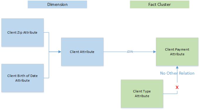
Figure 12: Illustration of join rules
Creating a new join
When you integrate two loads into a single project, you can join them while following the rules described above.
There are two possibilities for how to join loads – suggested or manually. To join two loads or clusters, follow the following instructions when in the InModeler module:
1. Click on the ldm tab.
2. Click on the Join Panel in the Right Properties Type Menu to open the Join panel.
3. In the left menu, click on attributes to open the Attributes panel. Select the attribute from dimension cluster (primary key) and click on
< button to show the labels of the attribute.
4. Drag the label to be used for the join to the From Object section of the Join panel and drop it there.
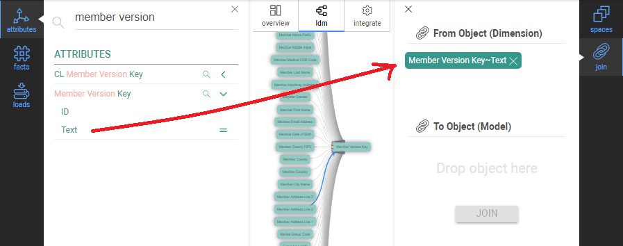
Figure 13: Drag primary key attribute text label to the “From Object” area on the right properties panel
5. Select the join cluster attribute and drop it into the To Object section of Join the panel in
the same way.
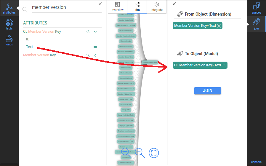
Figure 14: Drag second attribute text label (not a primary key) to the “To Object” area on the right properties panel
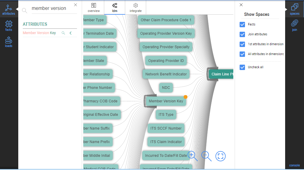
6. Press the Join button. The LDM graph is automatically refreshed.The graph symbol of the
join attribute is changed (an orange corner is added). The join dimension attribute is
connected to the target cluster and the join cluster attribute (in the target cluster) is
removed.
In our example, the “CL Member Version Key“ was substituted by the “Member Version Key“.


A hierarchy represents the logical relations among attributes. A typical example is the date hierarchy. A date belongs to one month and month has more dates (1:n relation). Accordingly, the next date relations among month, quarter and year.
The Hierarchy tool allows you to place two attributes into a hierarchy (Parent-Child) relationship. Simply drag the parent attribute into the parent location, and the child attribute beneath it. You can create multi-level hierarchies as well by using the child attribute of one hierarchy as the parent of another. These relationships will be displayed as a horizontal row in the data model with the highest level of the hierarchy to the left, and lowest level, to the right.
Figure 16 shows an example of a naturally-occuring hierarchy, a calendar/date hierarchy.
.png)
Figure 16: Example of hierarchy
You can create a new hierarchy among the loaded attributes:
1. Click on the ldm tab.
2. Click on the Hierarchy Panel in the Right Properties Type Menu to open the Hierarchy panel.
3. In the left menu, click on attributes to open the Attributes panel. Select the attribute (not the and Drag it to be used for the join to the From Object section of the Hierarchy panel and drop it there.
.png)
4. Select the object and drop it into the To Object section of Hierarchy the panel in the same way.
.png)
5.Click the Join button
The result view after the Join is shown here:
.png)
Figure 17: Example of Hierarchy after a join
To remove or reverse a hierarchy, select any of its elements, then use the Break button.
.png)


There are multiple ways text-based data files (CSV, TSV, Pipe delimited) can be formatted. To ensure a seamless experience loading your text-based data file into Inzata, we recommend following the guidelines below:
Text file delimited by one of the following way is supported:
• Comma
• Semicolon
• Tab
• Tilde
• Pipe
A text file represents one table (referred to as a cluster in an Inzata Project) with the data column types:
• attributes (identifiers, codes or descriptions for categorical variables. The values of an attribute column can be created as any alphanumeric text.)
• labels (A label is part of an attribute object. An attribute can be represented by more display forms, e.g. the “Person” attribute has the “Last Name”, “SSN” and “Email Address” labels).
• facts (quantitative measures defined as numbers). Use numeric values only.
The first row of this file contains the column names with a delimiter. These names are pre-selected as attribute and fact identifiers (names) during the “Creating a New Load” process article. We recommend using a file header with business names of attributes and facts.
One column is a primary key which has the unique values in the text file or across all the files loaded incrementally into one cluster.
We recommend (as the first – data integration) using a set of smaller files to create a logical data model in inModeler. Any file with from 100 to 1000 records is sufficient for this. If a user wants to load big data then to such crated enterprise LDM, then the IM ETLp system is designed for such data processing. This option also supports automated, scheduled data loading on a regular basis.
The NULL value is represented as an empty string (without quotes) in a text file.
String values in a file data can be used with double quotes or apostrophes as a character indicating beginning and end of a string.
Double quote character cannot be used in data except using it as a string separator mentioned above. The special characters [%’/#@$<>*] are available in data but they are not available in the first row as a column’s header.
There are following available Date and Time formats:
• Date:
YYYYMMDD
DD/MM/YYYY
D/M/YYYY
MM/DD/YYYY
M/D/YYYY
MM-DD-YYYY
DD-MM-YYYY
YYYY-MM-DD
YYYY-DD-MM
YYYY/DD/MM
• Date Time:
the same as date including a time with format HH:MM
• Time:
The available format: HH:MM.


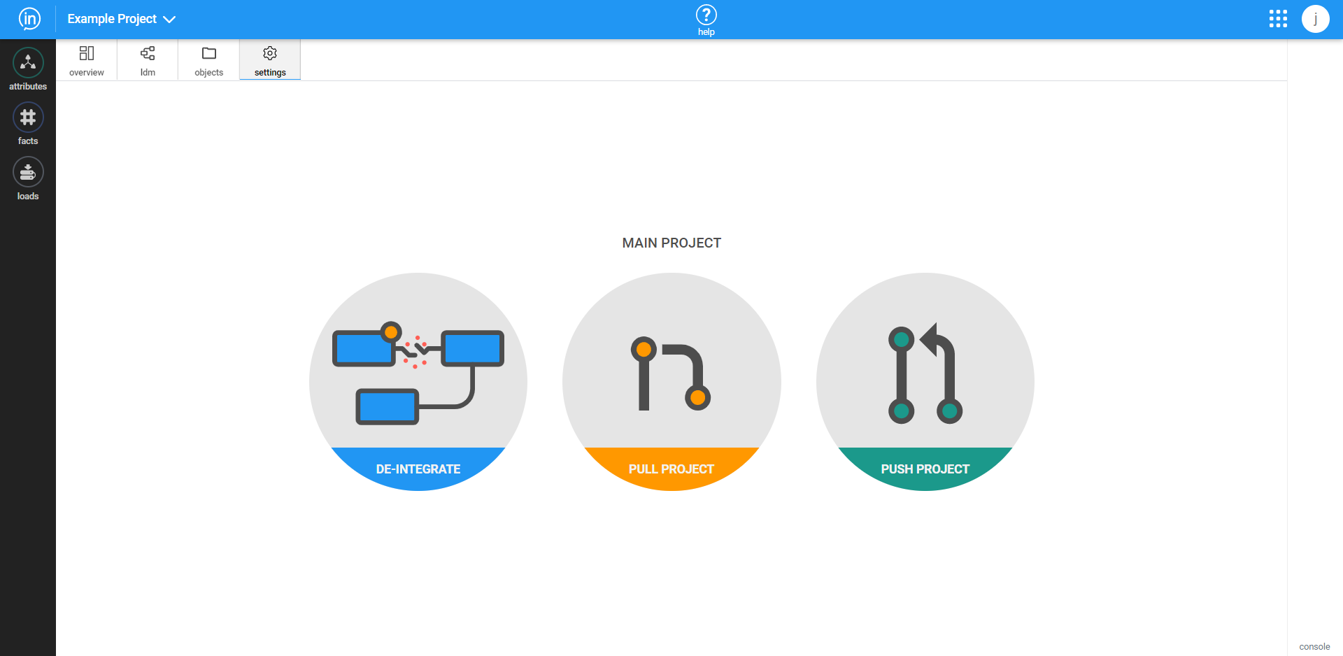
The Settings tab allows you to modify your loaded clusters.

De-integrate
This feature enables the user to remove all the connections and joins among loads which have been implemented in a project. All the dimensions added and integrated from the list of offered – compatible ones from the IM Object Marketplace will be automatically removed.
USE THIS FUNCTION WITH CAUTION. Accidental de-integration will require the data model to be recreated from the clusters.
Click on the settings tab.
Press the “De-Integrate” button.
All the-integrated steps are described in in the picture:
• All connected packages will be removed
• All joined dimensions will be disconnected and removed
• LDM will be restored to its original state ( as they were after loading all the data clusters into the common space (not joined/connected, just stand alone status).
Press the next “De-Integrate” button to start the process:
.png)
Pull/Push Project
Because multiple projects can be worked on by a user, Inzata supports the creation of staging and development projects that can be worked on without affecting the main production project. If a user takes this approach to developing their data warehouse, then they can use the Pull function to take the changes committed to a production project and replicate them in a staging/dev project. To complement that, a staging/dev project can be pushed to a production project using the “Push” button.


What are they? How do they work? – https://help.tableau.com/current/pro/desktop/en-us/datafields_typesandroles.htm

What are Facts and Attributes?
Facts and Attributes are two different types (classes) of data columns. They refer to what they represent or model in real-life. are just the roles that Inzata assigns to your data automatically.
Every column in your data is either a Fact or an Attribute.
By default, Inzata automatically assigns a Fact or Attribute role to every column based on that column’s properties and context when the data is loaded, but you can switch this role for any column manually, if you wish.
Why assign roles to my data?
Your ultimate goal is to analyze that data to answer questions. Your data are going to have different roles to play in your Inzata Data Warehouse! Remember, your data is merely there to tell a story about something that happened in real life. And in real life, there are people, places and things (Sometimes called ‘entities’) that interact and relate to one another (‘relationship’) and sometimes do things (‘activities’).
Attributes contain qualitative values (such as names, dates, or geographical data). You can use attributes to categorize, segment, filter and reveal the details in your data. Attributes affect the level of detail in the view. Attributes can be either alpha, or numeric, or a combination of both. Attributes can also change over time. An example of a numeric Attribute would be something like Zip Code or Phone Number.
Facts on the other hand contain quantitative (or numeric) values. Facts are a record of something that happened in the real world. They never change. They’re a standing record of something that happened in the past. Examples of Facts would include the details about a product sale such as “Transaction Total” or “Purchase Quantity”. Other examples would include a column called “Temperature” containing temperature readings taken every hour.
Questions for review – Attributes and Facts
1. Why do we not want facts to change over time?
2. Why would we want to change an attribute? Give an example of an attribute and why you might change it.
3. Classify the following Columns into Facts or Attributes (Best guess is fine!)
1. Zip Code
2. Time
3. Temperature
4. Eye Color
5. Test Score
6. College Major
7. Engine Type
8. Purchase Amount
9. Sales Tax Collected
10. City Sales Tax Rate

• Metrics are a way to make Facts more useful! Metrics are formulas that aggregate your facts, turning them into new numbers, like Sum, Average or Top-100. If you’ve ever used the =SUM formula in Excel, you’ve created a Metric!
• Facts, all by themselves, just aren’t very useful in Business Intelligence. Having the purchase amount of a single transaction doesn’t tell you much about the health of your business.
• That’s where Analytics platforms like Inzata come in. Inzata lets you take huge quantities of Facts, and through something called aggregation, turn them into insights that provides a lot more value.
• By aggregating the facts into a Sum total or an Average, or a Count, we can learn a lot about our how our business is doing.
• To take it a step further, when we combine Metrics with Attributes, we can get something like “Total Sales broken down by Region”, we’re taking a fact (“Sales”), then the “Total Sales” metric aggregates it, and finally the “by Region” attribute gives us a nice table showing sales broken down by region. Quite useful!
• Metrics and Attributes are the primary building blocks of reports and dashboards in Inzata! Every dashboard you create will be made up of Metrics and Attributes. How you mix these elements together will determine what business questions your reports and dashboards can answer.
Questions for review – Metrics:
1. What is the process that allow Metrics to make Facts more valuable?
2. Why are facts by themselves not very useful?
3. What is something that all Metrics need to have?
4. Name 3 types of aggregation functions.
5. Metrics + ________ are the primary building blocks of reports and Dashboard in Inzata.

• Not understanding what your data represents.
• Not having a clear business problem or question you’re trying to answer.
• Using the wrong type of visual for the story you’re trying to tell.
• Not addressing missing or null values or checking for bad data.
• Looking at the wrong time period or not aggregating consistently.
• Not doing any quality checks.
• Not communicating properly with the appropriate stakeholders.
• Reaching a conclusion before analyzing the data, then skewing analysis to support that conclusion.
• Skipping the step of exploring and understanding the data before diving into complex analyses (exploratory data analysis).


This widget allows you to add a separator line to your dashboard.
The orientation option lets you set if the separator is vertical or horizontal. The color option lets you set the color, size, and style of the separator. The X will set the separator back to its default styling.The text widget allows you to add text boxes to your dashbaords. These text boxes can support multiple sizes, colors, and formatting options all within the same text box.The image widget allows you to add an image to your dashboard. This is useful in the cases where maybe you want to include a map from some other platform or maybe a logo.


Starting to work with Inzata can be overwhelming at first, and it can be difficult to know where to start. Here are some good practices to get into the habit of doing, that will help users become proficient at loading data and creating insightful dashboards.
Use the top right menu to open new tabs
Clicking the 3×3 square icon at the top right of the page will open a menu of all the apps within Inzata. Clicking one of these will immediately open a new tab of the selected app while still keeping the original tab open. This can be incredibly helpful in situations where for example, a user is working on a dashboard but needs to open inModeler to tweak the data model. One detail to note about this is that you may need to refresh Inzata in all other tabs for changes in one tab to take effect.
Make a snapshot of your project before adding new data source
Just as it is a good idea to periodically save a document while editing it, it is a good idea to create snapshots while adding to or editing a data model. Creating a snapshot of a project can be useful if something goes wrong when adding a new data source. The snapshot will allow the user to restore the project back to how it was before, and allow the user to fix whatever went wrong.
Avoid clicking “Run” multiple times
If a user clicks the “run” button in inflow and does not see the inflow page reacting to his click, then the user should not click “run” any more times. If there is no reaction on the inflow page, that does not indicate the flow is not running. Multiple clicks may increase the amount of time before the flow is finished. If after a minute the inflow webpage still does not react to the user’s interaction, then the user should click again. You may also contact your customer success specialist for assistance and to alert the Inzata support team of the issue.
Save Often
This one is self-explanatory and not specific to Inzata, but it is still worth mentioning. Inzata does not automatically save, so users must remember to click the save button at the top of the screen every so often. After saving, users will need to re-enter edit mode to continue editing the flow or dashboard.
Use Date Converter task on all date entities
Sometimes part of a date column has bad formatting, contains bad characters, or uses dates that are outside the normal date range such as 1/1/0001. To catch these and keep the data model clean, it is best to use a date converter task on all the dates in a flow. The date converter task automatically prints “Invalid” when a date element has one of the previously mentioned issues, alerting the Inzata Full Access user to the problem. The Full Access user can then use a Replace task to catch all “Invalid” values and replace them with new values that indicates the data was unclean, such as leaving the element empty or having a designated date to indicate issues with data quality.
Use prefixes in flows
In a fully-developed data warehouse, there will naturally be many individual tables or clusters that in turn can each have tens to hundreds of attributes and facts. This often results in data warehouses with overlapping concepts between tables or clusters. For example, if Jim Bob wants to list the sales order number for each order in his ERP system, then there may be a field for the sales order number in both the orders data and the invoice data. It is important to distinguish between these two sales order number fields because they likely cannot be used the same way when making reports.
To address this problem, it is important to add a short prefix to the name of each field in a data warehouse to indicate the source of the data and/or the field’s table of origin within that source data. This is most easily done using the prefix task in inFlow.
Use the expand text button to handle long text strings
.png)
The above button (expand text box button) can increase/decrease the height of a textbox in Inzata by clicking and dragging the button. This is especially useful when entering a long block of text into a textbox field such as when listing column names to be deleted.
Limit the number of rows going through flows as you build them
When building a flow that uses the ODBC connector, it is best for a user to limit the number of queried rows. The user can subsequently adjust the flows to pull the full data after finishing the flow. This approach for testing can significantly reduce the time needed to build a flow because running a test on 100 rows will be much quicker than testing 100,000 rows.
Save time in inFlow by creating a template for the different connections that will be used (inflow)
Building a flow requires the user working on the flow to select the input method and provide credentials to authenticate connections. When creating multiple flows that pull data from the same source, it is recommended that a “stub” flow is made that contains the input method and sometimes a few initial transformations that can be applied to every load from a given data source. This “stub” flow can be duplicated and used as a template for new flows using the “save as” button on the top menu of an inflow page.
This will help users avoid recreating the connection method multiple times, saving time. This strategy can also improve data security by not requiring users to refer to credential vaults more than once.
Doublecheck Inzata’s AI guess at classification of facts/attributes (including dates and PKs) (inmodeler)
Inzata will try to classify each column in a newly loaded data set. Most of the time Inzata will classify each column correctly, but it is nonetheless a good idea to double check since Inzata will sometimes be wrong.
It is very simple to correct the wrong classification before the data is loaded. All a user has to do is click on the data type for the column in question and change the data type to the correct value. Not following this step can create issues that will require changing the data model and reloading the data.
Verify that the desired auto-generated metrics are selected
When doing the initial data profiling there is a button labeled “show advanced options”. In the menu that appears, there is a portion which contains the following options:
.png)
These determine which auto-generated metrics Inzata will create. Choosing to auto-generate the right metrics will likely save time that would otherwise be spent creating new metrics or cleaning out unused metrics.
Verify Inzata-recommended joins before approving
Inzata recommends joins between data clusters in inModeler and provides a goodness-of-fit score to indicate how well the structure and content of the columns joined match. To create a well-built data warehouse, it is strongly recommended to carefully review joins before approving.
inBoard
Drag metrics first
When creating a new report in inBoard, drag the metric(s) in first before attributes or facts. While it is possible to build some reports without doing this if all the data is related, dragging in a metric first will allow inzata to show only the attributes and facts that are related to that metric. Doing this greatly simplifies building reports.
Build reports out as tables first
It is important to build reports as tables before changing them into a given visualization as many visualizations will not load without a minimum number of metrics or attributes.
Save often
Just as with flows in inFlow, it is important to save regularly.
Use smaller, more focused dashboards
Unless it is absolutely necessary to have all of a team’s or organization’s reports on a single dashboard, it is generally recommended to separate them into multiple smaller size dashboards, rather than a single large one. The dashboards will load faster and it will also be easier to troubleshoot any errors that may occur. A business-side reason for doing so is that multiple targeted, concise dashboards often provide a more accessible and understandable view for business insights.


Control widgets are how the dashboard creator within Inzata can give the end user of a dashboard the ability to dynamically select or change what data is being shown by a report or a group of reports. Controls and reports have a many to many relationship, this is to say, a single report can be affected by many controls and a single control can affect many reports. This layering effect can allow an end user to have as much or as little flexibility as the dashboard designer wants to allow.
Control Menu
The control menu lets you set any text displayed within the control as well as the bind key and control type.
The empty text box is where you can set the text for the control. Just click in that box and begin typing to add the text.
The bind key is how a report knows which control is linked to it. A bind key should contain no spaces and needs to be unique to that control. This bind key is also case sensitive, so when it is used in a report it needs to match the text and case of the text exactly
The control type dropdown lets the user select a control from any one of 5 types:
Text Control
The text type control is similar to a drop down menu but it has substring search capability. This control should be used in cases where the attribute you are working with has many levels (think names of people) and the end result is you only want to see data around a single level of that attribute.
Slider Control
The slider type control is a single selection control that is useful when selecting an ordinal attribute. This control when used in conjunction with another of the same type is also useful for selecting a range within an attribute.
Dropdown Control
The dropdown control is most useful as a single selection control where the attribute has a moderate number of levels. If the attribute you want to search through has over 10 levels but under 50 then a dropdown control would probably be the best option
Checkbox Control
The checkbox control is useful when you want to select multiple levels within an attribute. This is useful for comparisons or when you want to look at all the data but excluding a few levels of data within an attribute.
Radio Control
The radio control is a single select control that is best used when your attribute only has a few levels, probably less than 10. In this case the radio allows the user to easily switch between what data within the attribute is being displayed.
Control Value Menu
The control value menu lets you set what data the control is going to use to filter the report it is eventually connected to via the bind key. There are two modes within the control value menu, they are set using the source type option at the top of the menu.
Lookup Source Type
The lookup source type control is the most common and will be used 90% of the time.


The text widget allows you to add text boxes to your dashboards. These text boxes can support multiple sizes, colors, and formatting options all within the same text box. The image widget allows you to add an image to your dashboard. This is useful in the cases where maybe you want to include a map from some other platform or maybe a logo.
Going from left to right starting at the top the icons allow you to do the following:
1. Font Size – Allows you to change the size of the selected text between “Huge”, “Large”, “Normal”, and “Small” text sizes. The default size is “Huge”
2. Font Color – This allows you to change the color of the selected text
3. Highlight Color – This option allows you to add a highlight to the selected text in whatever color you want to use
4. Bold Text – This option allows you to bold the selected text
5. Italic Text – This allows you to italicize the selected text
6. Underline Text – This allows you to underline the selected text
7. Text Alignment – Allows you to select the alignment for the selected text. The options are “Left Align”, “Center Align”, “Right Align”, and “Justified”. The default is “Left Align”.
8. Hyperlink – Allows you to convert the selected text to a hyperlink and set the destination URL
9. Subscript Text – Allows you to make the selected text a subscript
10. Widget Background Color – Allows you to set a specific color as the background to the whole widget


1. Create a grid
The first step is to create a new grid. To choose a name for it, click on “grid” at the top of the right-side menu bar and enter the desired name into the “Name” field on the “grid” panel. Populate the grid with the metric to be used for segmentation followed by the relevant attributes by dragging and dropping the metrics and attributes onto the grid or pivot table.

Start with metrics (I recommend bringing in the # PRIMARY KEY OF TABLE first as done in the above example) that you are going to be analyzing. You may run into a Row Limit reached warning. If that occurs, you can apply the suggested Filter and continue working.
Once your metrics are pulled in, bring in your attributes (NOTE: the metrics will be unfiltered aggregates until you pull in attributes so don’t try to validate numbers at that step). Depending on what entity you are segmenting, you should include an attribute that is unique for each record of that entity. Here, that attribute with the unique records for each entity is “pk”.

Now that your grid is made, you can add one or more filters to narrow the selection of data that will be segmented. At this point, save the grid before moving on.
2. Create the Flow
If there is no flow template already made, create a new flow. See the documentation on how to create a new flow. You will use the Inzata Report input method and select the grid that was made in step 1 using the dropdown menu.

It is recommended to use the “Info” button on the right to rename the report to the segment name (ie. “Segment A”).
From here, you’ll want to add transformations necessary for the analysis. Some suggested transformations are renaming columns to remove spaces and make the names friendlier for the next steps and using the Prefix/Suffix Column task to add a prefix to all the column names in a load.
Read about the different types of transformations on the documentation page to determine which ones you will need. Some ones you should have:
Rename Column: When attributes are used in Inzata grids, Inzata appends “ (Text)” or a similar tag to the attribute name. The rename column task in inflow can be used to fix the name so that the tag is no longer present, and the name is clearer.

SQL Like Case Statement: You’ll need this to create your segments. This task functions very similar to how SQL works within a CASE statement, but there is documentation that specifically addresses how to use this SQL Like Case statement task on the Inzata support site for more details. You can have ANDs in your WHEN statement if multiple conditions need to be met. At the ELSE part of the case statement, you may want to enter “Unclassified” or “Unsorted” to make later troubleshooting easier when testing the results of the segmentation. For an example of a SQL Like Case statement being used to create segmentations, see below. That newly created column “segmentation” contains two different values to represent two different segments, “After Y2K” and “Before Y2K”.

Don’t forget to add a prefix to the column names (ie. segment_tab_) and name your segment in the blue Inzata load box (ie. segment_on_date). The final draft of your segmentation flow should look like this:

The inputted data from the grid was converted using this flow to two columns of data that look like this:

Now that the segments are created, you can join the segmentation data to your data model on the “pk” field with inModeler.

Inzata’s data widgets also allow you to filter on a metric. There are two scenarios when adding a filter. The first is if there are no other filters on the widget. The second case will handle how to filter on a metric when other filters are already present.
Case 1: No other filters on widget
In the first case, no other filters are present on the widget. You may have several attributes and/or metrics present as shown below.

To filter on one of the metrics, click the three dots to the right of the metric name in the “Metrics” section. It will open a screen that looks like this. Toggle on the “Filter” toggle on the bottom to see all of the options: (NOTE: Make sure the “Filter” box is set to “Basic”)

At the bottom, select how the metric should be filtered and the value to filter it on.

Choose the to be applied, then enter the value to filter by. Once that is done, click “Done” in the top right of this box and the filter will be applied to the dashboard.

Case 2: Other Filters are Present on Widget
Add all other filters before filtering on a metric for the best experience. Once all other filters have been applied, the pivot menu should look similar to this:

When filtering on a metric with other filters present, change the “Filter” type to “Advanced”:

Type “AND” then drag in the metric that will be filtered on into the Filter box:
The types of Filters:
TOP: This will filter to the top X number of values for the selected metric.
BTM: This will filter to the bottom X number of values for the selected metric.
= : This will filter to only values exactly equal to the entered value.
< : This will filter to only values LESS THAN the value entered.
> : This will filter to only values GREATER THAN the value entered.
<=: This will filter to values LESS THAN OR EQUAL the value entered.
>=: This will filter to values LESS THAN OR GREATER the value entered.
<>: This will filter to values NOT EQUAL the value entered.


Prompt filters are a great way for users to dynamically filter the data feeding the visualizations in reports displayed in dashboards, giving even end users the ability to interact with dashboards. For more information on prompt filters and their variations, see Filter – Inzata Support.
Using inBoard, there are 2 ways to create a prompt filter, the prompt filter wizard and the manual route. The wizard has 3 steps: Select Elements, Filter Property, and Create Controller. To run the wizard, first open a dashboard in inBoard and click on a report widget to open the side panel on the right for editing the report. Once that has been done, the right side panel typically opens to the pivot menu (1), if not it should be opened. The user should then click “Add Filter” button (2) in the pivot menu.
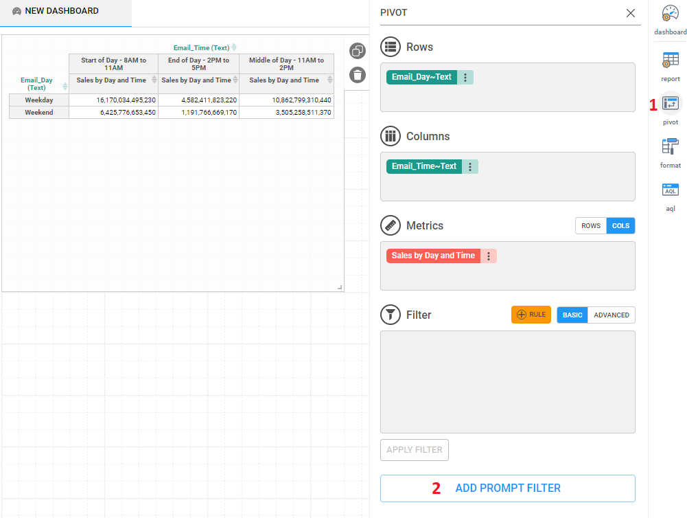
Step 1: Select Filter Elements
The wizard will now open to step 1: Select elements. Once the wizard panel opens, the user must pick an attribute on the left side of the panel first, then select the type of data to use for the control filter. In most cases, the type of data will be “Text” as shown below. Picking an attribute and data type will cause Inzata to populate the right side of the panel with its values so that the user can pick a default value for the filter. This is done by clicking on a value to select it. If the user does not want a default value to be set in the control filter, then they can proceed by selecting either the “—” value or by not picking any value. To go to step 2, click next.

Step 2: Name and Choose Filter Type
For step 2, the user picks the title that will display at the top of the filter and also picks the type of filter that will be used. The user can write the title in the text box and format the text by highlighting it and using the formatting options. The filter type can also be selected from one of the available options.

Step 3: Review and Create Filter
Step 3 entails a quick review of the key aspects of the control filter. The control filter object name is automatically chosen using the wizard, but it can be changed later in the settings of the control filter. The different fields present for review are the filtered attribute name, the control filter object name, the default value for the control filter, the title of the control filter displayed on the dashboard, the controller type, and the AQL code that goes in the filter field when editing a report. To finish the wizard and make the control filter, click create.


The application menu within Inzata is the blue bar at the top of your screen and at any point some of 12 options will be displayed. The options allow you to manage your objects within Inzata.
Share
The share option allows you to share your selected object to other user roles (groups of users) within Inzata. For example if you make a dashboard and you want to make it available to everyone else to see you would accomplish this through this option.
The first step is to check the boxes on the left next to the user roles you want to share your object to, then click the double arrows in the middle to move it over to the “shared” side and then on this right hand side check the boxes for if you want these users to be able to “read” (view the object only), or “read” and “write” (view the object and make changes). Once you have done this you can hit apply at the bottom right to share the object as you have configured it. If you want to unshare something, you simply have to remove the rights to it by moving the user role from the right side to the left side using the double arrows and hitting apply.
Edit
The edit option allows you to edit whatever object you are in through the use of the widget menu on the right (as well as in the case of some objects like dashboard the object itself). The only thing that cannot be edited within an object is its “ident”.
Save
Once you have finished editing your object and you are happy with your changes, this option allows you to save those changes.
Save As
This option allows you to save a copy of your object with a new name and a new ident. This is useful in the case where you want to make your own version of something that someone else has already created.
Cancel
This option will allow you to exit out of any object you are editing without saving any changes you have made.
Refresh
The refresh option will cause all the reports within the dashboard to reload. This will fix any errors that pop up due to your internet connection dropping causing a report to fail or any similar errors.
Show
The show button will open up your dashboard from inboard as if it is in inViewer. This is a good way to test your dashboard without navigating to inViewer first.
Export PDF
This button will export a static PDF of your dashboard as it existed when you click the Export PDF button. This export is subject to the gridlines and line breaks you see when putting together the dashboard. Do note that in this case since the PDF is a static representation of a dashboard you lose all the interactivity available when viewing the dashboard through inViewer.
Delete
The Delete option will completely delete your object from within Inzata. This cannot be undone.
Undo
This option will undo any changes done to widgets within a dashboard. This includes the removal, movement, copying of any widgets on the dashboard.
Redo
This button will allow you to undoes an undo operation.
Help
This is where you can find help and technical documentation associated with Inzata


The element menu within Inzata can be accessed through any attribute object by performing the following:
• Click Attributes on the object menu
• Click the drop down arrow to right of the attribute of which you want to see the listed elements
• Click the “=” sign next to the label you want to see all the elements of
These menu shows all the possible elements of the label within an attribute. For example if I selected the attribute “state” and then the label “Abbreviation” I would see the elements list containing data such as “AL” and “AK”. However if I instead chose the label “Full Name” I would see “Alabama” and “Alaska”. If you hover over the element itself you will see its associated Inzata ID number. You can also drag these elements over to use as filtering criteria in the case where you don’t want to type the full name of the element.
• Helpdesk
• Chat


Being able to show and hide attributes in a report gives a “drill down” experience for the user while still allowing the analyst the ability to control what is show and the order it is shown in.
First, create the report that contains all of the metrics and attributes you want at the most expanded.

Now bring in a control widget from the far left “widgets” navigation and give it a bind key. Write down this Bind Key for later.

Click on “Values” on the far right navigation with the control widget still selected and change the “Source Type” to “Values”. Use the blue + to add rows to match the number of attributes on your report.

Starting with the Attribute you want on the furthest left of your report, go to the “attributes” select on the far left and search and expand it. Hover over the “Text” option and use that name (including the brackets) in the ID column of the control.


Repeat that process for all desired attributes, making sure the order from top to bottom matches the order from left to right of where the attribute should appear on the table. When finished, all of your value rows should be filled in with the attribute ID on the left and the visible name on the right.

To set a default value, copy and paste the ID(s) in the “Default Value” text search in the bottom. If you want multiple defaults, separate them with a comma. Make sure “Sort ordinary (by ID)” is on so the control is in the same order you’ve listed them in.

The control is now complete.
Select the report that this control will work on. On the right selection menu, choose AQL. We will be replacing both highlighted areas (all of the attributes) with: %%BIND KEY%% where BIND KEY is the Bind Key set for the control. (NOTE: DO NOT get rid of the attributes after SLICE. Those refer to other filters or controls you may have on your report. Leave those as they are).

Your finished AQL should look similar:
The image widget allows you to add an image to your dashboard. This is useful in the cases where maybe you want to include a map from some other platform or maybe a logo.
Do note that Inzata will load the image at whatever resolution the native image is, large images can slow down dashboards significantly.
Border Radius
This option lets you set how thick an outline your image has within the widget.
Opacity
This option lets you set how transparent the image is. Note this will only affect images that are in a format that supports transparency like PNG. JPEG or JPG images do not support transparency. The higher the value is set, the less transparent the image is. 100% means no transparency and 0% means the image is invisible.
Scale
This option lets you shrink an image within the widget itself.
Align
These options let you set where the image appears within the widget. The top row of icons sets the horizontal alignment and the bottom row sets the vertical alignment


There are a maximum of 5 menus that can be open at any given time within inBoard. They are as follows:
1. Object Menu
2. Application Menu
3. Widget Menu
4. Inzata Open Tabs
5. Element Menu
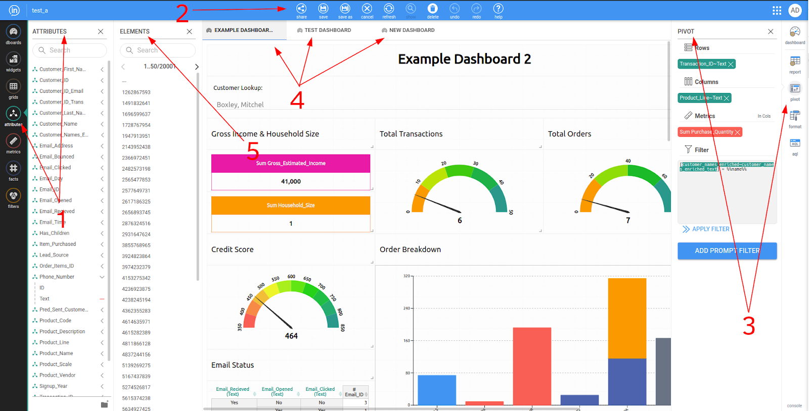
Object Toolbar
The InBoard object toolbar shows all you Inzata objects that can be viewed and accessed from within InBoard. These objects themselves will be explained in further detail in their own chapter labeled “InBoard Objects”. Clicking items on this toolbar will open that submenu. Within InBoard the following object types are available:
1. Dashboards
2. Widgets
3. Grids
4. Attributes
5. Metrics
6. Facts
7. Filters
This is the menu that you will drag items over from to create items like new report widgets on your dashboard, or add inzata objects to your report. This menu is also where you can create new objects like new metrics, filters, or dashboards.
It is important to note that new facts and attributes cannot be created from this menu. This is because attributes and facts come from the data itself.
Application Menu
The Application Menu within InBoard is how Inzata Objects can be edited, saved, shared, and more from within InBoard. The possible options that will be displayed within the InBoard Application Menu are:
1. Share
2. Edit
3. Save
4. Save As
5. Cancel
6. Refresh
7. Show
8. Export PDF
9. Delete
10. Undo
11. Redo
12. Help
These items are explored in detail in their own section “Inboard Application Menu Options”. Note that some of these options will be hidden or shown depending on if an object (like a dashboard) is simply being displayed, or if it is actively being edited. For example “Export PDF” will not be shown if the user is currently editing the dashboard.
Widget Menu
The Widget Menu within InBoard shows options dependant on what widget is currently selected within inBoard. This means that when the user has a report widget selected they will see a different set of available options than if they have a text box widget selected. The available widgets within InBoard and their available options will be explained in the section “Objects”.
Inzata Open Tabs
This menu shows any open Inzata tabs. These can be navigated by selecting the tab you want to open or, once many tabs are open, these tabs can be scrolled through via arrow buttons on either side of the listed tabs. Open tabs can be closed by hovering on the tab you want to close, and then clicking the X that appears to the right of the tab name. NOTE: Closing a tab means any changes that have been made will not be saved!
Element Menu
The Inzata Element menu can be opened for only the attributes object within InBoard. This menu shows the individual elements within a selected attributes. The best way to think of these elements is as an option within an attribute. I.e. if I send out a survey asking for peoples’ eye color, the attribute would be “Eye Color” and the elements within this attribute would be “Green”, “Blue”, “Brown”, “Hazel”, etc. These attribute elements can be displayed by opening the attributes list from the object menu, then clicking the drop down arrow next to the desired attribute, and then the “=” next to the label you want to see the elements for as displayed in the below image.


Dashboards are the how data is presented visually to viewers. Dashboards are interactive and designed for viewers to easily browse and explore data, view reports, activate and use filtering, and obtain business insights from the data. Dashboards are made up of various types of widgets that work together to present information visually and effectively!
There are two ways to create a new blank dashboard. Method 1 is: when you enter InBoard you will be presented with the option to create a new dashboard or grid.
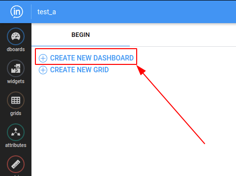
The second way is to open the “dboards” option within the objects menu and click the blue plus button.

The new dashboard’s properties instantly pop up on the right menu. Give your new dashboard a descriptiive name, and add an optional description if you wish.
You can also set Dashboard-level settings here such as themes and page orientation. This is useful if you want your dashboards to line up nicely for export to PDF or printing.
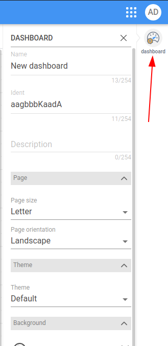
The first three fields in this menu are for identifying and describing your dashboard:
Name – Name your dashboard. This will be the name displayed in the open tabs bar as well as the Dashboards menus. This dashboard name can be changed at any time.
Ident – This is the unique identification number of your dashboard. This value cannot be changed by the user. It’s how Inzata will keep track of the multiple dashboards you’ll eventually create, even if two dashboards share the same name.
Description – Optional: You can enter a brief description about the dashboard
Additional Dashboard Settings. Note: To reset any settings to default values, click the X icon next to any of them. From top to bottom, the items are:
Page Size – The size of the page for PDF exporting or printing, this determines where the guides for page breaks appear on the layout screen.
Page Orientation – The orientation of the page for PDF exporting. The options are either landscape or portrait.
Theme – Inzata offers a number of colorful themes that can help your dashboard really stand out. Themes use combinations of colors, fonts and other visual elements. They’re a great way to visually unify all of your dashboard’s elements. Careful! Changing the dashboard theme will reset all of the individual color and font settings in each of your dashboard widgets.
Dashboard Color – This changes the color of the background dashboard canvas. This will be the color shown behind the widgets and in any empty space between them.
Width – This is used to set different vertical width constraints for the dashboard, in the event you want to make a dashboard layout that is viewable on smaller screens, like smartphones. The options, from narrow to wide, left to right, are “xS”, “S”, “M”, “L” and “M” (max). It is recommended you leave this set to Max for the majority of desktop and laptop viewing.
Background – This changes the color of the dashboard background as well as the default widgets color. It will affect all widgets on the dashboard.
Widget Style – Border – This option lets you set the color and style of widget borders.
Radius – This lets you set the the radius for rounded corners of your widgets. A larger radius will give a more rounded corner.
Spacing – Allows you to set empty space between widgets. The color of th empty space will. be the dashboard background color you set above. Try setting a slight color contrast between your widgets and the dashboard background to give them a nice accent. The more contrast, the more your widgets will “pop” off of the page.
Drop shadow – Sets the size of the drop shadow for each widget, use this to give a slight 3D effect to your dashboard.
Text Color – Changes the color of text within non text widgets for the whole dashboard
Font Family – Chooses the style of text displayed on the whole dashboard. Font sizes can be set within each widget. Caution: changing the font here affects the entire dashboard and will reset the font for every widget.
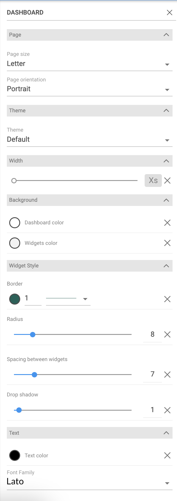
.png)


Within Inzata, a Fact is a set of column values in your data set. A single value of fact represents the most granular level of your transactional data, an individual data field at the intersection of a row and a column in a table. Think of a single value of Fact as analogous to a single cell in a spreadsheet containing an integer.
Within inBoard it is not possible to create new facts, it is possible to edit existing facts only. To open a fact move the cursor over the fact name and click on the fact name.
A new tab will appear. The options can be seen by opening the “fact” option from the widget menu seen on the right side of your screen.
From top to bottom, the items and what they effect are:
• Name – This lets you set a name for your fact. This will be how it is displayed in the open tabs bar as well as within the list from the objects menu. This fact name can be changed at any time.
• Ident – This is how Inzata will internally recognize the fact. Once this has been set, it is not able to be changed.
• Description – Can contain a brief description of the fact.
At the top there are graphically depicted direct relations of the selected attribute from the LDM.
The Used By section provides the list of all objects where the fact is part of their definition (reports, metrics,…).


Reports are the most commonly used widget type. A report is how data is represented on a dashboard. All reports start their life as a table and can then be formatted to look like a different type of chart. How to make these tables will be covered in the “Grids” section since it works the same if you make the report directly in the dashboard or if you make the table as a grid first.
There are 4 options within the widget menu of the report widget. They are:
1. Report
2. Pivot
3. Format
4. AQL
Report Menu
This menu reminds the users that a report is an element of a dashboard.
Pivot Menu
This menu is how a user creates the report itself:
.png)
Rows – Any attributes dropped here will be shown as rows of the report widget.
Columns – Any attributes dropped here will be shown as columns of the report widget.
Metrics – This is the item to be aggregated/broken down by the attributes.
In Cols / In Rows – This button changes metrics from being represented side by side or above and below one another.
Filter – This is how to exclude/include specific data within a report. Whenever a filter is edited, the below “APPLY FILTER” button must be clicked to update the report with the new, changed filter.
Add Prompt Filter – This button is used to open a wizard to help the user create a control
Format Menu - The format menu is how the appearance of a report widget is changed. Inzata has many different visualization options. Experiment with different visualizations by changing the display as option to other report types and changing attributes from rows to columns.
AQL Menu - This menu shows how the report is represented within Inzata. This is able to be edited directly for advanced customization of the report or is able to be copied to replicate a report on another dashboard.


The Table visualization is where all Inzata visualizations start. It has many options which will be explained below. You can add as many metrics as you want to a table and they will display to the right of the attributes contained in the rows of your report. Any attributes contained in the columns of the report will show above the metrics. Anything within your report can be sorted by ascending or descending order by clicking on the double arrows to the right of the object name. All attributes can be sorted alphabetically. Dates must be in the format YYYY-MM-DD to be sorted in this way (this sorting is provided by our date enrichment). Sorting precedence is metrics above all and then upper level attributes first. An upper level attribute is an attribute that is furthest left (in case of rows) or on top of the others (in case of columns). Tables can also display the conditional formatting set within metrics. An Inzata table can show a maximum of 50,000 rows.
Special Options and Parameters:
• Layout
• Rows per page – Inzata supports pagination within its tables, if the number of rows within a table goes beyond the number set here Inzata will show the option to click through the below pages
• Show sum total for columns – Displays column totals
• Show sum total for rows – Display row totals
• Data Section
• Background color – Sets the background color for the cells in the table
• Text color – Sets a color for the text within the cells, this will overwrite any conditional formatting
• Separator – Sets the color, thickness and style of the separator in the data section of the table
• Attribute Elements Section
• Background color – Sets background color within the cells containing the attribute elements (where you see “Motorcycles” and “1:10” in the above image)
• Text color – Sets element cells text color
• Separator – Sets the color, thickness and style of the separator in the attribute elements section
• Column header align – Sets how the text should be aligned within the cells of any elements within columns
• Row header align – Sets how the text should be aligned within the cells of any elements within rows
• Attributes header section
• Background color – Sets the color of the background in the attributes header section (this is where you can see “Product_Line” and “Product_Scale” in the above image)
• Text Color – Sets the color of the attribute header text
• Separator – Sets the color, thickness and style of the separator in the attributes header section


1. Create the report that will be used to filter.
To begin, create the report that will generate the list of attributes to filter the final report by (ie. customers who purchased a specific item in a specific year). Be sure to drag a metric in first (make sure it comes from the cluster furthest to the right in the data model of the attributes that will be brought in), then the attributes. The only necessary attribute is the one that will be used to filter (ie. Customer_ID) but it can be helpful to validate the first control by bringing in other related fields (ie. PRODUCT_CATEGORY and TRANS_DATE YEAR). It may be necessary to apply the TOP filter if the Browser Row Exceeded message pops up.

For this example, only people who purchased in 2019 will be considered in the original list so create a filter in the “BASIC” view by clicking the three dots on the right of the Trans_Date Year in the Rows box and searching for then selecting 2019 and then clicking Done at the top of the box.

Once all of your permanent filters are placed on the report, add a prompt filter using the button under the Filter box. Here is the final page that showing an example of selections:

At this point remove the TOP filter if it was applied (it’s okay if the warning shows up again – it can be ignored). Also, remove all of the extra attributes besides the one that will be piped into the other report.
2. Create the final report.
Now bring in a new Report widget and build out the final report. Remember to bring in a metric first.
3. Copy the AQL of the first report.
In the AQL tab on the far right, copy everything before the “ROWS AS”:

4. Paste the first report into the AQL of the final report.
In the AQL tab of the final report, right before “ROWS AS”, type in “AND IN ()”. (Shown in Yellow)

Now, paste the AQL from the first report in between the ( ). (Shown in yellow)

Between the AND and the IN, copy and paste in the name of the attribute you want from the first report (ie. CUSTOMER_ID). Make sure to use the same label (ie. text or ID) in both. (Copied from in blue, pasted is in yellow)

Then click “Execute” and the report will update with the correct list of customer IDs. The first report can be deleted.Make sure to name the Dashboard and save it!

There are many ways to create filters within Inzata. A filter can be created from any combination of metrics, facts, attributes, or other filters within Inzata. These can be saved within the equation editor for the filters menu for easy use in the future or typed directly into a report widget. There are predominantly 3 types of filters within Inzata. They are:
Selection filters are things like the following:
• [attribute] = [value from attribute]
• Selects a single attribute value•
•[attribute] <> [value from attribute]
• Selects all EXCEPT a single attribute value
•[attribute] IN ( [value from att.] , [value from att.] )
• Selects a group of attribute values
•[attribute] NOT IN ( [value from att.] , [value from att.] )
• Selects all EXCEPT a group of attribute values\
Range filters are similar to:
•( [metric] DICE [attribute] ) > [numeric value]
• Selects all greater than a value
•( [metric] DICE [attribute] ) < [numeric value]
• Selects all less than a value
•( [metric] DICE [attribute] ) > [numeric value] AND ( [metric] DICE [attribute] ) < [numeric value]
• Selects all values within a range
•( [metric] DICE [attribute] ) > [numeric value] OR ( [metric] DICE [attribute] ) < [numeric value]
• Selects all values outside a range
NOTE: If these filters remind you of reports it’s because they are constructed in the same way
Top and Bottom filters are like the following:
• ( TOP ( [metric] , [numeric value] ) DICE [attribute] ) > 0
• ( TOP ( [metric] , [numeric value] ) DICE [attribute] SLICE [selection filter] ) > 0
The “numeric value” after the metric denotes how many values are going to be shown in the final table (i.e. 5 would lead to the top 5 or 10 would lead to the top 10).
Filters can be combined by using the keyword AND or alternatively OR. For example entering a filter as FILTER_1 AND FILTER_2 will only show data where both filter criteria are met. However, FILTER_1 OR FILTER_2 will show data for where either filter criteria is met.


Within inBoard it is not possible to create new attributes, however, it is possible to edit existing attributes. To open an attribute move the cursor over the attribute name. “Open in new tab” icon appears to the right of the attribute name and then click on the icon.
A new tab will appear. The options for an attribute can be seen by opening the “attribute” option from the widget menu seen on the right side of your screen.
From top to bottom, the items and what they effect are:
• Name – This lets you set a name for your attribute. This will be how it is displayed in the open tabs bar as well as within the list from the objects menu. This attribute name can be changed at any time.
• Ident – This is how inzata will internally recognize the attribute. Once this has been set, it is not able to be changed.
• Description – Can contain a brief description of attribute.
At the top there are graphically depicted direct relations of the selected attribute from the LDM.
The Display Forms part shows all labels (display forms) created with the attribute. The Used By section provides the list of all objects where the fact is part of their definition (reports, metrics,…).


You can add as many metrics as you want to a table and they will display to the right of the attributes contained in the report. All attributes contained in the report are displayed in rows even if they are defined in columns of the report, data is not cross tabulated, paged and formatted.
Special Options and Parameters:
Data section
• Background color – Sets the background color for the cells in the table
• Text color – Sets a color for the text within the cells, this will overwrite any conditional formatting
• Separator – Sets the color, thickness and style of the separator in the data section of the table
Header section
• Background color – Sets the color of the background in the header section
• Text Color – Sets the color of the header text
• Separator – Sets the color, thickness and style of the separator in the header section


A bar chart or bar graph is a chart or graph that presents categorical data with rectangular bars with heights or lengths proportional to the values that they represent. The bars are plotted horizontally. Bar charts are a type of graph that are used to display and compare the number, frequency or other measure (e.g. mean) for different discrete categories of data.


You can add as many metrics as you want to a line report and as many attributes. Attributes contained in rows are used as labels on X axis. Attributes contained in columns define the lines.
Special Options and Parameters:
• Show with multi axis – If set then graph shows axis for each data set
• Show median on X axis- Shows data in terms of percentiles from 0 to 100
• Show trendline – If set then graph shows trendline for each data set
• Show as cumulative – If set then graph shows cumulative values instead original values
• Stroke
• Size – Sets the width of the lines
• Dashed stroke – If set then lines are dashed
• Labels
• Show labels – If set then labels are displayed, their size and position should be changed in section Label Positions for each data set
• Show dots – If set then dots of values are displayed
• Legends
• Show legend – If set then legends are displayed, default is true
• Size – Set size of legend text
• Set color of the same as theme – If set then text of legend is the same color as scatter plot graph
• Axis Labels
• Min value, Max value – Defines range of values on Y axis. Default is set to auto.
• Show Axis – If set then graph axises are displayed
• Show Y axis labels – If set then labels on axis Y are displayed
• Size – Set size of text of labels on Y axis
• Show Y axis labels – If set then labels on axis X are displayed
• Size – Set size of text of labels on X axis
• Show Grid – If set then grid on graph is displayed. Default is the column set.
• Color theme
• Select color palette – Sets color palette for the scatter plot graph. User can modify Custom palette


Spline Line is similar to the line graph, except the spline line’s shape is smoothed using spline function. You can add as many metrics as you want to a spline line report and as many attributes. Attributes contained in rows are used as labels on X axis. Attributes contained in columns define the spline lines.
Special Options and Parameters:
• Show with multi axis – If set then graph shows axis for each data set
• Show median on X axis- Shows data in terms of percentiles from 0 to 100
• Show trendline – If set then graph shows trendline for each data set
• Show as cumulative – If set then graph shows cumulative values instead original values
• Stroke
• Size – Sets the width of the lines
• Dashed stroke – If set then lines are dashed
• Labels
• Show labels – If set then labels are displayed, their size and position should be changed in section Label Positions for each data set
• Show dots – If set then dots of values are displayed
• Legends
• Show legend – If set then legends are displayed, default is true
• Size – Set size of legend text
• Set color of the same as theme – If set then text of legend is the same color as scatter plot graph
• Axis Labels
• Min value, Max value – Defines range of values on Y axis. Default is set to auto.
• Show Axis – If set then graph axises are displayed
• Show Y axis labels – If set then labels on axis Y are displayed
• Size – Set size of text of labels on Y axis
• Show Y axis labels – If set then labels on axis X are displayed
• Size – Set size of text of labels on X axis
• Show Grid – If set then grid on graph is displayed. Default is the column set.
• Color theme
• Select color palette – Sets color palette for the scatter plot graph. User can modify Custom palette


A pie chart (or a circle chart) is a circular statistical graphic, which is divided into slices to illustrate numerical proportion. In a pie chart, the arc length of each slice (and consequently its central angle and area), is proportional to the quantity it represents. While it is named for its resemblance to a pie which has been sliced, there are variations on the way it can be presented.
Special Options and Parameters:
• Merge Pie – if two metrics are used, either one, combine pie graph can be drawn, or two individual pie charts corresponding to each metric can be displayed.
• Labels
• Show labels – If set then labels are displayed, their size and position should be changed in section Label Positions for each data set (stacked bar )
• Legends
• Show legend – If set then legends are displayed, default is true
• Size – Set size of legend text
• Set color of the same as theme – If set then text of legend is the same color as stacked bar graph
• Color theme
• Select color palette – Sets color palette for stacked bar graph. User can modify Custom palette


All reports within Inzata whether they are built directly in the dashboard using the report widget or in the grids menu start life as a table. In this section we will go into how grids can be built and customized.
The proper way to build an Inzata grid is to first drag in your metric or metrics. This is the numeric item or items within your data that you want to make up your report. In my example I will use the example of a “Count of Customers” and “Total Sales”. These metrics can be dropped directly onto the grid or into the pivot menu on the right side of the screen. The advantage of dropping these metrics into the metric section of the pivot menu is that you can reorder the metric by moving one in front of or behind the other. When these metrics are added to the grid you will see a single number which is the result of the completely aggregated metric. For example if you have 10 customers and they each made a single $5 purchase your metric of “Count of Customers” would show 10 and “Total Sales” would show 50. More information on Metrics can be found in the Metrics section.
Now that we have established what metrics we want in our grid it is time to add our attributes. These are how the metrics are going to be DICED. Dice within inzata should be thought of as how the metric will be split into buckets. So for example if we added an attribute “Product” to the rows of our grid we will see our two metrics split across how they fall (are diced) into the buckets of all our “Products”. In most cases the majority of attributes will be put into the Rows of your report. However do note that the attributes of Rows and Columns will affect your visualizations in different ways. Also note that since we have added our metrics to our grid, Inzata will now recommend attributes that work within that portion of your established data model. These recommended attributes can be turned off using the toggle at the top of the attributes menu. More information about attributes can be found in the attributes section.
The final step in building a grid within Inzata is to apply your filters. This is also known as SLICE within inzata. For filtering if I want to SLICE my data to only include specific subsets of my data this can be accomplished by selecting the attribute I want to slice/filter and then listing the values I want it to be filtered by. Imagine this as Car_Color = “Green”. More information about filters can be found in the filters section


A stacked bar chart is a variant of the bar chart. A standard bar chart compares individual data points with each other. In a stacked bar chart, parts of the data are adjacent (in the case of horizontal bars); each bar displays a total amount, broken down into sub-amounts.
Equivalent subsections are the same color in each bar. This formatting makes it easy to compare both the whole picture and the components of each bar.
• Special Options and Parameters:
• Show as cumulative – If set then graph shows cumulative values instead original values
• Show trendline – If set then graph shows trendline for each data set
• Show as cumulative – If set then graph shows cumulative values instead original values
• Labels
• Show labels – If set then labels are displayed, their size and position should be changed in section Label Positions for each data set
• Legends
• Show legend – If set then legends are displayed, default is true
• Size – Set size of legend text
• Set color of the same as theme – If set then text of legend is the same color as scatter plot graph
• Axis Labels
• Min value, Max value – Defines range of values on Y axis. Default is set to auto.
• Show Axis – If set then graph axises are displayed
• Show Y axis labels – If set then labels on axis Y are displayed
• Size – Set size of text of labels on Y axis
• Show Y axis labels – If set then labels on axis X are displayed
• Size – Set size of text of labels on X axis
• Show Grid – If set then grid on graph is displayed. Default is the column set.
• Color theme
• Select color palette – Sets color palette for the scatter plot graph. User can modify Custom palette


A column chart is a data visualization where each category is represented by a rectangle, with the height of the rectangle being proportional to the values being plotted. A column chart displays data for a set of categories, with one value for each category
• Special Options and Parameters:
• Show as cumulative – If set then graph shows cumulative values instead original values
• Show trendline – If set then graph shows trendline for each data set
• Show as cumulative – If set then graph shows cumulative values instead original values
• Labels
• Show labels – If set then labels are displayed, their size and position should be changed in section Label Positions for each data set
• Legends
• Show legend – If set then legends are displayed, default is true
• Size – Set size of legend text
• Set color of the same as theme – If set then text of legend is the same color as scatter plot graph
• Axis Labels
• Min value, Max value – Defines range of values on Y axis. Default is set to auto.
• Show Axis – If set then graph axises are displayed
• Show Y axis labels – If set then labels on axis Y are displayed
• Size – Set size of text of labels on Y axis
• Show Y axis labels – If set then labels on axis X are displayed
• Size – Set size of text of labels on X axis
• Show Grid – If set then grid on graph is displayed. Default is the column set.
• Color theme
• Select color palette – Sets color palette for the scatter plot graph. User can modify Custom palette


A map chart is used to show items on a geographical.background (Map of the US). Map charts can contain different types of information in two different map format options.
• Marker option – Maps can contain interactive shapes or display markers of different types on an image or map background.
Special Options and Parameters:
• Grid is designed for 2 attributes (ZIP Latitude, ZIP Longitude and one metric)
• Map type is set to Marker
• Area type is set either to State or County depending, what corresponding geo attributes are present in the report grid
• Color theme
• Select color palette – Sets color palette for stacked bar graph. User can modify Custom palette
• Choropleth option – Choropleth Maps display divided geographical areas or regions that are colored, shaded or patterned in relation to a data variable. This provides a way to visualise values over a geographical area, which can show variation or patterns across the displayed location. The data variable uses color progression to represent itself in each region of the map. Typically, this can be a blending from one color to another, a single hue progression, transparent to opaque, light to dark or an entire color spectrum.
Special Options and Parameters:
• Grid is designed for one attribute (referring to either State’s or County’s related attribute) and one metric
• Map type is set to Choropleth
• Area type is set either to State or County depending, what geo attribute is present in the report grid
• Map Layer can set either to color or grayscale
• Set Initial zoom layer to fit a part of the map the a given report widget size
• Color theme
• Select color palette – Sets color palette for stacked bar graph. User can modify Custom palette


Stacked Spline Area is similar to the area spline graph, except the spline area’s shape is smoothed using spline function. You can add as many metrics as you want to a stacked area spline report and as many attributes. Attributes contained in rows are used as labels on X axis. Attributes contained in columns define the stacked spline area.
Special Options and Parameters:
• Show with multi axis – If set then graph shows axis for each data set
• Show median on X axis- Shows data in terms of percentiles from 0 to 100
• Show trendline – If set then graph shows trendline for each data set
• Show as cumulative – If set then graph shows cumulative values instead original values
• Stroke
• Size – Sets the width of the lines
• Dashed stroke – If set then lines are dashed
• Labels
• Show labels – If set then labels are displayed, their size and position should be changed in section Label Positions for each data set
• Show dots – If set then dots of values are displayed
• Legends
• Show legend – If set then legends are displayed, default is true
• Size – Set size of legend text
• Set color of the same as theme – If set then text of legend is the same color as scatter plot graph
• Axis Labels
• Min value, Max value – Defines range of values on Y axis. Default is set to auto.
• Show Axis – If set then graph axises are displayed
• Show Y axis labels – If set then labels on axis Y are displayed
• Size – Set size of text of labels on Y axis
• Show Y axis labels – If set then labels on axis X are displayed
• Size – Set size of text of labels on X axis
• Show Grid – If set then grid on graph is displayed. Default is the column set.
• Color theme
• Select color palette – Sets color palette for the scatter plot graph. User can modify Custom palette


The Inzata Gauge visualization is used to display one value, ie a report with one metric and without any attributes.
%2520(1).png)
Special Options and Parameters:
• Range settings
• Minimum – Sets the minimum value of the gauge graph
• Maximum – Sets the maximum value of the gauge graph, default value is 100,000
• Number of segments – Sets number of segments of graph
• Color theme
• Choose start/end color – Sets the color of the first and last section. The color of the other sections is calculated as the transition between the colors of the first and last sections.
• Choose needle color – Set the color of the needle


Area Graphs are Line Graphs but with the area below the line filled in with a certain color or texture. Like Line Graphs, Area Graphs are used to display the development of quantitative values over an interval or time period. They are most commonly used to show trends, rather than convey specific values.
Special Options and Parameters:
• Show with multi axis – If set then graph shows axis for each data set
• Show median on X axis- Shows data in terms of percentiles from 0 to 100
• Show trendline – If set then graph shows trendline for each data set
• Show as cumulative – If set then graph shows cumulative values instead original values
• Stroke
• Size – Sets the width of the lines
• Dashed stroke – If set then lines are dashed
• Labels
• Show labels – If set then labels are displayed, their size and position should be changed in section Label Positions for each data set
• Show dots – If set then dots of values are displayed
• Legends
• Show legend – If set then legends are displayed, default is true
• Size – Set size of legend text
• Set color of the same as theme – If set then text of legend is the same color as scatter plot graph
• Axis Labels
• Min value, Max value – Defines range of values on Y axis. Default is set to auto.
• Show Axis – If set then graph axises are displayed
• Show Y axis labels – If set then labels on axis Y are displayed
• Size – Set size of text of labels on Y axis
• Show Y axis labels – If set then labels on axis X are displayed
• Size – Set size of text of labels on X axis
• Show Grid – If set then grid on graph is displayed. Default is the column set.
• Color theme
• Select color palette – Sets color palette for the scatter plot graph. User can modify Custom palette


Spline Area is similar to the percentual area graph, except the spline area’s shape is smoothed using spline function. You can add as many metrics as you want to a area spline report and as many attributes. Attributes contained in rows are used as labels on X axis. Attributes contained in columns define the percentual spline area.
• Special Options and Parameters:
• Show as cumulative – If set then graph shows cumulative values instead original values
• Labels
• Show labels – If set then labels are displayed, their size and position should be changed in section Label Positions for each data set
• Legends
• Show legend – If set then legends are displayed, default is true
• Size – Set size of legend text
• Set color of the same as theme – If set then text of legend is the same color as scatter plot graph
• Axis Labels
• Min value, Max value – Defines range of values on Y axis. Default is set to auto.
• Show Axis – If set then graph axises are displayed
• Show Y axis labels – If set then labels on axis Y are displayed
• Size – Set size of text of labels on Y axis
• Show Y axis labels – If set then labels on axis X are displayed
• Size – Set size of text of labels on X axis
• Show Grid – If set then grid on graph is displayed. Default is the column set.
• Color theme
• Select color palette – Sets color palette for the scatter plot graph. User can modify Custom palette


A matrix chart shows relationships between two variables in a data set in grid format. Essentially, the matrix chart is a table made up of rows and columns that present data visually and can be seen as the visual equivalent of a crosstabulation that divides data between the variables. A matrix diagram charts complex relationships clearly by documenting the two (or more) lists as rows and columns and mapping their relationships within the cells.
Special Options and Parameters:
• Grid designed for 2 attributes and one metric, one attribute must be placed in the Rows section, the other in the Columns section of the Pivot panel
• Color theme
• Select color palette – Sets color palette for stacked bar graph. User can modify Custom palette


A scatter plot (aka scatter chart, scatter graph) uses dots to represent values for two different numeric variables. The position of each dot on the horizontal and vertical axis indicates values for an individual data point. Scatter plots are used to observe relationships between variables.
Scatter plots’ primary uses are to observe and show relationships between two numeric variables. The dots in a scatter plot not only report the values of individual data points, but also patterns when the data are taken as a whole.
Identification of correlational relationships are common with scatter plots. Relationships between variables can be described in many ways: positive or negative, strong or weak, or linear.
Special Options and Parameters:
• Show trendline – If set then graph shows trendline for each data set (scatter plot )
• Labels
• Show labels – If set then labels are displayed, their size and position should be changed in section Label Positions for each data set (scatter plot )
• Legends
• Show legend – If set then legends are displayed, default is true
• Size – Set size of legend text
• Set color of the same as theme – If set then text of legend is the same color as scatter plot graph
• Axis Labels
• Min value, Max value – Defines range of values on Y axis. Default is set to auto.
• Show Axis – If set then graph axises are displayed
• Show Y axis labels – If set then labels on axis Y are displayed
• Size – Set size of text of labels on Y axis
• Show Y axis labels – If set then labels on axis X are displayed
• Size – Set size of text of labels on X axis
• Show Grid – If set then grid on graph is displayed. Default is the column set.
• Color theme
• Select color palette – Sets color palette for the scatter plot graph. User can modify Custom palette


The sunburst chart is ideal for displaying hierarchical data. Each level of the hierarchy is represented by one ring or circle with the innermost circle as the top of the hierarchy. A sunburst chart without any hierarchical data (one level of categories), looks similar to a doughnut chart. However, a sunburst chart with multiple levels of categories shows how the outer rings relate to the inner rings. The sunburst chart is most effective at showing how one ring is broken into its contributing pieces, while another type of hierarchical chart, the treemap chart, is ideal for comparing relative sizes.
Special Options and Parameters:
• Color theme
• Select color palette – Sets color palette for stacked bar graph. User can modify Custom palette


Value format is used to display one value, ie a report with one metric and without any attributes. A red “!” indicates that the background grid contains more than a single cell and needs to be fixed.
Special Options and Parameters:
• Show only value – if checked then metric name is not displayed
• Style
• Align – Sets if metric name and value is in row or column
• Order – Sets order of metric name and value. If it is set to Normal order, the metric name is on the top or on the left, if it is set to Reverse order, the metric name is on the bottom or on the right.
• Title
• Background color – Sets the color of the background of title
• Text Color – Sets the color of the title text
• Title align – Sets how the text should be aligned within the cells
• Value
• Background color – Sets the color of the background of value
• Value align – Sets how the text should be aligned within the cells
• Select color palette – Sets color palette for the scatter plot graph. User can modify Custom palette


Within Inzata, a Fact is a set of column values in your data set. A single value of fact represents the most granular level of your transactional data, an individual data field at the intersection of a row and a column in a table. Think of a single value of Fact as analogous to a single cell in a spreadsheet containing an integer or text.
Facts alone are often not of great value for reporting. However, multiple Facts that are added, summed, or averaged together, can be of great value.
Inzata uses the concept of Metrics to accommodate this. A Metric is a value that is calculated from one or more Facts. In addition to the Metrics Inzata automatically generates from a dataset, Inzata gives you the ability to create custom Metrics that are stored as objects in the Metrics repository. These Metrics can then be shared across an organization and with many users to produce more complex reporting and analysis.
Inzata also supports the creation of new Metrics built using existing Metrics. In this way, more complex metrics can be built from simpler ones, and changed as required.
To create a new metric click on metrics in the left menu and list of metrics is presented on the left panel. In that panel click on the “Create new metric” button.
.png)
The Metrics Editor panel will open.
.png)
Navigate to and click the Settings Gear icon in the upper right.
.png)
It's good practice to name and save your Metric at this point.
.png)
Name – This lets you set a name for your metric. This will be how it is displayed in the open tabs bar as well as within the list from the objects menu. This metric name can be changed at any time.
Ident – This is how inzata will internally recognize the metric.
Description – Can contain a brief description of metric.
Next click Close to save your metric.
.png)
In the main window in the center you’ll now find the Expression Editor where you can define the formula and parameters for your new metric.
On the right side there are panels that help you to define metrics. There are following parts:
1. functions
2. parameters
3. format
4. operators
Functions

Parameters

Format
1. Syntax settings – it is dependent on selected Type and is used to define data format, for example number of decimals for numbers or date format.
2. Prefix/Suffix settings – you can define for example $ as prefix or % as suffix.
3. Icon settings – you can define the icon that is displayed in front of value.
Now click on the “Save” button in appBar to save the metric. Close the tab.


The stacked bar chart (aka stacked bar graph) extends the standard bar chart from looking at numeric values across one categorical variable to two. Each bar in a standard bar chart is divided into a number of sub-bars stacked end to end, each one corresponding to a level of the second categorical variable. The main objective of a standard bar chart is to compare numeric values between levels of a categorical variable. One bar is plotted for each level of the categorical variable, each bar’s length indicating numeric value. A stacked bar chart also achieves this objective, but also targets a second goal.
• Special Options and Parameters:
• Show as cumulative – If set then graph shows cumulative values instead original values
• Show trendline – If set then graph shows trendline for each data set
• Show as cumulative – If set then graph shows cumulative values instead original values
• Labels
• Show labels – If set then labels are displayed, their size and position should be changed in section Label Positions for each data set
• Legends
• Show legend – If set then legends are displayed, default is true
• Size – Set size of legend text
• Set color of the same as theme – If set then text of legend is the same color as scatter plot graph
• Axis Labels
• Min value, Max value – Defines range of values on Y axis. Default is set to auto.
• Show Axis – If set then graph axises are displayed
• Show Y axis labels – If set then labels on axis Y are displayed
• Size – Set size of text of labels on Y axis
• Show Y axis labels – If set then labels on axis X are displayed
• Size – Set size of text of labels on X axis
• Show Grid – If set then grid on graph is displayed. Default is the column set.
• Color theme
• Select color palette – Sets color palette for the scatter plot graph. User can modify Custom palette


Chart demonstrating a percentage-stacked area chart, a variation of the stacked area chart where each data series is visualized as a running percentage of the total. The areas are individually scaled so that they stacked up to 100.
.png)
Special Options and Parameters:
• Show as cumulative – If set then graph shows cumulative values instead original values
• Labels
• Show labels – If set then labels are displayed, their size and position should be changed in section Label Positions for each data set
• Legends
• Show legend – If set then legends are displayed, default is true
• Size – Set size of legend text
• Set color of the same as theme – If set then text of legend is the same color as Percentual Area graph
• Axis Labels
• Min value, Max value – Defines range of values on Y axis. Default is set to auto.
• Show Axis – If set then graph axises are displayed
• Show Y axis labels – If set then labels on axis Y are displayed
• Size – Set size of text of labels on Y axis
• Show Y axis labels – If set then labels on axis X are displayed
• Size – Set size of text of labels on X axis
• Show Grid – If set then grid on graph is displayed. Default is the Percentual Area set.
• Color theme
• Select color palette – Sets color palette for stacked area graph. User can modify Custom palette


Spline Area is similar to the area spline graph, except the spline area’s shape is smoothed using spline function. You can add as many metrics as you want to a stacked area spline report and as many attributes. Attributes contained in rows are used as labels on X axis. Attributes contained in columns define the stacked spline area.
Special Options and Parameters:
• Show with multi axis – If set then graph shows axis for each data set
• Show median on X axis- Shows data in terms of percentiles from 0 to 100
• Show trendline – If set then graph shows trendline for each data set
• Show as cumulative – If set then graph shows cumulative values instead original values
• Stroke
• Size – Sets the width of the lines
• Dashed stroke – If set then lines are dashed
• Labels
• Show labels – If set then labels are displayed, their size and position should be changed in section Label Positions for each data set
• Show dots – If set then dots of values are displayed
• Legends
• Show legend – If set then legends are displayed, default is true
• Size – Set size of legend text
• Set color of the same as theme – If set then text of legend is the same color as scatter plot graph
• Axis Labels
• Min value, Max value – Defines range of values on Y axis. Default is set to auto.
• Show Axis – If set then graph axises are displayed
• Show Y axis labels – If set then labels on axis Y are displayed
• Size – Set size of text of labels on Y axis
• Show Y axis labels – If set then labels on axis X are displayed
• Size – Set size of text of labels on X axis
• Show Grid – If set then grid on graph is displayed. Default is the column set.
• Color theme
• Select color palette – Sets color palette for the scatter plot graph. User can modify Custom palette


Stacked Area Graphs work in the same way as simple Area Graphs do, except for the use of multiple data series that start each point from the point left by the previous data series.
The entire graph represents the total of all the data plotted. Stacked Area Graphs also use the areas to convey whole numbers, so they do not work for negative values. Overall, they are useful for comparing multiple variables changing over an interval.
Special Options and Parameters:
• Show with multi axis – If set then graph shows axis for each data set
• Show median on X axis- Shows data in terms of percentiles from 0 to 100
• Show trendline – If set then graph shows trendline for each data set
• Show as cumulative – If set then graph shows cumulative values instead original values
• Stroke
• Size – Sets the width of the lines
• Dashed stroke – If set then lines are dashed
• Labels
• Show labels – If set then labels are displayed, their size and position should be changed in section Label Positions for each data set
• Show dots – If set then dots of values are displayed
• Legends
• Show legend – If set then legends are displayed, default is true
• Size – Set size of legend text
• Set color of the same as theme – If set then text of legend is the same color as scatter plot graph
• Axis Labels
• Min value, Max value – Defines range of values on Y axis. Default is set to auto.
• Show Axis – If set then graph axises are displayed
• Show Y axis labels – If set then labels on axis Y are displayed
• Size – Set size of text of labels on Y axis
• Show Y axis labels – If set then labels on axis X are displayed
• Size – Set size of text of labels on X axis
• Show Grid – If set then grid on graph is displayed. Default is the column set.
• Color theme
• Select color palette – Sets color palette for the scatter plot graph. User can modify Custom palette


After opening the InViewer app from your Inzata homepage, you’ll be brought to a page that lists the different dashboards you can access within Inzata. The project name is listed in the top blue bar to the far left. By clicking on that name, the drop down menu opens, listing out the other projects that a user can access. To the right of the project name in the top blue bar is a menu showing all dashboards you are able to view. These will also appear as icons in the “Dashboards List” section in the middle of the page. There is also a Search box you can use to search for and filter dashboards by name.


Dashboard filters are a way for InViewer users to dynamically filter the data to change visualizations in report widgets displayed in dashboards.
Below are the different filter types you may encounter:
Radio Button
The Radio filter type allows you to select individual values from a list, one at a time. Only one value at a time can be selected.
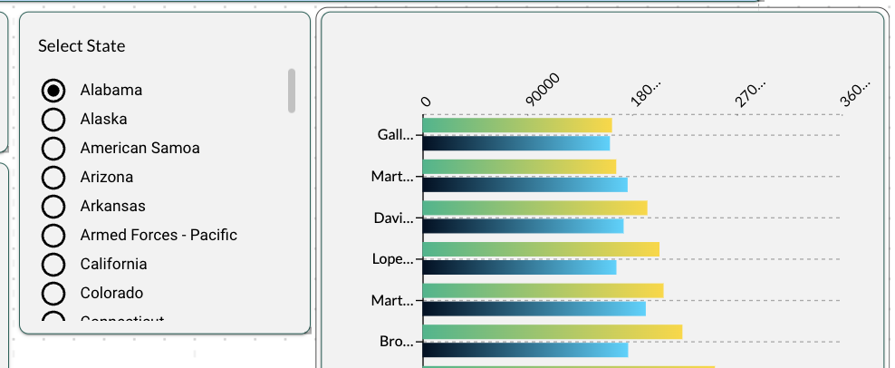
Checkbox
The Checkbox also lets you select values from a list, but you can select multiple values, Select All, or toggle to Unselect All.
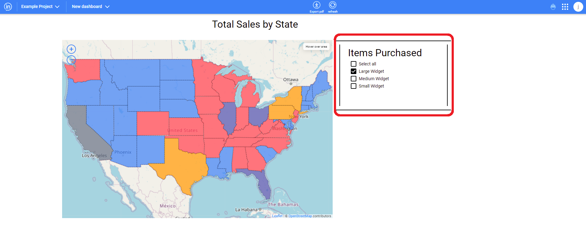
Multiselect
The Multiselect filter is similar to the Checkbox. The Multiselect is useful when there are multiple, even hundreds of selectable values for the user to choose from to filter by. Rather than occupy screen space showing all of the choices, the Multiselect shows these via a simple drop-down, and then only displays the selected items.
.png)
The Multiselect also allows you to quickly search among hundreds of filter choices by typing the first few letters of the value you’re seeking, it’s like a filter within a filter!
.png)
Slider
The slider functions by clicking an dragging the dot along the slider line to make different selections. It is commonly used for picking different time periods to show how data looked for each of them, or two can be used to set a start date and the other the end date to create ranges.
Text
The text variation of the prompt filter allows the user to type in the feature that they would like to filter to. An example is below. It also can auto-complete partial text strings and can generate a list that lets the user select an option.
Date Picker
The date picker prompt filter lets the user pick out a date from on a calendar view. See below for an example of one of these calendars. Multiple date pickers may also be used to select a date range.


InVault is Inzata’s module for managing user access and users themselves. In other words, it is the hub for controlling who a Full Access user allows to use the Inzata platform as well as for controlling what the Full Access user allows the other users to view, modify, or create. To open it, a user can click on inVault in the list of Inzata applications on the bottom of their project overview page. Alternatively, they click on the below button to see that same list of applications from anywhere within their project.

In inVault, Full Access users can create and modify user access privileges on a role basis using our click-and-drag approach in combination with our flexible data filters. These filters are the same platform-wide filters used in the other modules for tasks such as controlling what information is displayed in a visualization or what information shows in a table.
The other core feature in this module is user management. Using our user management system, a Full Access user can add or remove users to the Inzata platform. A Full Access user can also choose which Inzata modules a user can access as well as select parameters that specify certain user characteristics, allowing broad user access controls that are not limited to their data.


To add a user to Inzata, a Full Access user can click the “users” button in the left toolbar, then click the plus button in the “users” panel that opens.
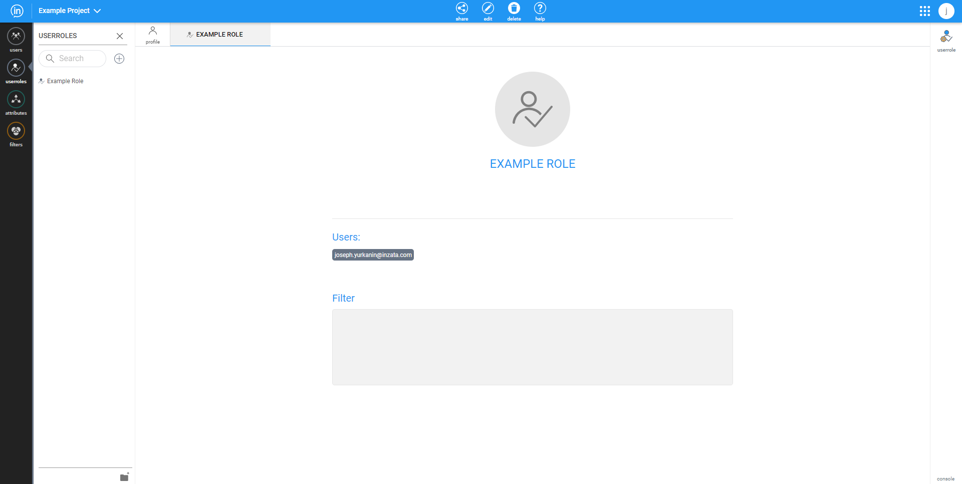
After that new user has been created, the new user page will open as seen above. This new user page is identical to the account page for an existing user except that a new user can edit the email field. To change any of the fields, enter the edit mode by clicking the edit button in the middle of the top menu bar. This will also make the “delete” button appear in the top menu bar. If a very large number of users needs to be added, then please contact your customer success manager.


The Inzata platform features the “share” button to enable Full Access users to control the read/write permissions on objects within the inVault, inFlow, and inBoard applications. The inModeler application also features a share button for setting user access controls, which is documented in the page “Share to a User Role (inModeler)”.
This is the complete list of objects, categorized by the app in which their permissions are set:
• inVault
• Users
• User Roles
• inFlow
• Flows
• inModeler
• Attributes
• Dashboards
• Facts
• Filters
• Folders
• Grids
• Labels
• Metrics
• inBoard
• Dashboards
How to use Share Dialog
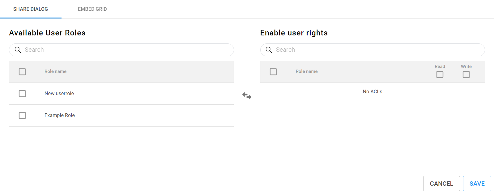
Above, the share dialog is shown for inVault, inFlow, and inBoard. To share a given object, check one or more of the boxes in the “Available User Roles” list, and click on the button in the center with arrows pointing left and right. This will move the selected available user roles to the “Enable User Rights” list. Conversely, a user role can be selected in the “Enable User Rights” list and moved back to the “Available User Roles” list by clicking the button with two arrows.
Next, the user rights are specified by selecting either, both, or neither of the read and write checkboxes. To check all the checkboxes in a column of checkboxes, mark the checkbox at the top of the column, next to column names. Lastly, click save to share the object to the user roles.


The landing page for a user opening inVault will be their own user profile as seen below, and it will always open in the standard “view” mode. If a user wants to make changes to a profile, then they will have to first enter “edit” mode by clicking the edit button in the middle of the top navigation bar, which can be seen below.

To view or edit a different account, the user can click on the “user” button in the left toolbar, and select one of the displayed profiles.
User Account Details

On a user account page, a Full Access user can view the the different details that describe how they can interact with the Inzata platform. These details are:
• User email – The email used to register the user. This also serves as the user’s username within Inzata.
• WebDav token – A token used for establishing a backend connection to the WebDav directory.
• Applications – list of applications that a user has access to and can see on their Inzata home page.
• User Roles – user groups that can define what data or objects a user can access.
• Params – defines the user level and status. They are:
Admin – can create and edit all objects.
Meta Data Admin – can see all data within Inzata.
Ad-hoc mode – can use ad-hoc mode in the inViewer app
Active – is a user that currently uses the account.


To add a user to Inzata, a Full Access user can click the “users” button in the left toolbar, then click the plus button in the “users” panel that opens.

After that new user has been created, the new user page will open as seen above. This new user page is identical to the account page for an existing user except that a new user can edit the email field. To change any of the fields, enter the edit mode by clicking the edit button in the middle of the top menu bar. This will also make the “delete” button appear in the top menu bar. If a very large number of users needs to be added, then please contact your customer success manager.


The user roles page within inVault is where a Full Access user can specify what data a given user can access. The area under “Users” on a user role page lists out the different users on a platform by their username. A user can be added to a user role’s users list by clicking on the “users” button on the left toolbar and then clicking and dragging a given user’s username to the area under “Users” on the user roles page. Alternatively, a user role can be assigned to a user on the user’s account page in inVault. Please see the User documentation for more details. On the user role page, another key feature is the area under “Filter” in the center space. This is where a user can write AQL filters or drag them from the filters panel that can be opened by clicking on the “filters” button on the left toolbar. To edit the user role name or user role description, a user can click on the “userrole” button near the top right of the page, which opens a panel containing the user role name, description, and ID. Of these, the ID is the only characteristic that cannot be changed after a user role is created. This panel also has a checkbox for “Public role” which controls whether or not the dashboards and data within them in a user role are available for external embedding. For more information on how you may embed your dashboards within a website or presentation, please contact your Inzata account manager. Lastly, the top menu bar has the “share” button while inVault is in edit mode. This opens the share dialog, which is further documented on the “share to a user role” page.

The user roles page within inVault is where a Full Access user can specify what data a given user can access.
The area under “Users” on a user role page lists out the different users on a platform by their username. A user can be added to a user role’s users list by clicking on the “users” button on the left toolbar and then clicking and dragging a given user’s username to the area under “Users” on the user roles page. Alternatively, a user role can be assigned to a user on the user’s account page in inVault. Please see the User documentation for more details.

On the user role page, another key feature is the area under “Filter” in the center space. This is where a user can write AQL filters or drag them from the filters panel that can be opened by clicking on the “filters” button on the left toolbar.
To edit the user role name or user role description, a user can click on the “userrole” button near the top right of the page, which opens a panel containing the user role name, description, and ID. Of these, the ID is the only characteristic that cannot be changed after a user role is created. This panel also has a checkbox for “Public role” which controls whether or not the dashboards and data within them in a user role are available for external embedding. For more information on how you may embed your dashboards within a website or presentation, please contact your Inzata account manager.
Lastly, the top menu bar has the “share” button while inVault is in edit mode. This opens the share dialog, which is further documented on the “share to a user role” page.


In the case of any suspected security issues or security related questions please reach out with screenshots or video to your assigned customer successes specialist. They will then either assist in answering any questions or raise the issue if required to the security team.
In the case of any security incidents a link to a new page detailing what the issue was, it’s current status, how it was discovered, how it was resolved, and when it was resolved.
Reported incidents will be documented below:
•No reported Issues


InVault has three main ways to restrict access: at the data level, at the dashboard level, and at the filter level. These can all be used simultaneously, but it is recommended that users utilize only one of these approaches for each user role. Multiple user roles should then be created if multiple approaches to data restriction are used.
If a user is in two or more user roles that have an overlap in their restrictions, then the resulting access a user has is determined by the following set of rules:
• Data: overlapping data access controls result in a combination or union of the different access controls.
• Dashboards: overlapping dashboard access controls result in a combination or union of the different data access controls.
• Filters: overlapping data filter controls result in a intersection of the different data filter controls.
Additionally, a user can be given access to a dashboard even if the user does not have the rights to access all the data present in the dashboard, but the data that a user does not have the rights to access will not load. This can result in dashboards only loading partially if the user does not have the rights to access all of the data. The benefit of that is that multiple dashboards do not necessarily need to be made for multiple users that have varying levels of data access rights; instead, the users will only see what they are allowed to see in one dashboard.


The inModeler app on the Inzata platform features a “share” button to enable Full Access users to control the read/write permissions on objects within it. In inModeler, these are the objects that can be assigned read/write permissions with user roles:
• Attributes
• Dashboards
• Facts
• Filters
• Folders
• Grids
• Labels
• Metrics
How to Share an Object to a User Role

To share a object to a user role, a user must first enter the “objects” panel in the inModeler application. In this panel, there are checkboxes next to the data dictionary list. These checkboxes are used to select which objects a user wants to share or unshare. Upon selecting one or more objects, the user will see the mostly empty panel containing the phrase “No selected objects” change to look like the below:

By clicking on the circular share button in the newly-populated selection details panel, the user will open the sharing dialog for inModeler.

The inModeler sharing dialog begins by having the user select which role they would like to share the data with. Doing so will generate a second and third column. The second column of information is the list of users within the selected user role in order to allow for previewing the users who would have access to the data to be shared. The third column of in the share dialog that appears after selecting a user role has the title “Enable Role Rights”. These role rights are the read/write permissions associated with the selected objects. To commit the changes to the user role’s data access, click the blue share button. Also, if the user role rights need to be revoked, then the “remove role from objects” button can be clicked.
