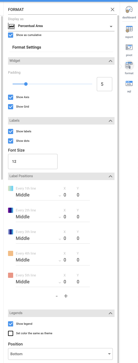
Chart demonstrating a percentage-stacked area chart, a variation of the stacked area chart where each data series is visualized as a running percentage of the total. The areas are individually scaled so that they stacked up to 100.
Special Options and Parameters:
• Show as cumulative – If set then graph shows cumulative values instead original values
• Labels
• Show labels – If set then labels are displayed, their size and position should be changed in section Label Positions for each data set
• Legends
• Show legend – If set then legends are displayed, default is true
• Size – Set size of legend text
• Set color of the same as theme – If set then text of legend is the same color as Percentual Area graph
• Axis Labels
• Min value, Max value – Defines range of values on Y axis. Default is set to auto.
• Show Axis – If set then graph axises are displayed
• Show Y axis labels – If set then labels on axis Y are displayed
• Size – Set size of text of labels on Y axis
• Show Y axis labels – If set then labels on axis X are displayed
• Size – Set size of text of labels on X axis
• Show Grid – If set then grid on graph is displayed. Default is the Percentual Area set.
• Color theme
• Select color palette – Sets color palette for stacked area graph. User can modify Custom palette