The role that data analytics plays in modern business is becoming increasingly appreciated. According to one report, the per-dollar-spent ROI gained from using analytics & increased from $10.66 in 2011 to $13.01 in 2014. Working with analytics is one thing, but translating data-driven insights into useful work products is quite another. That’s where data visualization enters the picture. Data visualization is an opportunity to go beyond dumping data into an Excel spreadsheet. With the right approach, data visualizations can improve a company’s efficiency and effectiveness in the following ways.
Shorter and Better Meetings
At many organizations, analytics need to be converted into work products that are then presented to stakeholders at meetings. How you choose to go about presenting the insights you’ve gained can influence the meetings you have. Research from the American Management Association has shown that data visualizations were able to:
- Shorten meeting times by 24%
- Provide 43% greater effectiveness in persuading audiences
- Bring about 21% more consensus in decision-making
- Improve problem-solving by 19%
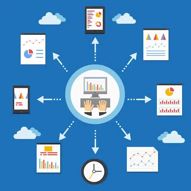
Simply put, coming into a meeting with effective data visualizations makes a meeting faster and more useful. Bear in mind that modern data visualization techniques can yield a lot more than just a few pie, bar and line charts. Today’s data visualization techniques include producing items like:
- Interactive dashboards
- Real-time updates
- Geographic data
- 3-D maps
- Cloud and bubble charts
- Tree maps
Visual Learning
Most human beings cannot listen to or read large amounts of data and readily make sense of what it really means. Human beings tend to benefit from having a sense of how things relate over time and through space, and visualization examples help. In visualization examples, an alluvial diagram of events can help people understand how one thing flows from one place to a new one.
For some sense of how visualization examples can help understanding, consider this diagram of asylum seeking in Europe. Hearing that certain groups are more likely to have their applications accepted based on their origin and destination is one thing. Conversely, being able to study a diagram that shows the flow of people and their acceptance and rejection statuses makes it easier to process the idea.
There are four core data visualization tools that can be used to represent insights. These are:
- Color
- Shape
- Visual movement
- Spatial relationships
Just being able to differentiate to color-coded data points may go a long way to increase your understanding of the meaning of a piece of research. A company’s data team might visualize questions about new and established customers, for example, by coloring new users with red dots and old users with blue dots. This can make it easier to follow along as you see how changes in the customer base have shifted over time. Compare that to trying to fish out data from a spreadsheet.
Long-Term Engagement
Particularly in the era where data visualization tools like dashboards can be made available to everyone who has a phone, tablet or laptop, there’s a lot to be said for the engagement value of data visualizations. Let’s say a CFO who was presented with a report at a meeting wants to refer back to materials from the session. Rather than having to sift through papers or ask someone to email them a particular slide, they can simply pull up the company’s data visualization tools and check the presentation there.
More importantly, increased interactivity can keep decision-makers engaged with data. Being able to click on items and see how different factors shift can improve engagement significantly. Especially when working with parties that aren’t 100% sold on your ideas, it can be helpful for them to scan and interact with data over several iterations.
People also enjoy interacting with data. Switching back and forth using the data visualization tools between an operations current-year report and one from last year, for example, can foster engagement and interest.
Promoting Culture Change
Becoming a data-centric organization requires bringing along decision-makers, employees, contractors, customers and other stakeholders. You want to onboard as many of these parties as possible as your company starts valuing data as a part of its decision-making process. Whenever possible, you also don’t want to leave people behind.
Data visualizations can help folks get onboard with a culture change that’s moving toward data and analytics. Improvements in engagement, learning and efficiency can help them feel why the culture change has to happen and how it benefits them.
Stakeholders will eventually become more proficient as they settle into patterns of using visualizations. They will come to understand and apply statistical concepts such as:
- Regression to the mean
- Outliers
- Hypothesis testing
- Statistical confidence and uncertainty
They’ll also begin to appreciate why certain data visualization techniques were employed.
Over time, analytics insights can become a product that stakeholders start to demand rather than dread seeing. People will whip out their phones and tablets to check up on the state of the company in real-time via dashboards. Instead of feeling like the culture change has been imposed upon them, they will start to see it as just something they can’t do without.
Read More Here
