Categories
Artificial Intelligence

The Future of Digital Transformation: 2023 and Beyond

As organizations begin to move full throttle into enhancing internal and external business outcomes, the term ‘digital transformation’ has gained supreme status into the particular tech lexicon. Digital transformation has become an important strategy for organizations for years and is predicted to be a crucial factor in the competition of who remains in the business.

The term digital transformation is defined as the particular integration of technology into all areas of the business, fundamentally changing how it operates and delivers value to its customers. Digital transformation is also a cultural change that requires organizations to continually challenge the status quo, experiment, and get comfortable with failure even if that happens.

Research analysts believe that when it comes to a timeframe, 85% of key decision makers feel they have only 2 years to get in order to grips with digital transformation. So, while the past few years have seen some movement in digital transformation, there’s now an urgency, as time becomes the new benchmark associated with which businesses stay in the race and which ones drop out.

Important Change For Every Business

Digital transformation has increasingly become very important for every business, from small businesses to large enterprises. This is quickly becoming widely accepted with the increasing number of panel discussions, articles, and published studies related to how businesses can remain relevant as the operations and jobs become increasingly digital.

Many business leaders are still not clear with what digital transformation brings to the table, while many believe that it is all about the business moving towards the cloud. Business leaders in the C-Suite are still in two minds of the changes they have to take into their strategies and forward way of thinking. Numerous believe that they should be hiring an external agency for change implementation, whilst many still question about the costs involved in the particular process.

As every organization is different, so are their digital change requirements. Digital transformation has the long legacy and extends much beyond 2023. It is a change which requires businesses to experiment often, get comfortable with failing, and continually problem the status quo. It also means that companies have to move beyond the age-old processes and look out for new challenges and changes.

Here is what the essence of digital transformation brings to the table:

• Customer experience

• Culture and leadership

• Digital technology integration

• Operational Agility

• Workforce enablement

Digital transformation can be predominantly used within a business context, bringing change into the organizational structure, impacting governments, public sector agencies and enterprises which are involved in tackling societal challenges such as tracking pollution, the sustenance levels and so on by leveraging one or more of these existing plus emerging technologies.

Digital Transformation 2023 and Beyond

Because digital transformation techniques mature, and its status as an innovation driver becomes a new standard, leading IT professionals are usually asking – what’s next? If the particular lesson from the last decade was the power of digital flexibility, how can it create a more efficient and productive workforce moving forward?

Today’s businesses are as diverse as the clients they serve. From the cloud-native startup to the legacy enterprise, as companies have embraced the value of electronic flexibility, an overwhelming majority have embarked on digital modification journeys.

One critical aspect of the approach to digital transformation is that IT departments are progressively expected to take the greater role in driving overall company goals.

As technology gets more advanced, the human element becomes significantly vital. The digital transformation saw a seismic shift in the way IT leaders strategy their infrastructure, but workplace transformation requires a deep understanding associated with the unique way’s individuals approach productivity.

In essence, many businesses have begun their journey, and have started making changes in their strategies within the business’s large digital programs adapting to AI initiatives and modern technologies. In most cases, it is simply a humble beginning and a whole lot more needs to be achieved.

Technologies are evolving and changing, challenging the particular fundamental strategic and operational processes that have defined organizations up until now.

In the times to come, enterprises will no longer have separate digital and AI strategies but instead will have to integrate corporate strategies deeply infused with changing technologies.

Categories
Artificial Intelligence

Is AI Changing the 80/20 Rule of Data Science?

Cleaning and optimizing data is one of the biggest challenges that data scientists encounter. The ongoing concern about the amount of time that goes into such work is embodied by the 80/20 Rule of Data Science. In this case, the 80 represents the 80% of the time that data scientists expend getting data ready for use and the 20 refers to the mere 20% of their time that goes into actual analysis and reporting.

Much like many other 80/20 rules inspired by the Pareto principle, it’s far from an ironclad law. This leaves room for data scientists to overcome the rules, and one of the tools they’re using to do it is AI. Let’s take a look at why this is an important opportunity and how it might change your process when you’re working with data.

The Scale of the Problem

At its core, the problem is that no one wants to be paying data scientists to prep data anymore than is necessary. Likewise, most folks who went into data science did so because deriving insights from data can be an exciting process. As important as diligence is to mathematical and scientific processes, anything that allows you to do more diligence and to get the job done faster is always a win.

IBM published a report in 2017 that outlined the job market challenges that companies are facing when hiring data scientists. Growth in a whole host of data science, machine learning, testing, and visualization fields was in the double digits year-over-year. Further, it cited a McKinsey report that shows that, if current trends continue, the demand for data scientists will outstrip the job market’s supply sometime in the coming years.

In other words, the world is close to arriving at the point where simply hiring more data scientists isn’t going to get the job done. Fortunately, data science provides us with a very useful tool to address the problem without depleting our supply of human capital.

Is AI the Solution?

It’s reasonable to say that AI represents a solution, not The Solution. With that in mind, though, chipping away at the alleged 80% of the time that goes into prepping data for use is always going to be a win so long as standards for diligence are maintained.

Data waiting to be prepped often follow patterns that can be detected. The logic is fairly straightforward, and it goes as follows:

Have individuals prepare a representative portion of a data set using programming tools and direct inspections.

Build a training model from the prepared data.

Execute and refine the training model until it reaches an acceptable performance threshold.

Apply the training model and continue working on refinements and defect detection.

Profit! (Profit here meaning to take back the time you were spending on preparing data.)

There are a few factors worth considering. First, depending on the size of the task and its overall value, it has to be large enough that a representative sample can be extracted from the larger dataset. Preferably, you don’t want it to be 50% of the overall dataset, otherwise, you might be better off just powering through with a human/programmatic solution.

Second, some evidence needs to exist that shows the issues with each dataset lend themselves to AI training. While the power of AI can certainly surprise data scientists in terms of improving processes such as cleaning data as well as finding patterns, you don’t want to be on it without knowing that upfront. Otherwise, you may spend more time working with the AI than you gain for doing analysis.

Conclusion

The human and programming elements of cleaning and optimizing data will never go away completely. Both are essential to maintaining appropriate levels of diligence. Moving the needle away from 80% and toward or below 50%, however, is critical to fostering continued growth in the industry. 

Without a massive influx of data scientists into the field in the coming decade, something that does not appear to be on the horizon, AI is one of the best hopes for turning back the time spent on preparing datasets for analysis. That makes it an option that all projects that rely on data scientists should be looking at closely.

Categories
Business Intelligence Data Analytics Data Visualization

How to Avoid the 5 Most Common Data Visualization Mistakes

Why Do Data Visualization Mistakes Matter?

Although data visualization has been in place since 1780, when the first bar chart was produced by a toy company in Scotland, the practice is still imperfect. Both intentional, misleading data visualization “mistakes” as well as honest mistakes made during output are more common in the business world than one might think.

Intentional “Errors”

When an organization wants to get a point across without providing much evidence, “statistical manipulation” is commonplace. Though a dishonest practice, it’s still widely seen in business today. Typically, organizations will leave out the scale on a bar graph or pie chart. Then, they will intentionally emphasize disparities or relationships in the data, with no actual scale to which viewers can compare each bar.

Virtually any data set can be made to look off-target using this method. While experienced analysts would be able to question or see right past this type of reporting, individuals unfamiliar with the data may not. As a side effect, this manipulation and bias could lead to a loss of credibility or potential revenue.

Unintentional Errors

The “weakest link” in the chain of statistical reporting is often the human generating the report. Even if there’s no reason for the person making the report to be misleading, their reports could unintentionally appear this way. Most often due to a lack of experience or context on the matter, these mistakes look deceiving and can result in a loss of integrity.

Who is Responsible for These Mistakes?

Most organizations have several layers of employees. While a report may be generated by an individual analyst, the responsibility for its contents is typically on the department that ends up releasing it. 

It can be hard to take a step back and think objectively when you’re the one working so closely with the data. This is why it’s critical to get multiple perspectives on the veracity of your reports before releasing them. Alternatively, you may choose to train an internal department that reviews every data set before it’s released to the public or another company.

What Are the Five Most Common Mistakes?

While there is an abundance of potential mistakes that could occur during the creation of a data set, some are more common than others. Here are the five issues we see the most often when it comes to data visualizations. They are important to avoid as all of these can be harmful to a company’s reputation and credibility overall.

1. Unlabeled X-Axis Start

A common technique in intentional data distortion, this is an abuse of the common conclusion that readers would draw from your chart. Unless otherwise marked, readers assume that your X-axes start at 0. Starting them at a higher number to emphasize smaller disparities is beyond merely “tweaking” a chart.

2. An Inverted Y-Axis

Elementary school-level math taught most of us that our X-axis and Y-axis should start at zero and go up from there. If an analyst wants to convey a message that’s the opposite of the results, flipping an axis is a great way to do that. However, this method rarely pays off due to the irregular visualization. Experienced viewers will undoubtedly detect this. 

3. Scale Truncation

We all expect bar charts to be linear in nature. However, if someone generating the chart wants a number to appear lower than it actually is, truncating it is the way to go. This is when you might see a small squiggle in a bar chart that randomly cuts out a large number. Ostensibly, the reason is usually to “keep it all on one page.” However, simply changing the scale rather than truncating arbitrary columns is how to keep it honest.

4. Cherry-Picking Scales

This is when a chart has data in arbitrary units. These are typically (but not always) intentionally engineered to make two scales either as close to each other as possible or as far away from each other as possible. It’s important to use the same units wherever possible. If it’s not possible, this must be clearly distinguished.

5. Including Too Much Data

Not always done intentionally but confusing nonetheless, this is when a chart has far too much data for the average reader to interpret. Charts should be kept as simple as possible. This will allow viewers to quickly and easily understand the information presented. 

Categories
Big Data Business Intelligence Data Analytics

Augmented Analytics: The Missing Piece of Business Intelligence

Can you believe it? We’ve made it to 2023. And truth be told, it’s a pretty sci-fi time to live. People carry around pocket computers, celebrities are “beamed” into performances, and increasing numbers of people consider phone calls quaint.

The same rate of technological progress has also consumed the business world. Like phone calls, companies that still use analog methods are throwbacks. These days, big data and augmented analytics are fueling the market, and businesses that refuse to adapt may find themselves at the back of the pack.

What Is Augmented Analytics?

Augmented analytics is shorthand for “using advanced technology to squeeze more out of business analysis efforts.” Artificial intelligence and machine learning are now commonplace, and they’ve transformed the data analysis landscape. Not only can we glean valuable insights about product pipelines, back-office operations, and customer interactions, but automation possibilities have also improved significantly.

Augmented analytics programs touch every point of the data lifecycle, from preparation to implementation.

How Can Augmented Analytics Help Your Company?

Augmented analytics isn’t just the buzzword of the quarter. Instead, think of it as the next “Internet.”

Back in the day, many companies didn’t see the value of the Internet or websites and cynically dismissed both as fads. When it became evident that the “World Wide Web” was here to stay, businesses that didn’t establish a digital foothold were caught on the backfoot — and catching up was prohibitively expensive in many cases.

In a way, we’re at a similar inflection point regarding big data. Businesses that got in early are reaping the financial benefits and winning market share. Companies that wait too long may find themselves hopelessly behind the eight ball.

How do big data and augmented analytics give organizations an edge? They uncover hidden operational pitfalls and possibilities, deliver value faster, and increase data intelligence.

Uncovers Hidden Pitfalls and Possibilities

Augmented analytics provides a clearer, more dynamic view of a company’s operations and sales. As such, it’s easier to spot and leverage trends.

Delivers Value Faster

Analog back-office operations consume a lot of resources and time. After all, manually entering every record, one by one, will take significantly more hours than a semi-automated system that can cycle through data by the microsecond.

Increased Data Intelligence

Computers can do amazing things. Heck, commonplace systems are smarter than we are in many regards. Marketing models can pinpoint potential customers and clients, increasing conversion rates and, ultimately, your bottom line.

Augmented Analytics Best Practices

It’s important not to conflate augmented analytics with full automation. Though the latter informs and supports the former, augmented analytics systems require people power. So when transferring to an augmented analytics system, hew to these three best practices

  1. Start Small: Don’t try to implement a new system all at once. Start with a small project that best serves your key performance indicators.
  2. Collaborate: Lack of transparency can hamstring an AI implementation. Make a seat at the table for every department that will use and benefit from the data. The best systems are ones that include input from across the board.
  3. Educate Employees About the Advantages of a Data-Driven Culture: The more employees understand the power of analytics, the more enthusiastic they’ll be about the process. After all, if the company prospers, that’s great for them, too!

How Is Augmented Analytics Transforming Business Intelligence and Data Analytics?

Augmented analytics is the third stage of the business intelligence metamorphosis.

  • First Stage Is Traditional Business Intelligence: The first iteration of business intelligence is known as “the traditional stage.” Under these setups, data engineers mold static dashboards, reports take days to prepare, and cross-departmental collaborations are rare. While most traditional processes feature elementary computer modeling, data entry and manipulation are 100% manual.
  • Second Stage Is Self-Service Business Intelligence: Self-service business intelligence options grew up alongside web 2.0. Hardware and software updates simplify the informational pipeline and provide better modeling, reporting, and data analysis. Automation is more prevalent for routine tasks under second-stage systems. However, the digital apparatus is limited to drag-and-drop options that may require advanced knowledge.
  • Third Stage Is Augmented Analytics: Augmented analytics programs leverage artificial intelligence to streamline the data prep stage, allowing for real-time analysis. Moreover, since the systems are highly intuitive, they’re accessible to more employees. To state it another way: employees no longer need to be data scientists to be part of — and benefit from — a company’s analytics pipeline.

If you’re contemplating an augmented analytics upgrade, it’s wise to consult with industry-leading platforms, like Inzata Analytics.

Categories
Data Preparation Data Quality

Top 3 Risks of Working with Data in Spreadsheets

Microsoft Excel and Google Sheets are the first choices of many users when it comes to working with data. They’re readily available, easy to learn, and support universal file formats. When it comes to using a spreadsheet application like Excel or Google Sheets, the point is to present data in a neat, organized manner that is easy to comprehend. They’re also on nearly everyone’s desktop and were probably the first data-centric software tool any of us learned.

While spreadsheets are popular, they’re far from the perfect tool for working with data. There are some important risks to be aware of. We’re going to explore the top three things you need to be aware of when working with data in spreadsheets.

Risk #1: Beware of performance and data size limits in spreadsheet tools 

Most people don’t check the performance limits in spreadsheet tools before they start working with them. That’s because the majority won’t run up against them. However, if you start to experience slow performance, it might be a good idea to refer to the limits below to measure where you are and make sure you don’t start stepping beyond them.

Like I said above, spreadsheet tools are fine for most small data, which will suit the majority of users. But at some point, if you keep working with larger and larger data, you’re going to run into some ugly performance limits. When it happens, it happens without warning and you hit the wall hard.

Excel Limits

Excel is limited to 1,048,576 rows by 16,384 columns in a single worksheet.

  • A 32-bit Excel environment is subject to 2 gigabytes (GB) of virtual address space, shared by Excel, the workbook, and add-ins that run in the same process.
  • 64-bit Excel is not subject to these limits and can consume as much memory as you can give it. A data model’s share of the address space might run up to 500 – 700 megabytes (MB) but could be less if other data models and add-ins are loaded.

Google Sheets Limits

  • Google Spreadsheets are limited to 5,000,000 cells, with a maximum of 256 columns per sheet. (Which means the rows limit can be as low as 19,231 if your file has a lot of columns!)
  • Uploaded files that are converted to the Google spreadsheets format can’t be larger than 20 MB and need to be under 400,000 cells and 256 columns per sheet.

In real-world experience, running on midrange hardware, Excel can begin to slow to an unusable state on data files as small as 50MB-100MB. Even if you have the patience to operate in this slow state, remember you are running at redline. Crashes and data loss are much more likely!

(If you’re among the millions of people who have experienced any of these, or believe you will be working with larger data, why not check out a tool like Inzata, designed to handle profiling and cleaning of larger datasets?)

Risk #2: There’s a real chance you could lose all your work just from one mistake

Spreadsheet tools lack any auditing, change control, and meta-data features that would be available in a more sophisticated data cleaning tool. These features are designed to act as backstops for any unintended user error. Caution must be exercised when using them as multiple hours of work can be erased in a microsecond.

Accidental sorting and paste errors can also tarnish your hard work. Sort errors are incredibly difficult to spot. If you forget to include a critical column in the sort, you’ve just corrupted your entire dataset. If you’re lucky enough to catch it, you can undo it, if not, that dataset is now ruined, along with all of the work you just did. If the data saves to disk while in this state, it can be very hard, if not impossible, to undo the damage.

Risk #3: Spreadsheets aren’t really saving you any time

Spreadsheets are fine if you just have to clean or prep data once, but that is rarely the case. Data is always refreshing, new data is continually coming online. Spreadsheets lack any kind of repeatable processes and or intelligent automation.

If you spend 8 hours cleaning a data file one month, you’ll have to repeat nearly all of those steps the next time a refreshed data file comes along. 

Spreadsheets can be pretty dumb sometimes. They lack the ability to learn. They rely 100% on human intelligence to tell them what to do, making them very labor-intensive.

More purpose-designed tools like Inzata Analytics allow you to record and script your cleaning activities via automation. AI and Machine Learning let these tools learn about your data over time. If your Data is also staged throughout the cleaning process, and rollbacks are instantaneous. You can set up data flows that automatically perform cleaning steps on new, incoming data. Ultimately, this lets you get out of the data cleaning business almost permanently.

To learn more about cleaning data, download our guide: The Ultimate Guide to Cleaning Data in Excel and Google Sheets

Categories
BI Best Practices

What Qualities are Most Important in a Business Intelligence Project Manager?

What do Data Analysts think about working with Project Managers for BI projects? What makes a good manager and what are some signs of a poor Project Manager?

These are our top three characteristics. And notice they have more to do with philosophy than skills like who can build the longest Gantt Chart.

  1. Vision,
  2. Project understanding
  3. Realistic expectations
  • Having a sense of solidarity with the team, win together, perform together, not be somebody who would throw the team under the bus
  • Having an understanding of the application is very important. If possible, the project should be trained as any other user of the application, and be able to experience it as a user would.  We’ve worked with teams where the PM had no understanding about the application and it made them unable to set realistic expectations. Over time, this became a major liability and cost them the trust of the team.
  • Agile is a well-known standard in any IT environment. It’s becoming socially unacceptable for BI project managers to not know Agile. A good PM focuses on the work and how to get it done, doesn’t pressure team members to do the impossible, takes the time to listen and understand what you’re telling them, helps to remove obstacles, stands up for the truth, and doesn’t make tasks “57% complete”.

In one case I had a BI PM, in the finance vertical, who was extremely helpful. He was very savvy, understood the politics in large corporations and really lead the project to a successful outcome (and around several challenges). I’ve also worked with PMs with software development backgrounds who pushed antiquated waterfall approaches in BI and this had a really negative impact on the team. The PM, in this case, was respected and influential with leadership – but was not democratic with the team, and led everyone in the wrong direction. Given his influence, we went down the wrong path even faster and further before we could recover (which included switching out the PM).

  • It’s not important for the PM to have extensive technical knowledge.  They’re responsible for delivering good work on the proper timeline, not the tech.
  • Teams of analysts expect the requirements to be laid out, and any reference info that you can find attached to the requirements.
  • Requirements are everything with a BI project. Having them complete and at the proper level of details is essential to success. Not hearing about a “must have” feature until late in development is what ruins schedules and frustrates work teams. Also, don’t worry about having super specific requirements docs.
  • Devs don’t want to read them. Especially for dashboards, requirements should be as specific as they need to be to communicate concepts. We don’t need three paragraphs describing what a filter control does. A PowerPoint with sketches and notes is often more effective than a 50+ page requirement doc.
  • Be creative with requirements. Take out your phone and snap photos of people’s whiteboards with critical requirements on them. Some people are more verbal, some are more visual. If a client just drew you something for an hour, you’d better take a photo of it and share it with us, don’t try to document it in words. You’ll get it wrong.
  • Finally, resourcefulness and attention to detail are also appreciated. If the PM does not know where something is, they can at least include a link to a contact who might know. 
  • Good PMs don’t make the analysts stand around waiting for more work. Have a handful of tickets ready to go, because while you’re busy in other all-day meetings the team will be idle, waiting for more assignments.
  • A good BI PM always assigns out a reasonable amount of work, just enough to keep people busy plus a little bit more.  This makes maximum use of people’s time and avoids analyst time being wasted resulting in more work done in less time and far fewer nights- and weekends-worked at the end.
  • Analysts and Devs, myself included, can be dramatic. Expect it. Don’t get offended. But if you treat us well and make our lives easier by setting us up well we will move mountains for you.

Categories
Big Data Data Analytics Data Quality

Optimize big data solution: warehouses, lakes, lakehouses compared.

Which Big Data Solution Is Best for You? Comparing Warehouses, Lakes, and Lakehouses

Big data makes the world go round. Well, maybe that’s an exaggeration — but not by much. Targeted promotions, behavioral marketing, and back-office analytics are vital sectors fueling the digital economy. To state it plainly: companies that leverage informational intelligence significantly boost their sales.

But making the most of available data options requires tailoring a platform that serves your company’s goals, protocols, and budget. Currently, three digital storage options dominate the market: data warehouses, data lakes, and data lakehouses. How do you know which one is right for you? Let’s unpack the pros and cons of each.

Data Warehouse

Data warehouses feature a single repository from which all querying tasks are completed. Most warehouses store both current and historical data, allowing for a greater breadth of reporting and analytics. Incoming items may originate from several sources, including transactional data, sales, and user-provided information, but everything lands in a central depot. Data warehouses typically use relational tables to build profiles and analysis metrics.

Note, however, that data warehouses only accommodate structured data. That doesn’t mean unstructured data is useless in a warehouse environment. But incorporating it requires a cleaning and conversion process.

Pros and Cons of Data Warehouses

Pros

  • Data Standardization: Since data warehouses feature a single repository, they allow for a high level of company-wide data standardization. This translates into increased accuracy and integrity.
  • Decision-Making Advantages: Because of the framework’s superior reporting and analytics capabilities, data warehouses naturally support better decision-making.

Cons

  • Cost: Data warehouses are powerful tools, but in-house systems are costly. According to Cooldata, a one-terabyte warehouse that handles about 100,000 queries per month can run a company nearly $500,000 for the initial implementation, in addition to a sizable annual sum for necessary updates. However, new AI-driven platforms allow companies of any size to design and develop their data warehouse in a matter of days, plus at a fraction of the price. 
  • Data Type Rigidity: Data warehouses are great for structured data but less so for unstructured items, like log analytics, streaming, and social media bits. Resultantly, it’s not ideal for companies with machine learning goals and aspirations.

Data Lake

Data lakes are flexible storage repositories that can handle structured and unstructured data in raw formats. Most systems use the ELT method: extract, load, and then transform. So, unlike data warehouses, you don’t need to clean informational items before routing them to data lakes because the schema is undefined upon capture.

At first, data lakes may sound like the perfect solution. However, they’re not always a wise choice — data lakes get very messy, very quickly. Ensuring the integrity and effectiveness of in-house systems takes several full-time workers who do nothing else but babysit the integrity of the lake.

Pros and Cons of Data Lakes

Pros

  • Ease and Cost of Implementation: Data lakes are much easier to set up than data warehouses. As such, they’re also considerably less expensive.
  • Flexibility: Data lakes allow for more data-type and -form flexibility. Moreover, they’re equipped to handle machine learning and predictive analytics tasks.

Cons

  • Organizational Hurdles: Keeping a data lake organized is like trying to keep a kid calm on Christmas morning: near impossible! If your business model requires precision data readings, data lakes probably aren’t the best option.
  • Hidden Costs: Staffing an in-house data lake pipeline can get costly fast. Data lakes can be exceptionally useful, but they require strict supervision. Without it, lakes devolve into junkyards.
  • Data Redundancy: Data lakes are prone to duplicate entries because of their decentralized nature.

Data Lakehouse

As you may have already guessed from the portmanteau, data lakehouses combine the features of data warehouses and lakes. Like the former, lakehouses operate from a single repository. Like the latter, they can handle structured, semi-structured, and unstructured data, allowing for predictive analytics and machine learning.

Pros and Cons of Data Lakehouses

Pros

  • Cost-Effective: Since data lakehouses use low-cost, object-storage methods, they’re typically less expensive than data warehouses. Additionally, since they operate off a single repository, it takes less manpower to keep lakehouses organized and functional.
  • Workload Variety: Since lakehouses use open-data formats and come with machine learning libraries like Python/R, it’s easier for data engineers to access and utilize the data.
  • Improved Security: Compared to data lakes, data lakehouses are much easier to keep secure.

Cons

  • Potential Vulnerabilities: As with all new technologies, hiccups sometimes arise after implementing a data lakehouse. Plus, bugs may still lurk in the code’s dark corners. Therefore, budgeting for mishaps is wise.
  • Potential Personnel Problems: Since data lakehouses are the new kid on the big data block, it may be more difficult to find in-house employees with the knowledge and know-how to keep the pipeline performing.

Big data collection, storage, and reporting options abound. The key is finding the right one for your business model and needs.

Categories
Business Intelligence Data Analytics

3 Strategies to Accelerate Digital Transformation

Three Strategies to Accelerate Digital Transformations

We’re well into the Digital Age, but some businesses have yet to harness computing power. Sure, they may be drowning in company devices and have accounts with the “right” platforms, but are they properly leveraging the tools they have? Surprisingly, in many instances, the answer is “no.”

Making a true digital transformation requires long-term strategic planning and precise implementation.

What Is Digital Transformation?

Digital transformation is the process of upgrading your business operations to fully leverage the power of computing and business intelligence systems. The metamorphosis from analog to digital involves more than just stocking up on the latest and greatest devices. Instead, digital transformations are complete procedural overhauls informed by a 360-degree analysis of your market and company.

What Are the Fundamental Tiers of a Digital Transformation?

Computer engineers typically divide digital transformation projects into four tiers:

  • Operational Efficiencies: How can we improve our production or service pipeline with enhanced digital integration?
  • Advanced Operational Efficiencies: How can we collect, analyze, and leverage information gleaned from customer and client interactions with our products and services?
  • Data-Driven Services Rooted in Value Chains: How can we leverage big data to create new market-making, customer-oriented services?
  • Data-Driven Services Rooted in Digital Enhancements: How can we collect market-making data, via the products and services we create, by digitally enhancing our offerings?

Why Is it Important to Invest in the Right Software and Tools?

One of the biggest mistakes companies make is not investing in the right tools and software for their operation. What’s “new” isn’t always ideal, and focusing on the needs of your business should be the top priority. Before committing to a digital transformation, ask yourself questions like:

  • How much money can we safely commit to the project without overextending the business?
  • What sectors of our business are working well and which need optimizing?
  • What are our team member’s computer competencies? What is the learning curve?

How Can You Accelerate Your Company’s Digital Transformation?

Analyze Operations: The first step in a digital transformation is analysis. Whether you conduct an in-house review or hire a skilled third party that helps companies navigate wall-to-wall computational upgrades, it’s essential to start with an accurate assessment of the business’s operations.

Analyze Customers: After you take stock of back-office operations, it’s time to peel back the layers on your customers. Invest in a thorough examination of how the people who use your services and products interact with them.

Match Competencies and Leverage Technologies: Once you have a 360-degree view of your operations and customer interaction, it’s time to pick your technologies. Finding solutions that fit your team’s budget and skills will help ensure the best possible outcome.

We are well into the digital age, and waiting to embark on a digital transformation is no longer an option. Tackle one step at a time, enlist experts, and take the plunge.

Categories
BI Best Practices Business Intelligence

How to Develop Your BI Roadmap for Success

Business intelligence is more than just a buzzword. Today’s BI apps and offerings give companies the edge they need to stay competitive in a market where customers increasingly tune out information that’s not tailored to their likes, needs, and desires. But implementing a business intelligence strategy is a resource-intensive process, and getting it right takes proper planning.

What Is Business Intelligence?

Business intelligence is the process of leveraging data to improve back-office efficiency, spot competitive advantages, and implement profitable behavioral marketing initiatives. Organizations that fail to institute proper business intelligence strategies:

  • Miss out on strategic growth opportunities
  • Routinely fall short on customer satisfaction
  • Overspend on promotional projects with little ROI
  • Remain reactive instead of proactive

Why Do We Need a Business Intelligence Strategy?

Business intelligence initiatives are not plug-and-play propositions, and instituting a BI process without a proper plan is like setting sail with broken navigational equipment. Sure, you can use the sun as a general guide, but the chance of landing at your exact destination is between slim and none. The same goes for businesses without clear and defined BI strategies. Departments will inevitably veer off course and toil toward different ends, and the data quality almost always suffers.

Seven Steps to a Successful BI Strategy

Now that we’ve established why business intelligence strategies are so important, how do you get started when implementing one? Consider these seven critical steps when defining your roadmap.

Step #1: Survey the Landscape

One of the biggest mistakes companies make when embarking down a BI path is failing to survey the landscape. It may sound cliche, but understanding where you are in relation to your desired destination is of paramount importance. During this stage, answer questions like:

  • What obstacles are we likely to face during this process?
  • Where are our competitors, and what are they doing that we’re not?
  • What resources are available that fit our budget?
  • How can we leverage data to increase sales and improve efficiency?

Step #2: Identify Objectives

Once you’ve got a handle on your niche’s market topography, it’s time to set goals. Too often, organizations and companies don’t get specific enough in this phase. While “making more money” or “securing more members” are, technically, goals, they’re too broad. During this stage, drill down your objectives. By how much do you want to grow your customer base? What is a reasonable expectation given market conditions? What metrics will you use to measure progress?

Step #3: Build the Right Team

The goals are in place. Next is team-building. The ideal BI working group is multi-disciplinary. Not only do you need a strong IT arm to handle and transform unstructured data, but it’s also important to include representatives from all the departments that will be using the information.

Step #4: Define the Vision

Defining a BI vision is similar to identifying objectives but not quite the same. In this step, members of the working group share their departmental processes and map out the ideal data flow. Defining objectives deals with end goals; vision mapping is about implementation practicalities. Which departments will receive it and when? How will they get it? Is there a roll-out hierarchy? How will the data be used?

Step #5: Build the Digital Infrastructure

Once the roadmap has been drawn, it’s time to start crafting the data pipeline. This step is mainly the responsibility of either an in-house IT department or a third-party data analytics platform. The ultimate objective of this step is to produce clean data that are distributed to the right people in a useful format.

Step #6: Launch Your Solution

It’s time to launch your system! Yes, by this point, you’ve likely held dozens of meetings — if not more — and tested your data pipeline and reporting systems like there’s no tomorrow. Yet, there’s still a 99.9 percent chance that you’ll need to make adjustments after launch. Expect it and plan for it. 

Step #7: Implement a Yearly Review Process

Pat the team members on their backs. Developing and implementing a business intelligence strategy is no small feat. But also understand that things will change. Your market may shift; your target demographic’s wants and needs will evolve — as will the technology. As such, it’s essential to review your strategy, data pipeline architecture, and goals yearly.

While this roadmap is by no means entirely exhaustive, business intelligence is a must-have in today’s marketplace. Having the technology isn’t enough. Meticulously mapping out a comprehensive strategy is what makes your BI initiative profitable and successful in the long run.

Categories
Business Intelligence Data Visualization

4 Powerful Ways to Visualize Your Data (With Examples)

While visualizing data, all of us know about the pie chart or the line graph. These graphs are some of the most common and basic visualizations of data. However, these graphs are only the tip of the iceberg. There is a whole range of visualization methods that can be used to present data in the most effective manner.

Though the nearly endless possibilities lead to another issue, which one do you choose?

Exploring Some Common Visualizations

In this post, we will discuss some of the most common data visualizations and more specifically when they communicate your data clearly and when they don’t. Again, there are wide choices available, so we can’t cover them all, but the ideas presented can be applied to any visualization you come across in the future.

Line Chart

If there was an “old reliable” of the data visualization world, the line chart would be it. However, despite the old part being true, the reliable part should probably be up for debate. Line charts show one thing very well and that is numerical data combined with an ordinal attribute. 

graph

For example, transaction totals over time. That is due to the structure of the purpose of the line chart. At the end of the day, what the line chart is designed to show is how something moves from one ordinal data point to another. 

In cases where the data shouldn’t be connected in such a manner, all a line chart does is confuse the viewer. A line chart should only be used to communicate a maximum of 3-5 “lines” at a time, any more than this and the chart begins to feel crowded and look confusing. 

The two biggest offenders for bad line charts are too many variables (as seen to the right) or too high a frequency. Both of these mistakes cause a line chart to be confusing and hard to understand.

Gauge Visualization

The needle gauge is an incredibly popular visual and has some strong benefits. 

We’ve been conditioned since we learned to drive to trust and love gauges. They are very efficient at showing a single numerical data value at a single point in time. People love their simplicity, but that’s also their weakness. 

graph
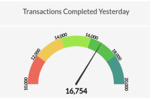
A gauge is an exceptionally clear visual. It shows exactly where a number falls between a minimum value and maximum value. If you want to show how your sales performance was for a specific time period, a gauge will allow a user to instantly know if you did better or worse than expected.

However, this simplicity is also an issue for gauges and similar one-dimensional visualizations. It can only be used to show a single number, and it takes up a lot of room. That’s fine in a car dashboard, where you only care about a few key real-time metrics like speed, RPM, and engine temp. But on a business data dashboard, prime real estate is valuable. It is for that reason we like to use gauges sparingly.

map

Choropleth Map

A choropleth, also known as a filled map, uses differences in shading or coloring within predefined areas to indicate the values or categories in those areas.

This is useful when you want to see what states you have the most sales in for example. These sorts of maps are very good at showing such distributions. However, they don’t have the granularity of other visualizations.

screen

Table

Yes, sometimes a simple table is the best way to show data. However, if a table is going to be used as part of a dashboard, it needs to be used properly. This means things like conditional formatting or in-depth filtering must be applied. 

table

The goal of a table in a dashboard should be just like the rest of these visualizations, to show something specific! It should be highlighting something like customers who have an outstanding balance. Do not fall into the trap of just showing the data again, otherwise, why did you spend time and money on visualizing your data at all?

Polk County Schools Case Study in Data Analytics

We’ll send it to your inbox immediately!

Polk County Case Study for Data Analytics Inzata Platform in School Districts

Get Your Guide

We’ll send it to your inbox immediately!

Guide to Cleaning Data with Excel & Google Sheets Book Cover by Inzata COO Christopher Rafter