Categories
Business Intelligence Data Analytics Data Visualization

How to Avoid the 5 Most Common Data Visualization Mistakes

Why Do Data Visualization Mistakes Matter?

Although data visualization has been in place since 1780, when the first bar chart was produced by a toy company in Scotland, the practice is still imperfect. Both intentional, misleading data visualization “mistakes” as well as honest mistakes made during output are more common in the business world than one might think.

Intentional “Errors”

When an organization wants to get a point across without providing much evidence, “statistical manipulation” is commonplace. Though a dishonest practice, it’s still widely seen in business today. Typically, organizations will leave out the scale on a bar graph or pie chart. Then, they will intentionally emphasize disparities or relationships in the data, with no actual scale to which viewers can compare each bar.

Virtually any data set can be made to look off-target using this method. While experienced analysts would be able to question or see right past this type of reporting, individuals unfamiliar with the data may not. As a side effect, this manipulation and bias could lead to a loss of credibility or potential revenue.

Unintentional Errors

The “weakest link” in the chain of statistical reporting is often the human generating the report. Even if there’s no reason for the person making the report to be misleading, their reports could unintentionally appear this way. Most often due to a lack of experience or context on the matter, these mistakes look deceiving and can result in a loss of integrity.

Who is Responsible for These Mistakes?

Most organizations have several layers of employees. While a report may be generated by an individual analyst, the responsibility for its contents is typically on the department that ends up releasing it. 

It can be hard to take a step back and think objectively when you’re the one working so closely with the data. This is why it’s critical to get multiple perspectives on the veracity of your reports before releasing them. Alternatively, you may choose to train an internal department that reviews every data set before it’s released to the public or another company.

What Are the Five Most Common Mistakes?

While there is an abundance of potential mistakes that could occur during the creation of a data set, some are more common than others. Here are the five issues we see the most often when it comes to data visualizations. They are important to avoid as all of these can be harmful to a company’s reputation and credibility overall.

1. Unlabeled X-Axis Start

A common technique in intentional data distortion, this is an abuse of the common conclusion that readers would draw from your chart. Unless otherwise marked, readers assume that your X-axes start at 0. Starting them at a higher number to emphasize smaller disparities is beyond merely “tweaking” a chart.

2. An Inverted Y-Axis

Elementary school-level math taught most of us that our X-axis and Y-axis should start at zero and go up from there. If an analyst wants to convey a message that’s the opposite of the results, flipping an axis is a great way to do that. However, this method rarely pays off due to the irregular visualization. Experienced viewers will undoubtedly detect this. 

3. Scale Truncation

We all expect bar charts to be linear in nature. However, if someone generating the chart wants a number to appear lower than it actually is, truncating it is the way to go. This is when you might see a small squiggle in a bar chart that randomly cuts out a large number. Ostensibly, the reason is usually to “keep it all on one page.” However, simply changing the scale rather than truncating arbitrary columns is how to keep it honest.

4. Cherry-Picking Scales

This is when a chart has data in arbitrary units. These are typically (but not always) intentionally engineered to make two scales either as close to each other as possible or as far away from each other as possible. It’s important to use the same units wherever possible. If it’s not possible, this must be clearly distinguished.

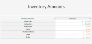
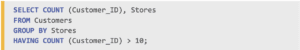
5. Including Too Much Data

Not always done intentionally but confusing nonetheless, this is when a chart has far too much data for the average reader to interpret. Charts should be kept as simple as possible. This will allow viewers to quickly and easily understand the information presented. 

Categories
Big Data Business Intelligence Data Analytics

Augmented Analytics: The Missing Piece of Business Intelligence

Can you believe it? We’ve made it to 2023. And truth be told, it’s a pretty sci-fi time to live. People carry around pocket computers, celebrities are “beamed” into performances, and increasing numbers of people consider phone calls quaint.

The same rate of technological progress has also consumed the business world. Like phone calls, companies that still use analog methods are throwbacks. These days, big data and augmented analytics are fueling the market, and businesses that refuse to adapt may find themselves at the back of the pack.

What Is Augmented Analytics?

Augmented analytics is shorthand for “using advanced technology to squeeze more out of business analysis efforts.” Artificial intelligence and machine learning are now commonplace, and they’ve transformed the data analysis landscape. Not only can we glean valuable insights about product pipelines, back-office operations, and customer interactions, but automation possibilities have also improved significantly.

Augmented analytics programs touch every point of the data lifecycle, from preparation to implementation.

How Can Augmented Analytics Help Your Company?

Augmented analytics isn’t just the buzzword of the quarter. Instead, think of it as the next “Internet.”

Back in the day, many companies didn’t see the value of the Internet or websites and cynically dismissed both as fads. When it became evident that the “World Wide Web” was here to stay, businesses that didn’t establish a digital foothold were caught on the backfoot — and catching up was prohibitively expensive in many cases.

In a way, we’re at a similar inflection point regarding big data. Businesses that got in early are reaping the financial benefits and winning market share. Companies that wait too long may find themselves hopelessly behind the eight ball.

How do big data and augmented analytics give organizations an edge? They uncover hidden operational pitfalls and possibilities, deliver value faster, and increase data intelligence.

Uncovers Hidden Pitfalls and Possibilities

Augmented analytics provides a clearer, more dynamic view of a company’s operations and sales. As such, it’s easier to spot and leverage trends.

Delivers Value Faster

Analog back-office operations consume a lot of resources and time. After all, manually entering every record, one by one, will take significantly more hours than a semi-automated system that can cycle through data by the microsecond.

Increased Data Intelligence

Computers can do amazing things. Heck, commonplace systems are smarter than we are in many regards. Marketing models can pinpoint potential customers and clients, increasing conversion rates and, ultimately, your bottom line.

Augmented Analytics Best Practices

It’s important not to conflate augmented analytics with full automation. Though the latter informs and supports the former, augmented analytics systems require people power. So when transferring to an augmented analytics system, hew to these three best practices

  1. Start Small: Don’t try to implement a new system all at once. Start with a small project that best serves your key performance indicators.
  2. Collaborate: Lack of transparency can hamstring an AI implementation. Make a seat at the table for every department that will use and benefit from the data. The best systems are ones that include input from across the board.
  3. Educate Employees About the Advantages of a Data-Driven Culture: The more employees understand the power of analytics, the more enthusiastic they’ll be about the process. After all, if the company prospers, that’s great for them, too!

How Is Augmented Analytics Transforming Business Intelligence and Data Analytics?

Augmented analytics is the third stage of the business intelligence metamorphosis.

  • First Stage Is Traditional Business Intelligence: The first iteration of business intelligence is known as “the traditional stage.” Under these setups, data engineers mold static dashboards, reports take days to prepare, and cross-departmental collaborations are rare. While most traditional processes feature elementary computer modeling, data entry and manipulation are 100% manual.
  • Second Stage Is Self-Service Business Intelligence: Self-service business intelligence options grew up alongside web 2.0. Hardware and software updates simplify the informational pipeline and provide better modeling, reporting, and data analysis. Automation is more prevalent for routine tasks under second-stage systems. However, the digital apparatus is limited to drag-and-drop options that may require advanced knowledge.
  • Third Stage Is Augmented Analytics: Augmented analytics programs leverage artificial intelligence to streamline the data prep stage, allowing for real-time analysis. Moreover, since the systems are highly intuitive, they’re accessible to more employees. To state it another way: employees no longer need to be data scientists to be part of — and benefit from — a company’s analytics pipeline.

If you’re contemplating an augmented analytics upgrade, it’s wise to consult with industry-leading platforms, like Inzata Analytics.

Categories
Business Intelligence Data Analytics

3 Strategies to Accelerate Digital Transformation

Three Strategies to Accelerate Digital Transformations

We’re well into the Digital Age, but some businesses have yet to harness computing power. Sure, they may be drowning in company devices and have accounts with the “right” platforms, but are they properly leveraging the tools they have? Surprisingly, in many instances, the answer is “no.”

Making a true digital transformation requires long-term strategic planning and precise implementation.

What Is Digital Transformation?

Digital transformation is the process of upgrading your business operations to fully leverage the power of computing and business intelligence systems. The metamorphosis from analog to digital involves more than just stocking up on the latest and greatest devices. Instead, digital transformations are complete procedural overhauls informed by a 360-degree analysis of your market and company.

What Are the Fundamental Tiers of a Digital Transformation?

Computer engineers typically divide digital transformation projects into four tiers:

  • Operational Efficiencies: How can we improve our production or service pipeline with enhanced digital integration?
  • Advanced Operational Efficiencies: How can we collect, analyze, and leverage information gleaned from customer and client interactions with our products and services?
  • Data-Driven Services Rooted in Value Chains: How can we leverage big data to create new market-making, customer-oriented services?
  • Data-Driven Services Rooted in Digital Enhancements: How can we collect market-making data, via the products and services we create, by digitally enhancing our offerings?

Why Is it Important to Invest in the Right Software and Tools?

One of the biggest mistakes companies make is not investing in the right tools and software for their operation. What’s “new” isn’t always ideal, and focusing on the needs of your business should be the top priority. Before committing to a digital transformation, ask yourself questions like:

  • How much money can we safely commit to the project without overextending the business?
  • What sectors of our business are working well and which need optimizing?
  • What are our team member’s computer competencies? What is the learning curve?

How Can You Accelerate Your Company’s Digital Transformation?

Analyze Operations: The first step in a digital transformation is analysis. Whether you conduct an in-house review or hire a skilled third party that helps companies navigate wall-to-wall computational upgrades, it’s essential to start with an accurate assessment of the business’s operations.

Analyze Customers: After you take stock of back-office operations, it’s time to peel back the layers on your customers. Invest in a thorough examination of how the people who use your services and products interact with them.

Match Competencies and Leverage Technologies: Once you have a 360-degree view of your operations and customer interaction, it’s time to pick your technologies. Finding solutions that fit your team’s budget and skills will help ensure the best possible outcome.

We are well into the digital age, and waiting to embark on a digital transformation is no longer an option. Tackle one step at a time, enlist experts, and take the plunge.

Categories
BI Best Practices Business Intelligence

How to Develop Your BI Roadmap for Success

Business intelligence is more than just a buzzword. Today’s BI apps and offerings give companies the edge they need to stay competitive in a market where customers increasingly tune out information that’s not tailored to their likes, needs, and desires. But implementing a business intelligence strategy is a resource-intensive process, and getting it right takes proper planning.

What Is Business Intelligence?

Business intelligence is the process of leveraging data to improve back-office efficiency, spot competitive advantages, and implement profitable behavioral marketing initiatives. Organizations that fail to institute proper business intelligence strategies:

  • Miss out on strategic growth opportunities
  • Routinely fall short on customer satisfaction
  • Overspend on promotional projects with little ROI
  • Remain reactive instead of proactive

Why Do We Need a Business Intelligence Strategy?

Business intelligence initiatives are not plug-and-play propositions, and instituting a BI process without a proper plan is like setting sail with broken navigational equipment. Sure, you can use the sun as a general guide, but the chance of landing at your exact destination is between slim and none. The same goes for businesses without clear and defined BI strategies. Departments will inevitably veer off course and toil toward different ends, and the data quality almost always suffers.

Seven Steps to a Successful BI Strategy

Now that we’ve established why business intelligence strategies are so important, how do you get started when implementing one? Consider these seven critical steps when defining your roadmap.

Step #1: Survey the Landscape

One of the biggest mistakes companies make when embarking down a BI path is failing to survey the landscape. It may sound cliche, but understanding where you are in relation to your desired destination is of paramount importance. During this stage, answer questions like:

  • What obstacles are we likely to face during this process?
  • Where are our competitors, and what are they doing that we’re not?
  • What resources are available that fit our budget?
  • How can we leverage data to increase sales and improve efficiency?

Step #2: Identify Objectives

Once you’ve got a handle on your niche’s market topography, it’s time to set goals. Too often, organizations and companies don’t get specific enough in this phase. While “making more money” or “securing more members” are, technically, goals, they’re too broad. During this stage, drill down your objectives. By how much do you want to grow your customer base? What is a reasonable expectation given market conditions? What metrics will you use to measure progress?

Step #3: Build the Right Team

The goals are in place. Next is team-building. The ideal BI working group is multi-disciplinary. Not only do you need a strong IT arm to handle and transform unstructured data, but it’s also important to include representatives from all the departments that will be using the information.

Step #4: Define the Vision

Defining a BI vision is similar to identifying objectives but not quite the same. In this step, members of the working group share their departmental processes and map out the ideal data flow. Defining objectives deals with end goals; vision mapping is about implementation practicalities. Which departments will receive it and when? How will they get it? Is there a roll-out hierarchy? How will the data be used?

Step #5: Build the Digital Infrastructure

Once the roadmap has been drawn, it’s time to start crafting the data pipeline. This step is mainly the responsibility of either an in-house IT department or a third-party data analytics platform. The ultimate objective of this step is to produce clean data that are distributed to the right people in a useful format.

Step #6: Launch Your Solution

It’s time to launch your system! Yes, by this point, you’ve likely held dozens of meetings — if not more — and tested your data pipeline and reporting systems like there’s no tomorrow. Yet, there’s still a 99.9 percent chance that you’ll need to make adjustments after launch. Expect it and plan for it. 

Step #7: Implement a Yearly Review Process

Pat the team members on their backs. Developing and implementing a business intelligence strategy is no small feat. But also understand that things will change. Your market may shift; your target demographic’s wants and needs will evolve — as will the technology. As such, it’s essential to review your strategy, data pipeline architecture, and goals yearly.

While this roadmap is by no means entirely exhaustive, business intelligence is a must-have in today’s marketplace. Having the technology isn’t enough. Meticulously mapping out a comprehensive strategy is what makes your BI initiative profitable and successful in the long run.

Categories
Business Intelligence Data Visualization

4 Powerful Ways to Visualize Your Data (With Examples)

While visualizing data, all of us know about the pie chart or the line graph. These graphs are some of the most common and basic visualizations of data. However, these graphs are only the tip of the iceberg. There is a whole range of visualization methods that can be used to present data in the most effective manner.

Though the nearly endless possibilities lead to another issue, which one do you choose?

Exploring Some Common Visualizations

In this post, we will discuss some of the most common data visualizations and more specifically when they communicate your data clearly and when they don’t. Again, there are wide choices available, so we can’t cover them all, but the ideas presented can be applied to any visualization you come across in the future.

Line Chart

If there was an “old reliable” of the data visualization world, the line chart would be it. However, despite the old part being true, the reliable part should probably be up for debate. Line charts show one thing very well and that is numerical data combined with an ordinal attribute. 

graph

For example, transaction totals over time. That is due to the structure of the purpose of the line chart. At the end of the day, what the line chart is designed to show is how something moves from one ordinal data point to another. 

In cases where the data shouldn’t be connected in such a manner, all a line chart does is confuse the viewer. A line chart should only be used to communicate a maximum of 3-5 “lines” at a time, any more than this and the chart begins to feel crowded and look confusing. 

The two biggest offenders for bad line charts are too many variables (as seen to the right) or too high a frequency. Both of these mistakes cause a line chart to be confusing and hard to understand.

Gauge Visualization

The needle gauge is an incredibly popular visual and has some strong benefits. 

We’ve been conditioned since we learned to drive to trust and love gauges. They are very efficient at showing a single numerical data value at a single point in time. People love their simplicity, but that’s also their weakness. 

graph
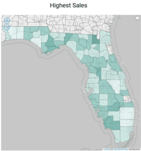
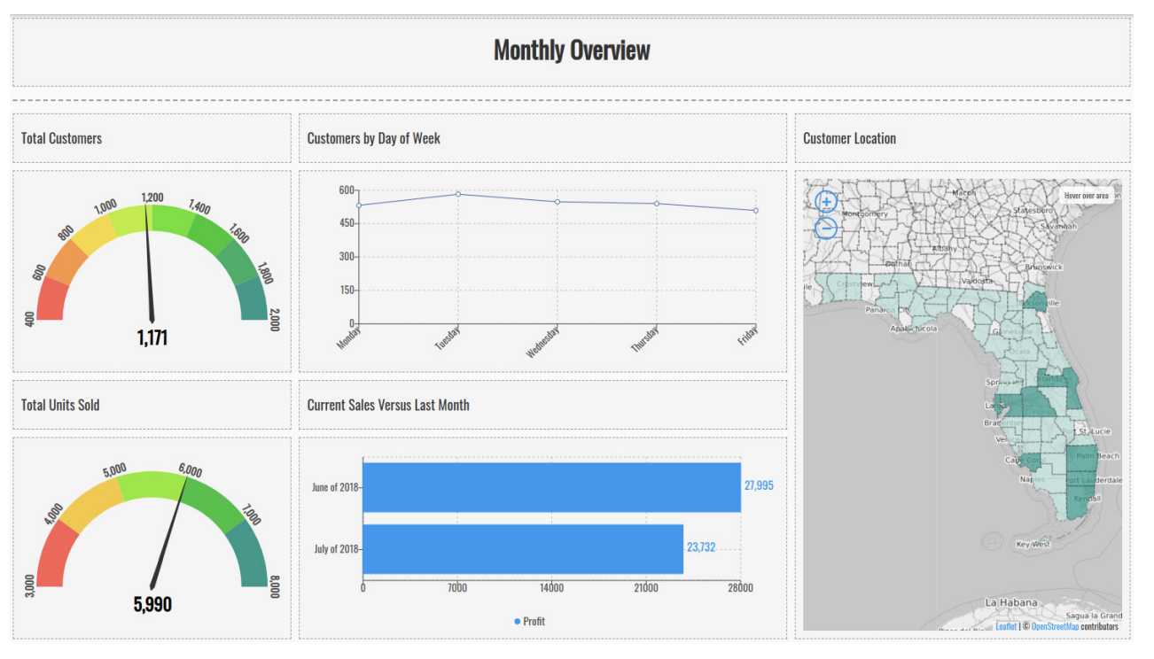
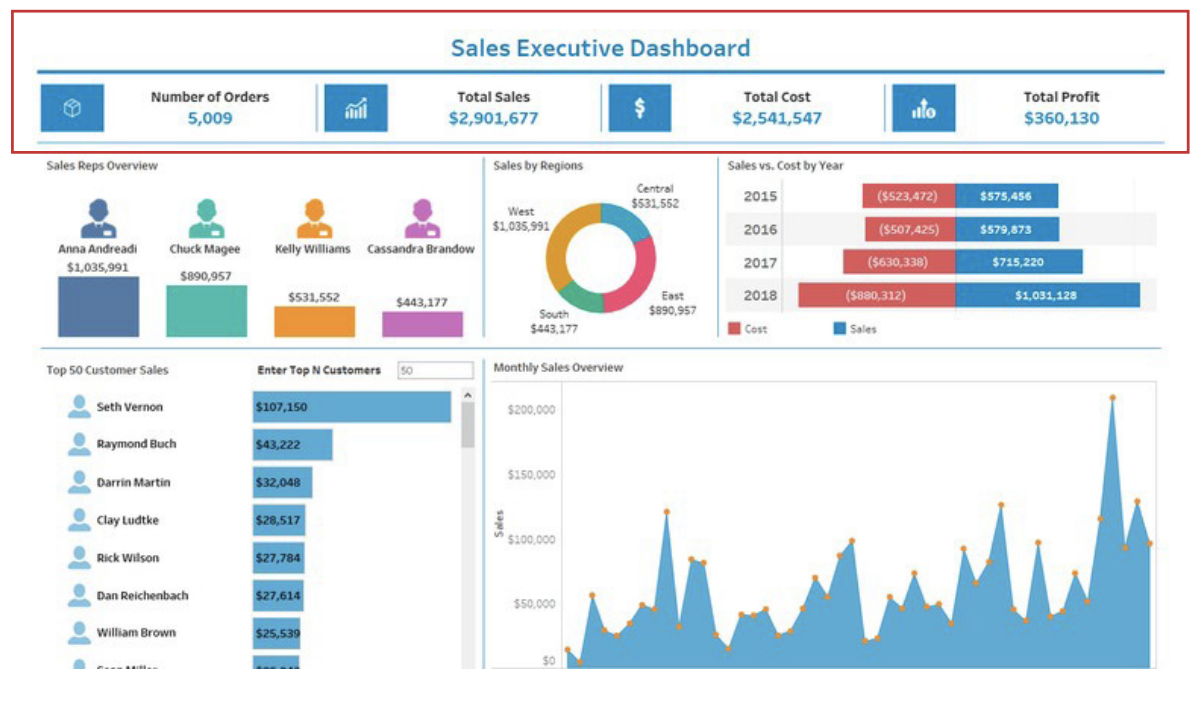
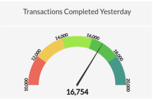
A gauge is an exceptionally clear visual. It shows exactly where a number falls between a minimum value and maximum value. If you want to show how your sales performance was for a specific time period, a gauge will allow a user to instantly know if you did better or worse than expected.

However, this simplicity is also an issue for gauges and similar one-dimensional visualizations. It can only be used to show a single number, and it takes up a lot of room. That’s fine in a car dashboard, where you only care about a few key real-time metrics like speed, RPM, and engine temp. But on a business data dashboard, prime real estate is valuable. It is for that reason we like to use gauges sparingly.

map

Choropleth Map

A choropleth, also known as a filled map, uses differences in shading or coloring within predefined areas to indicate the values or categories in those areas.

This is useful when you want to see what states you have the most sales in for example. These sorts of maps are very good at showing such distributions. However, they don’t have the granularity of other visualizations.

screen

Table

Yes, sometimes a simple table is the best way to show data. However, if a table is going to be used as part of a dashboard, it needs to be used properly. This means things like conditional formatting or in-depth filtering must be applied. 

table

The goal of a table in a dashboard should be just like the rest of these visualizations, to show something specific! It should be highlighting something like customers who have an outstanding balance. Do not fall into the trap of just showing the data again, otherwise, why did you spend time and money on visualizing your data at all?

Categories
Big Data Business Intelligence Data Analytics

Why You Need to Modernize Your Data Real Estate

How Does Your Company’s Data Real Estate Measure Up?

Are you still letting your gut guide business and promotional plans? In today’s market, where nearly 60 percent of companies leverage “big data” and growth statistics indicate a 5,000 percent industry increase over the past 10 years, it’s a dangerous choice — especially since that number continues to grow. Before long, data-rooted marketing and procedural initiatives will become as commonplace as the Internet.

This industry push toward informational analytics begs the question: How is your company’s digital data game? Are you keeping up with the times or lagging woefully behind? 

Why Is Data So Important These Days?

Data is like a crystal ball. It provides insight into market trends, customer behavior, and back-office logistics. Companies that invest in informational architecture tend to save money and increase efficiency, giving them a competitive edge. 

What Is Data “Real Estate?”

Data “real estate” refers to the software, hardware, and reporting mechanisms a business uses to collect, sort, and analyze raw data. The phrase can also encompass your informational pipeline and procurement methods. 

How To Modernize Your Data Real Estate?

Decades ago, when businesses first started leveraging data, most IT analytics tools were static and limited. Microsoft Excel and Access were the big players back then. In short order, relational databases popped onto the scene, but early options required lots of human data entry, and they lacked dynamism.

If you’re still paddling in that data puddle, it’s time to modernize. Today’s options are light-years ahead, and they’ll likely improve your bottom line in the long run. 

Embrace Automation and Merge Your Lakes

Automation advancements have seismically changed the data pipeline landscape. Today’s programs can handle many routine parsing, cleaning, and sorting tasks. What once took hours now takes minutes. Additionally, auto-correction and other machine-learning innovations have significantly improved data accuracy. 

Streamline Your Data Flow: Moving from ETL vs. CDC

The next step in modernizing your data real estate is moving from an ETL environment to a CDC one. ETL stands for “extract, transform, load,” while CDC represents “change data capture.” We could write a dissertation on the technical differences between the two methodologies, but for the purposes of this conversation, suffice it to say that the latter provides a constant stream of fresh data while the former is more of a traditionally manual process.

Now here’s where things get a little bit confusing. CDC uses ELT, which stands for “extract, load, transform” — the next generation of ETL, which allows for better speed and fluidity.

The Future Is Now, And It’s Data-Driven

In days of old, when Mad Men ruled Madison Avenue, business acumen was more of a talent than a science. And while it still takes competency and knowledge to run a successful company, data analysis removes a lot of the guesswork. 

The margin of error is becoming increasingly narrow, and leveraging big data will help ensure that you keep a competitive edge.

Categories
BI Best Practices Business Intelligence

Self-Service Analytics: Turning Everyday Insight Into Actionable Intelligence

Business intelligence and analytics have become essential parts of the decision-making process in many organizations. One of the challenges of maximizing these resources, though, comes with making sure everyone has access to the analysis and insights they need right when they need them. The solution you may want to consider is self-service BI.

What is Self-Service BI?

The idea behind self-service BI is simple. Users should be able to access reports and analysis without depending on:

  • An approval process
  • A third party
  • Any specific person in the organization

In other words, everyone should be able to ask the person to their left to pull something up. If the boss needs to hear what the details of a report are, their team should be able to access key information without contacting a help desk or a third-party vendor. When they need help, anyone from the top down should be able to instantly address the issue by pointing them to the proper dashboards and tools.

Defining Your Requirements

Before getting too deep into the complexities of self-service BI, it’s important to establish what your requirements are. First, you’ll need to have the resources required to provide self-service to your end-users. If you’re going to have 10,000 people simultaneously accessing dashboards from locations across the globe, that’s a huge difference compared to a company that has 5 people in the same office on a single system.

Scalability is an extension of that issue. If your company has long-term growth plans, you don’t want to have to rebuild your entire analytics infrastructure three years from now. It’s important to build your self-service BI system with the necessary resources to match long-term developments.

Secondly, you’ll want to look at costs. Many providers of BI systems employ license structures, and it’s common for these to be sold in bulk. For example, you might be able to get a discount by purchasing a 500-user license. It’s important that the licensing structure and costs must match your company’s financial situation.

Finally, you need to have a self-service BI setup that’s compatible with your devices. If your team works heavily in an iOS environment on their phones, for example, you may end up using a different ecosystem than folks who are primarily desktop Windows users.

Developing Skills

A handbook has to be put in place that outlines the basic skills every end-user must have. From a data standpoint, users should understand things like:

  • Data warehousing
  • Data lakes
  • Databases

They also should have an understanding of the BI tools your operation utilizes. If you’re using a specific system in one department, you need to have team members who can get new users up to speed company-wide. You’ll also likely need to have team members who are comfortable with Microsoft Excel or Google Sheets in order to deal with the basics of cleaning and analyzing data.

Your users need to be numerate enough to understand broad analytics concepts, too. They should understand the implications of basic stats, such as why small sample sizes may hobble their ability to apply insights to larger datasets.

Understand How Users Will Behave

Having the best tools and people in the world will mean nothing if your team members are always struggling to work the way they need to. This means understanding how they’ll use the system.

Frequently, user behaviors will break up into distinct clusters that have their unique quirks. Someone putting together ad hoc queries, for example, is going to encounter a different set of problems than another user who has macros set up to generate standard reports every week. Some users will be highly investigative while others are largely pulling predefined information from the system to answer questions as they arise.

Within that context, it’s also important to focus on critical metrics. Team members shouldn’t be wandering through a sea of data without a sense of what the company wants from them.

By developing an enterprise-wide focus on self-service BI, you can help your company streamline its processes. When the inevitable time comes that someone needs a quick answer in a meeting or to make a decision, you can relax knowing that your users will have access to the tools, data, and analysis required to do the job quickly and efficiently.

Categories
Business Intelligence Data Visualization

7 Golden Rules for Dashboard Design

There are some important rules to follow when making dashboards and to ensure your dashboard hits the mark it needs to and gets people using it. Now let’s dive deeper into what makes a good dashboard.

1. Make sure you are designing the right dashboard for who is going to be using it

If you are going to spend your time and energy making a good dashboard you need to know who the dashboard has to be “good” for. Executives will want to see something different from a salesperson and so on for a data analyst, you need to know about the audience of the dashboard. The most effective dashboards are those which target a single user or group of users and then provide the right data and visualizations accordingly. A lot of people overlook this step, which creates havoc later on.

2. Display the dashboard data in a logical manner

Ensure that your data is displayed in logical groups, and in a proper manner. The top left-hand corner of your dashboard is where the eye will immediately go to and as such, it is the most important part of the dashboard. When we say to display the data in logical groups that is to say; if you are making an executive overview that compares two marketing strategies, the data for each strategy should be grouped together so that all of the visualizations for strategy A go on the left and all of the visualizations for strategy B go on the right.

3. Vary your visuals

When it comes to dashboards, variety is always better. Don’t use only one chart type, no matter how much you love stacked bars. Mix it up with straight lines and curves. Vary your report elements between low-level tables that show granular data and higher-level pie charts, gauges, and value widgets.

Here is an example of a good variety of visualizations for a monthly recap. It immediately shows the important totals as well as a comparison to last month and where our customers are coming from.

4. Locate the most important visuals “above the fold”

Above the fold is an old newspaper term, and it means the top part of the front page, which is still visible when the paper is folded. For dashboards, this means the screen real estate at the top is visible when the dashboard is first loaded by the user. Put your most important and/or summary level visuals at the top. Tools like Inzata (https://qastaging.wpengine.com) let you view heatmaps of how your users scroll and navigate within their dashboards. Use these to identify their most important and most-viewed elements and move them near the top.

5. Don’t forget your headline

You’re probably tired of all the newspaper references, but hey, there’s a reason why nearly every print newspaper on Earth is organized in more or less the same way: it’s effective.

What do headlines do? They communicate the main message to the reader about what happened or is happening. They’re in big, bold print so they’re hard to miss. We recommend using a nice row at the top consisting of 3 or 4 easy-to-spot widgets that are easy to read, like gauges or single-value widgets. This “headline” row quickly delivers key information to the viewer and sets the stage for further exploration as they continue reading.

6. Always refresh your data

Data that is being displayed on your dashboard only maintains importance if it is up to date. If you are trying to decide what to do tomorrow based on data from three months ago, you are going to arrive at the wrong conclusions.

7. Keep your dashboards focused!

Make sure that the most important data gets highlighted in the dashboard. You should also keep your dashboard small so that it is able to focus on the thing which is most important. Long dashboards aren’t always the best. Many small dashboards, which are focused on a single topic or goal, make a better dashboard than long and heavy ones.

Your dashboard should be focused on answering a single question and should almost never have more than five or six visualizations. It may be tempting to make one huge dashboard where someone could find all the answers, but that is not how people’s brains typically work. It will result in users feeling lost and confused because they can’t find what they need quickly. If it takes someone more than 5 seconds to find what they need on your dashboard, consider redesigning it.

Categories
Big Data Business Intelligence

Making Sense of IoT Sensors, MQTT, and Streaming Data

With the use of IoT sensors on the rise, one of the great challenges companies face is finding a protocol that’s both compact and robust enough to meet a variety of requirements. IoT devices oftentimes need to be able to communicate on a machine-to-machine (M2M) basis, and they also need to transmit information to servers, analytics platforms, and dashboards. Similarly, they may need to provide streaming data to all of these platforms.

One solution many organizations have settled on is Message Queuing Telemetry Transport (MQTT). Created by IBM in 1999, MQTT is a very mature protocol compared to other available options. Let’s take a look at why MQTT is a strong candidate for widespread adoptions over the coming decade and some of its best use cases.

What’s in a Protocol?

It may be helpful to think generically about what makes a transport protocol ideal for deployment in IoT sensors and devices. Qualities worth including in such a protocol include:

  • Very low power consumption
  • A light code footprint that can be adapted to many small devices
  • Minimal bandwidth usage
  • Low latency
  • Compatibility with a wide range of public clouds
  • A simple publication and subscription model

MQTT ticks all the boxes, providing support to a variety of major platforms. It was originally intended to allow oil pipeline systems to communicate with satellites. Deployed in sometimes difficult conditions, MQTT is built to keep power and bandwidth requirements minuscule. It also offers robust library support for popular programming languages like Python.

How MQTT Works

A publication and subscription model is the core of MQTT. Individual devices are set up as clients, but the central systems they communicate with are considered brokers rather than servers. If a client wants to send information out, it will publish the data to a topic. The broker then sends the information to all other clients that have subscribed to receive publications on the topic.

This is ideal for use with sensors because they don’t need to know anything about what’s occurring upstream. Also, all clients on the network have the capacity to be publishers and subscribers. They simply check in with the broker to find out what’s new.

Using MQTT with Streaming Data

IoT devices oftentimes use fire-and-forget solutions to minimize bandwidth and power consumption. For example, a Raspberry Pi might be set up as a monitoring station in a cornfield to provide data regarding things like air and soil temperatures, humidity, hydration, and pH levels. In the simplest form, the farmer’s data dashboard is just one more client in the network. Each of the sensors publishes data, and the dashboard, acting as just another client, subscribes to the topics from all of the sensors.

The beauty of this system is fairly self-evident. No one has to deal with massive server-client infrastructure. The farmer can easily have clients set up on a cellphone, tablet, in-vehicle display and laptop. Information is available everywhere and at all times, and this is all accomplished with little power consumption, a light central broker, and minimal bandwidth consumption. This represents a very lean approach to streaming data.

Two Use Cases

Logistics firms frequently use MQTT to track fleets and shipments. A system using MQTT can connect sensors in planes, trains, trucks and cars with a company’s existing backend for analytics and storage. Likewise, computers and mobile devices can bypass the cumbersome backend by talking directly to the MQTT system, providing nearly real-time information.

Despite its rather heavy-duty industrial pedigree, MQTT has found its way into a surprising variety of applications, too. For example, MQTT is a core component of Facebook Messenger. The company elected to use MQTT because its low power consumption helped it preserve battery life on mobile devices.

Conclusion

Having a lightweight protocol is essential to maximizing the efficiency and effectiveness of IoT devices and sensors. MQTT is one of the more appealing options for companies that need to prioritize speed and simplicity. If you’re preparing to deploy or upgrade a network of IoT systems, MQTT will be one of the options on your shortlist when it comes to choosing a protocol.

Categories
Business Intelligence

The Beginner’s Guide to SQL for Data Analysis

What Is SQL?

SQL stands for “Structured Query Language,” and it’s the programming protocol used for relational database management systems. Or, in plain English, SQL is the code that accesses and extracts information from data sets.

The Importance of SQL and Data Analysis

In our current economy, data ranks among the most commodifiable assets. It’s the fuel that keeps social media platforms profitable and the digital mana that drives behavioral marketing. As such, crafting the best SQL data queries is a top priority. After all, they directly affect bottom lines.

In our examples below, we use the wildcard * liberally. That’s just for ease and simplicity. In practice, wildcards should be used sparingly and only at the end of the query condition.

Display a Table

It’s often necessary to display tables on websites, internal apps, and reports.

In the examples below, we show how to a) pull every column and record from a table and b) pull specific fields from a table.

code

Adding Comments

Adding comments to SQL scripts is important, and if multiple people are working on a project, it’s polite! To add them, simply insert two dashes before the note. Don’t use punctuation in comments, as it could create querying problems.

Below is an example of a comment in a SQL query.

code

Combine Columns

You’ll want to combine two columns into one for reporting or output tables.

In our example below we’re combining the vegetable and meat columns from the menu table into a new field called food.

code

Display a Finite Amount of Records From a Table

Limiting the number of records a query returns is standard practice.

In the example below, we’re pulling all the fields from a given table and limiting the output to 10 records.

code

Joining Tables Using INNER JOIN

The INNER JOIN command selects records with matching values in both tables.

In the example below, we’re comparing the author and book tables by using author IDs. This SQL query would pull all the records where an author’s ID matches the author_ID fields in the book table.

code

Joining Tables Using LEFT JOIN

The LEFT JOIN command returns all records from the left table — in our example below that’s the authors table — and the matching records from the right table, or the orders table.

code

Joining Tables Using RIGHT JOIN

The RIGHT JOIN command returns all records from the right table — in our example the orders table — and the matching records from the left table, or the authors.

code

Joining Tables Using FULL OUTER JOIN

The FULL OUTER JOIN command returns records when there’s a match in the left table, which is the authors table in our example, or the right table — the orders table below. You can also add a condition to further refine the query.

code

Matching Part of a String

Sometimes, when crafting SQL queries, you’ll want to pull all the records where one field partially meets a certain criteria. In our example, we’re looking for all the people in the database with an “adison” in their first names. The query would return every Madison, Adison, Zadison, and Adisonal in the data set.

code

If/Then CASE Logic

Think of CASE as the if/then operator for SQL. Basically, it cycles through the conditions and returns a value when a row matches. If a row doesn’t meet any of the conditions, the ELSE clause is activated.

In our example below, a new column called GeneralCategory is created that indicates if a book falls under the fiction, non-fiction, or open categories.

code

HAVING Instead of WHERE

The HAVING and WHERE keywords accomplish very similar tasks in SQL. However, WHERE is processed before a GROUP BY command. HAVING, conversely, is processed after a GROUP BY command.

In our example below, we’re pulling the number of customers for each store, but only including stores with more than 10 customers.

code

It’s fair to argue that SQL querying serves as the spine of the digital economy. It’s a valuable professional asset, and taking time to enhance your skills is well worth the effort.

Polk County Schools Case Study in Data Analytics

We’ll send it to your inbox immediately!

Polk County Case Study for Data Analytics Inzata Platform in School Districts

Get Your Guide

We’ll send it to your inbox immediately!

Guide to Cleaning Data with Excel & Google Sheets Book Cover by Inzata COO Christopher Rafter