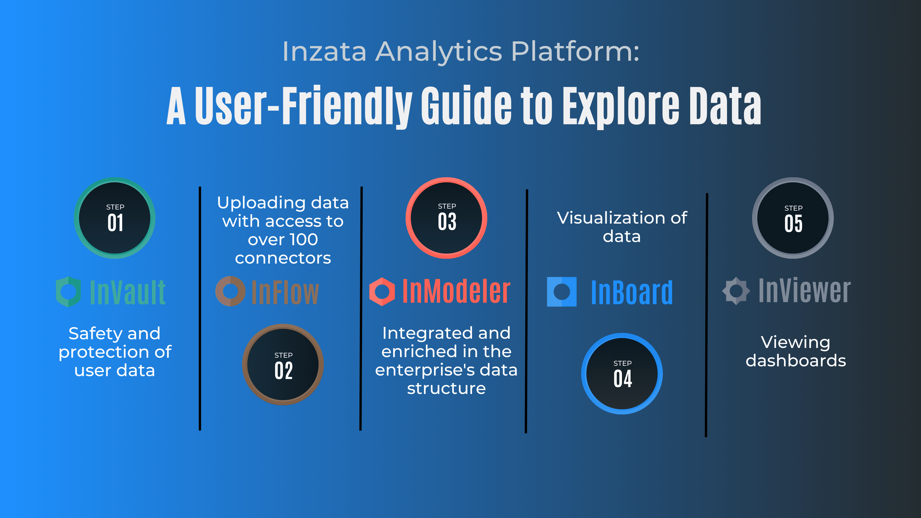
Inzata, the all-in-one data analytics platform, has recently unveiled a range of new dashboard templates designed to elevate user experience. These templates introduce fresh designs, colors, and shading options, enhancing the platform’s visual appeal and functionality.
The dashboard templates are designed with a focus on modern aesthetics and user-friendly interfaces. The dashboards are rounded, and with the new shading, they give a more 3D effect. The templates are available in both dark and light themes, providing users with a choice of color schemes to suit their preferences.
Introducing the Themes: Where Form Meets Function
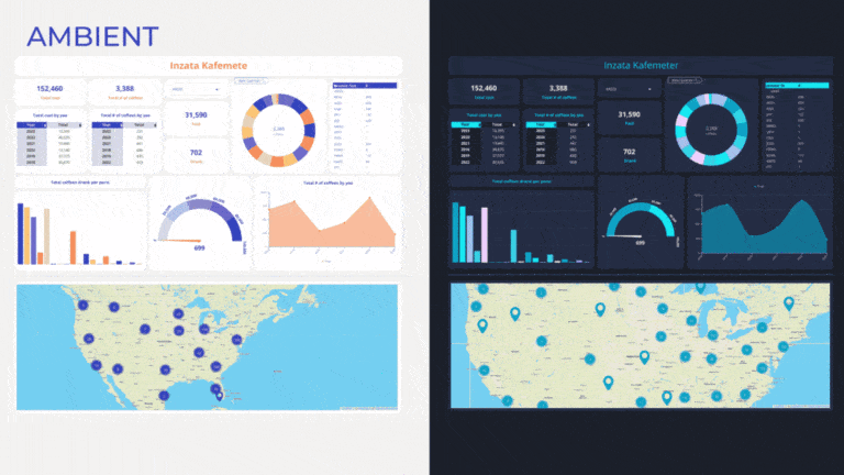
The Ambient Dark and Ambient Light templates are designed to provide a relaxed and calm environment for users to view their data. The soft, muted color schemes of these templates give a calming effect that helps users focus on the data without any distractions.
The Pastel Dark and Pastel Light templates are designed with a subtle blend of pastel colors, providing a softer and more soothing effect. These templates are ideal for users who want to view their data in a more gentle and relaxed way.
The Neon Dark and Neon Light templates are designed with a more vibrant color scheme, with bright neon colors that give a modern and energetic look. These templates are perfect for users who want to showcase their data boldly and excitingly.
The Modern Retro Dark and Modern Retro Light templates are designed with a retro feel, with a modern twist. These templates combine the classic look of the 70s and 80s with modern design elements, creating a unique and stylish look.
The Brutalism Dark and Light templates feature bold and expressive color combinations, including vibrant greens, yellows, pinks, and azure blues. These templates are designed to make a strong visual impact when conveying data. Whether users prefer energetic or calming colors, the templates offer a versatile and dynamic solution for data visualization that helps users make bold statements with their data.
Why do These Templates Matter?
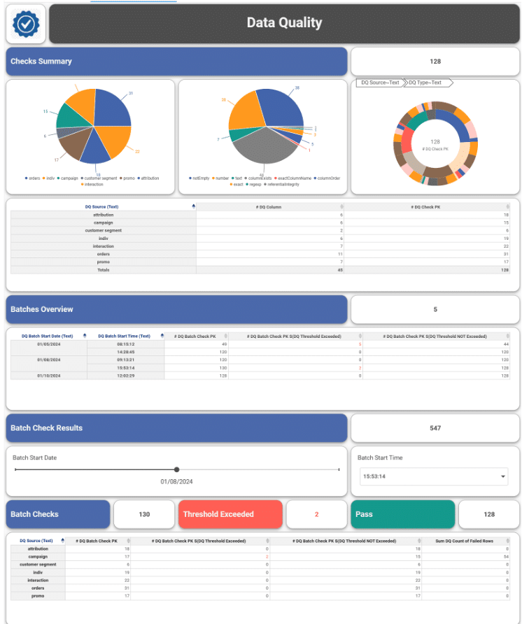
Overall, the new dashboard templates on the Inzata platform offer a range of options to users, with something to suit every taste and preference. The new templates are a great addition to the already feature-rich platform and will undoubtedly enhance the user experience. The new shading and rounded design make the dashboards more visually appealing, and the choice of colors will help users customize their dashboards to their liking.